Getting consumers to buy from your business and, more importantly, encouraging them to return to your online store hugely depends on the browsing experience you can provide.
With exceptional UX design, you’re guaranteed to leave a positive impression, inspire web visitors to browse products, and even get them to convert. But if you get it wrong, the results could be devastating. Bad UX design decisions can not only lead to a high bounce rate but also threaten your brand’s reputation.
So, how can you create a pleasant browsing experience for your prospects and boost sales along the way? Here’s how to increase conversions in 2024 with eight effective UX hacks.
UX Hacks to Increase Conversions
There are five core elements of UX design. These include:
- Surface — everything your audience sees, like images, text, clickable objects, etc.
- Skeleton — the order determining the placement of different elements, like where you position buttons, photos, text, and how they appear to your audience.
- Structure — the underlying structure of your website, which needs to be clear and logical (the three-click navigation rule is an example of structural UX design).
- Scope — any feature or function on a website (like logging into an account or saving an address for faster checkout in the future) falls under this category.
- Strategy — the reason a website looks and performs in a specific manner, with a clear goal set from the beginning of the design process.
Get all these elements right, and you’ll be well on your way to boosting website conversions. The following are some of the best UX hacks to attract and engage more customers, increase sales, and (hopefully) wow visitors so that they remain loyal to your brand.
Pay Attention to Technical Performance
Websites that don’t perform well technically have zero chance of converting new customers. In fact, research shows people become hugely frustrated with sites when they run into technical performance issues.
Load Speed
For example, the speed at which your pages load directly influences how your web visitors will react.
According to research from Google, the probability of a bounce increases by 32% as page load times go from 1 to 3 seconds. Even more shockingly, bounce rates increase by 123% when a page takes more than 10 seconds to load.
The takeaway? You need to ensure your site loads fast. Use the available tools, like Google’s Page Speed Insights, and explore ways to improve technical performance to prevent your audience from becoming frustrated with your site.
Responsiveness
Another simple UX hack that can prevent your audience from forming a negative impression of your business (and navigating away from your website to convert with your competition) is ensuring your website performs and displays well on all devices and screen sizes.
Adobe found that 30% of web visitors stop viewing a page if it doesn’t display well on their current device. So, if you don’t want that to happen, learn how to design sites and mobile apps that will meet your customers’ expectations and encourage them to stick around until they’ve converted.
Moreover, do your best to explore how thriving brands approach responsive design. For instance, if you check out the homepage of Going, a deals service for low-cost airfare, you’ll notice it’s equally user-oriented in desktop and mobile mode, with the latter prioritizing information hierarchy and using structure to show visitors hints of content to encourage them to scroll.
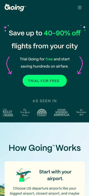
Source: going.com
Understand How Your Audience Views/Interacts With Web Pages
Designing the ideal user experience for your potential customers requires a solid understanding of how your audience views and interacts with web pages.
Now, the best way to learn about your ideal customers’ browsing behavior is to record user sessions and use them to form insights and create design strategies. However, if you’re just starting to design your website, base your design decisions on widespread browsing behaviors. Then, test the results and adjust as needed to maximize conversions.
Positioning High-Impact Elements
According to research from the NN Group, people spend 57% of their page-viewing time looking at the first screenful of the page. So, if you want to guarantee they notice a conversion-boosting element like your USP or a CTA button, do your best to position it in the hero section of your page.
Check out how Bay Alarm Medical, a medical alerts provider, does it. Knowing its users want a reliable solution, this brand fills the homepage hero section with trust elements. These include a Google rating, an eye-catching value proposition, and a phone contact option that’s an excellent choice, seeing that the brand targets elderly users and their caretakers.
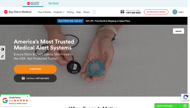
Source: bayalarmmedical.com
Content Scanning & Reading Patterns
When reading online content, people scan instead of consuming articles word-for-word. So, use UX design to boost scannability and improve website readability.
Are you wondering how this helps boost conversions? Well, you must understand that consumers want to make informed buying decisions. So, do your best to encourage web visitors to quickly identify and understand the benefits of your solution. That way, you’ll maximize their purchase intent.
For instance, check out how wonderfully TikTok applies this principle on its For Business landing page:
- Knowing that people scan online content left to right, the brand places solution benefits on the left-hand side of the page.
- As people don’t have much patience for big chunks of text, the brand uses a limited number of words.
- Seeing how videos and images convey more information than text, TikTok employs both to help web visitors comprehend the potential value of using the platform’s advertising and sales functions.
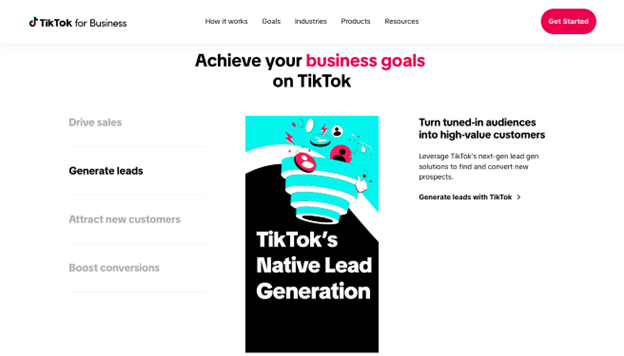
Source: tiktok.com
Search Bar
Finally, to increase conversions with UX design, you must understand that consumers need efficient ways to find what they’re after. In fact, research shows that, when landing on a site, 69% of web users go straight to the search bar. So why not make the search bar a conversion-boosting powerhouse on your website?
For an exceptional example of what you could do, check out Shop Solar. This brand doesn’t just use advanced UX functionalities (like personalized product recommendations) to make its search bar more powerful. It also turns each result preview into a clickable button, allowing prospects to go directly to a product page and convert in just a few clicks.
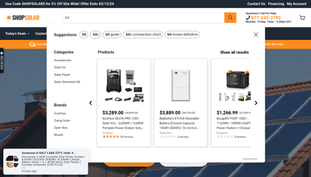
Source: shopsolar.com
Follow CTA Best Practices
One of the most commonly overlooked yet effective UX hacks you can implement immediately is to follow CTA best practices. To increase conversions in 2024, you must optimize your conversion elements. And CTA buttons are the most important of those.
Essentially, you can easily ensure your calls to action stand out and compel your audience to invest in your solutions.
- Follow the principles of visual hierarchy by using contrasting colors, making CTAs sufficiently big, and employing easy-to-read typography.
- Optimize CTA copy to appeal to your audience. Ideally, your calls to action should offer a solution to your prospects’ frustrating pain points. Or, they could awaken a sense of urgency in web visitors, helping you move them through the sales funnel more quickly.
- Repeat CTAs whenever logical. Understand that web visitors consume web page content in a linear way. That is, they won’t scroll back up. So, to maximize their chances of converting, position CTA buttons at the end of each webpage section, inviting prospects to convert.
For an excellent example, take a look at the home page of Netify, a cloud solutions provider. The brand uses multiple CTA buttons, each inviting prospects to perform a different action — sign up, request a demo, learn more about key features, or explore the platform.
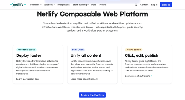
Source: netlify.com
Display Social Proof
Want to boost conversions on your website? In that case, you must display social proof.
Research shows that:
- 99.5% of people read reviews before making a purchase
- 99% of consumers conduct online product research before buying
- (according to the previous source) 92% do that research while in-store
With this in mind, one easy psychology-based UX design hack you can implement on your site is to show off positive feedback about your brand, products, or services.
The easiest way to use social proof elements on your site is to display testimonials, like Ultimate Meal Plans, a customized meal planning app, did in the example below. Or, if you’re trying to target B2B prospects, show off media mentions, certificates, and product awards. And, of course, don’t forget to build credibility by association. You can easily do that if you display client logos in a high-impact section of your site.
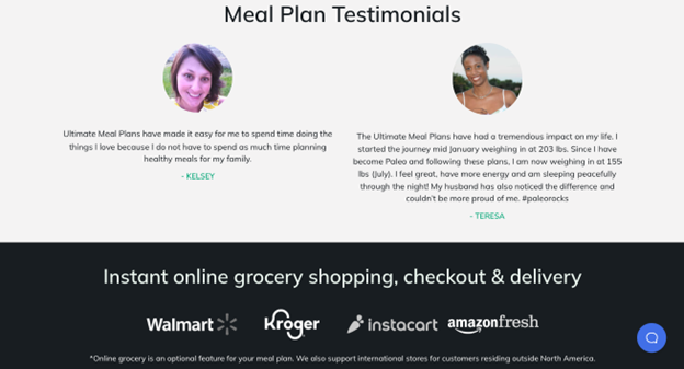
Source: ultimatemealplans.com
To further maximize site conversions, however, do your best to utilize the right social proof format.
For example, Edelman discovered that over 60% of young consumers consider scientists and experts trustworthy brand spokespeople. Moreover, 74% of people think science-backed evidence is as credible as recommendations from friends. So why not add this type of testimonial to your website?
For a great example, check out the homepage of supplement brand Healthycell. This brand knows its audience wants proven results. So, it presents web visitors with a graphic and excerpt from a double-blind, randomized human clinical trial to prove that its product does what it promises.
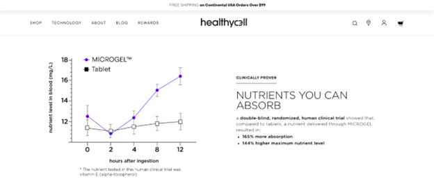
Source: healthycell.com
Streamline the Checkout Process
Want to know the biggest conversion-killer on your website? It’s a shopping experience that’s not user-friendly.
According to research, 18% of cart abandonments happen due to a complicated checkout process. So, if you want to employ UX design to boost conversions, why not streamline your site’s shopping functionalities with one-click checkout and third-party payments?
For example, the Jo Malone website includes a Quick Shop UX feature on its product collection pages. On top of that, it also allows new customers to check out with PayPal, which lets them complete a purchase without entering an address or credit card info.
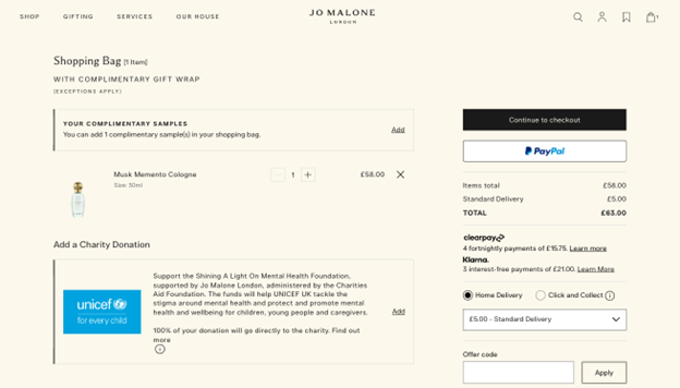
Source: jomalone.co.uk
Another consumer behavior you can use to improve the browsing experience and increase conversions is to provide free shipping. Data shows that 62% of shoppers won’t consider purchasing unless a brand offers free shipping. So, why not make complimentary shipping a part of your conversion-boosting strategy? Or, if that’s not the case, at least make it easy for web visitors to calculate delivery costs to help prevent last-minute cart abandonments.
Check out how Waterdrop does this on their Sky page. When consumers add an item to their carts, the website automatically displays their shopping bags, along with a bar at the top telling them how much more they have to spend to qualify for free delivery.
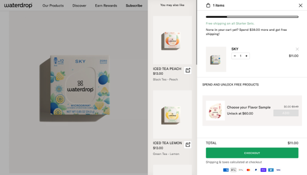
Source: waterdrop.com
Finally, don’t forget that people often prioritize convenience when shopping. Thus, if you want to increase conversion rates, consider making it super-easy for your audience to get access to your solutions.
For example, 51% of consumers think product/service subscriptions are convenient, and 47% choose these options because they offer cost savings. It would be good for you to provide the option, especially when selling consumables.
Ease the Product Evaluation Process
Sometimes, boosting UX is as simple as making product information easy to navigate.
For instance, data shows that 29% of consumers use price comparison websites to research products. What does that mean? It shows that people want an easy way to collect product info and evaluate potential solutions to make the best purchase decision.
If you wish to boost conversions by streamlining the product evaluation stage of the sales funnel, add product comparison functionalities to your site. This will help your audience make better purchase decisions. Plus, it will prevent web visitors from navigating away from your site to find the info they need (and choosing your competitors’ solutions).
Check out the comparison page from the ClickUp site below. In it, the brand lets potential customers see the differences between its solution and that of a competitor. And, sure, the inclusion of such a resource may seem counter-intuitive. After all, why would you draw web visitors’ attention to an alternative to your solution? However, ClickUp knows its customers will seek out content like this either way. So, by including it on its website, at least it’s ensuring people continue browsing and understand the benefits the brand offers compared to alternative options.
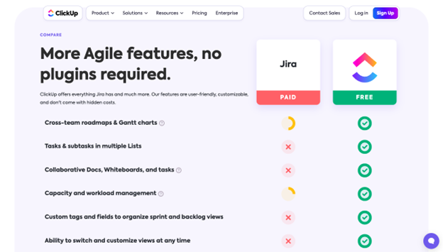
Source: clickup.com
Present Web Visitors With Customer-Service Resources
Getting UX design right hugely depends on giving potential customers what they need at every step of the buyer’s journey. And the only way you can do that is by understanding that things can’t always be smooth sailing.
Converting and retaining customers requires you to understand that your audience will encounter some issues at some point in their shopping process — regardless of whether that’s before or after they’ve converted.
With this in mind, you must design your site with as many customer service resources as possible.
For instance, research shows that 69% of people will try to resolve issues on their own before contacting support. So, empower them with the necessary resources to do so. These can include FAQ tables, sizing charts, or even calculators to allow them to figure out the best solution for their needs. Check out how the Fear of God site includes a handy size chart below the buy button on its product pages, knowing that garment sizing is a key element for a positive customer experience in the fashion industry.
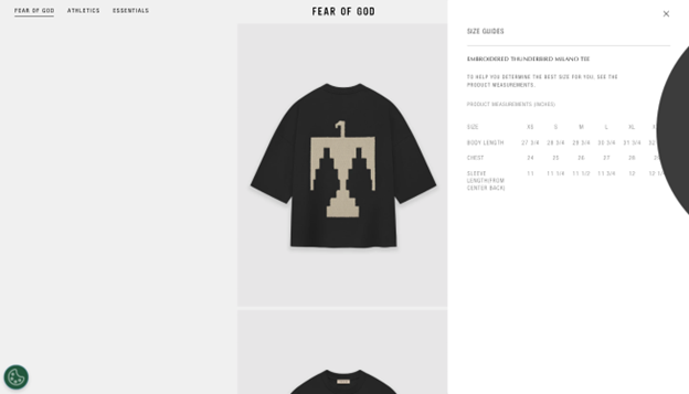
Source: fearofgod.com
Or, if you want to employ a more advanced UX hack to inspire web visitors to convert, why not demonstrate your brand’s commitment to providing next-level customer support?
Chatbots are a great way to help prospects along their buying journey. Still, 77% of people prefer interacting with humans over AI when solving customer service needs.
So, do your best to provide convenient and highly visible contact options for web visitors. Look at how Amazon repricer tool Aura does it on its website, where the chat feature tells customers they can get assisted by the brand’s customer support team if they have a complex question.
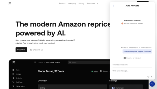
Source: goaura.com
Employ A/B & User Testing to Identify Usability Issues and Reveal Improvement Opportunities
Last but not least, as you explore UX hacks to increase conversions in 2024, don’t forget that the only way to make your website perform at its peak is to actively identify holes in your website’s UX design. Then, you must do your best to eliminate them.
Always use A/B testing when going live with new web pages. Keep an eye on user behavior to reveal potential improvement opportunities. And ensure that you make every design change with a clear goal in mind. That way, you’ll guarantee you arrive at the outcomes you want instead of landing on a result that doesn’t help your business convert new customers.
In Closing
There you have it, the eight effective UX hacks that can help you increase conversions in 2024.
As you can see, none of these design strategies require too much work. However, to truly boost sales on your site, you must make your design decisions based on data, testing, and strategy.
So, do your best to develop a tactical approach to improving your site. And always remember to prioritize your target audience’s wants and needs. That way, you’ll be able to present them with a web browsing experience that will inspire them to invest in your solutions and continue buying from your brand.

- Reducing Cognitive Load: How Simpler UX Drives Better Outcomes - April 20, 2026
- UX Essentials Every Website Needs to Stay Trustworthy in 2026 - January 19, 2026
- The UX of Trust: Why Design Can Make or Break Brand Credibility - November 24, 2025
![]()
![]() Give feedback about this article
Give feedback about this article
Were sorry to hear about that, give us a chance to improve.
Error: Contact form not found.