
In the field of User Experience (UX) design, understanding the principles of visual hierarchy is incredibly important. By carefully arranging elements, colors, and content, visual hierarchy acts as a guiding tool, making it easier for users to navigate and accurately gather information. This blog takes a deep dive into the concepts that lead to effective visual hierarchy in UX design. It offers valuable insights to help you craft engaging and user-friendly experiences.
What is Visual Hierarchy in UX Design?
Visual Hierarchy in UX Design refers to the arrangement and presentation of elements within a user interface in a way that guides users’ attention, understanding, and interaction. It is a design principle that uses various visual cues such as size, color, typography, and spacing to create a structured order of importance among the elements on a screen.
By establishing a clear visual hierarchy, you can lead users through the content, making it easier for them to understand the information, navigate the interface, and complete their intended tasks.
The goal of visual hierarchy is to direct users’ focus to the most important and relevant elements, helping them to quickly grasp the content’s structure and significance.
Importance of Visual Hierarchy in User Experience
Visual hierarchy is of foremost importance in user experience (UX) design due to its significant impact on how users interact with and perceive digital interfaces. Here are some key reasons why visual hierarchy is crucial for creating a positive and effective user experience:
- Clear Information Architecture: Visual hierarchy helps establish a clear structure and organization within a design, making it easier for users to navigate and understand the content. By presenting information in a hierarchical order, users can quickly grasp the relationships between different elements, enhancing their overall comprehension of the interface.
- Guidance and Orientation: Effective visual hierarchy guides users’ attention toward the most important elements, such as calls to action, navigation menus, and key content. This guidance simplifies the decision-making process for users, helping them focus on the tasks they need to complete.
- Enhanced Readability: Proper visual hierarchy ensures that text and content are clear and easy to read in different types of visual communication. By using typography techniques like font size, weight, and spacing, you can create a pleasant reading experience, especially on digital platforms where users scan content quickly.
- Mobile and Responsive Design: Visual hierarchy is especially crucial in responsive design, where content needs to adapt to different screen sizes. Prioritizing elements ensures that the most important information remains accessible, even on smaller screens.
- Consistency and Brand Identity: Visual hierarchy ensures that design elements are presented consistently throughout an interface. This consistency reinforces brand identity, making users more familiar and comfortable with the design, thus building trust.
The Core Principles of Visual Hierarchy
The principles of visual hierarchy are fundamental design concepts that aim to create a clear and organized visual structure to enhance the overall user experience. The main principles include:
- Size and Scale:
Size and scale play a crucial role in directing user attention and establishing the significance of elements within a design. The idea behind this principle is simple yet effective: larger elements naturally draw your eyes due to their visibility.
When certain elements are made larger than others, they stand out as focal points, instantly capturing your attention. You can use this technique to highlight important components such as headings, titles, or key images. By making these elements larger, they create a clear hierarchy that guides users to what matters most.
For example, take a look at the Loop11 homepage.

When you land on the Loop11 homepage, a bold and enlarged headline is likely the first thing you notice, immediately conveying the main message or topic that they want to convey.
- Color:
Color is a powerful tool for establishing visual hierarchy and drawing attention to specific elements. Color can be used to evoke emotions, indicate interactivity, and differentiate between various content types.
Here’s how color can be effectively used for visual hierarchy:
- Color as Signifiers: Important elements like call-to-action buttons, alerts, or notifications can be highlighted with vibrant and contrasting colors. For example, a red “Submit” button in a form draws attention and indicates an action.
- Color Consistency: Consistency in color usage throughout the interface helps users associate specific colors with certain actions or meanings. For instance, using consistent colors for links and buttons creates a predictable user experience.
- Color Gradients: Gradients that shift from one color to another can guide the eye along a specific path or highlight the sense of depth within a design. Gradients can be applied to backgrounds or elements to create visual interest.
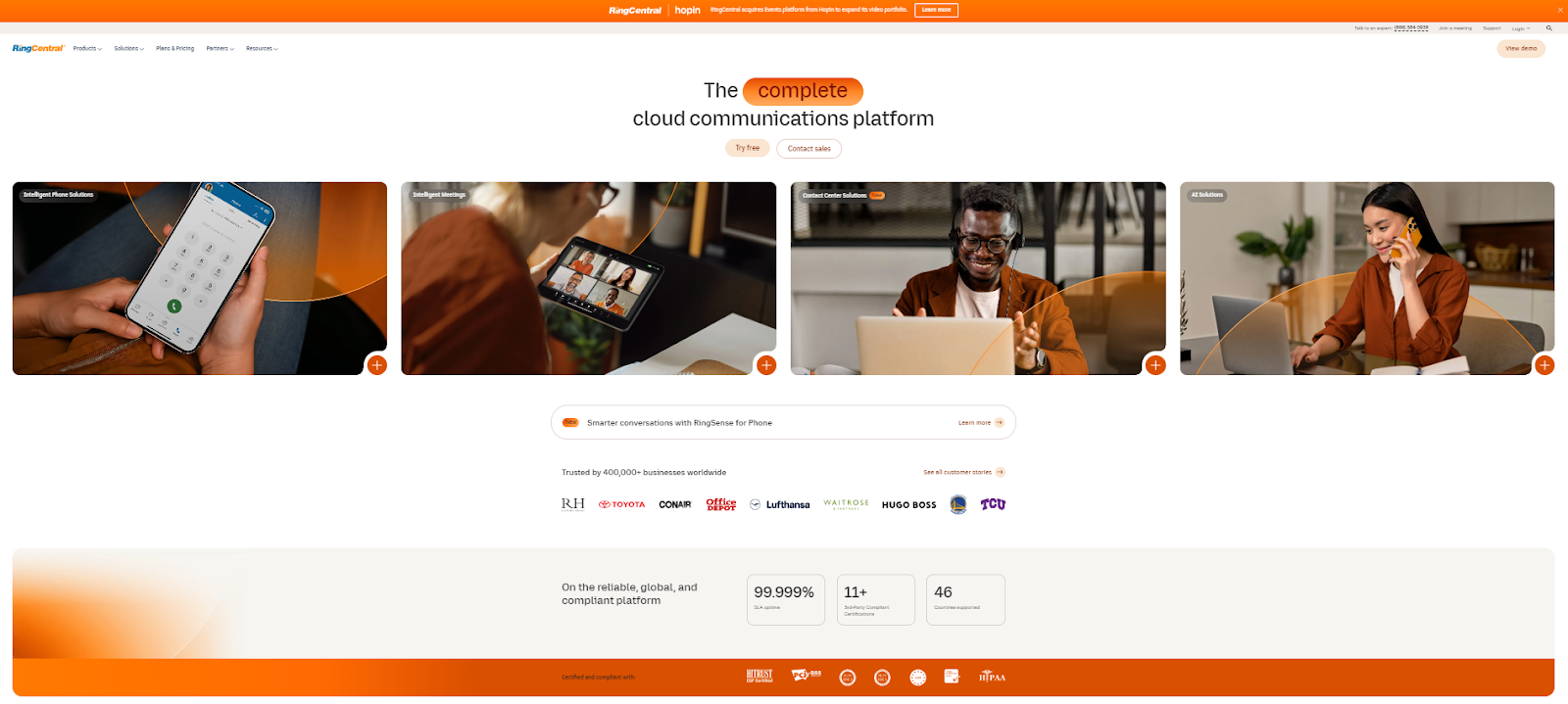
For example, RingCentral’s brand color, the distinctive orange hue, takes center stage on its home page, showcasing a strategic and impactful approach to visual hierarchy and user engagement. In this context, color becomes more than just an aesthetic choice; it becomes a dynamic tool for conveying information and guiding interactions.
The vibrant and recognizable orange hue is deliberately applied to call-to-action buttons, the image backdrop, and other pivotal elements. Its purpose is clear: to capture attention. By employing such a vivid and contrasting shade, the design team ensures that essential interactive components, like buttons, are immediately noticeable.
RingCentral’s home page exemplifies how the strategic use of its signature orange color drives visual hierarchy and user engagement.
- Contrast:
Contrast refers to the difference in visual properties, such as color, size, and typography, between elements on a design surface. In a visual hierarchy, contrast plays a crucial role in guiding users’ attention and creating a clear and organized visual order.
By strategically applying contrast, you can make certain elements stand out while others fade into the background. This contrast helps users quickly identify and process important information, enhancing the overall usability of the interface.
There are different shades of contracts such as:
- Color Contrast: Using contrasting colors for background elements ensures that content is easily readable. For example, black text on a white background provides a high level of contrast, making the text clear.
- Size Contrast: Varying the size of elements based on their importance or hierarchy creates a sense of importance and flow. Larger elements draw more attention and are often perceived as more significant.
- Typography Contrast: Combining different font sizes, weights, and styles creates contrast in typography. Headings can be bold and larger, while body text remains softer.
- Typography:
The principle of typography is a key component of creating an effective visual hierarchy in UX design. Typography involves the selection, arrangement, and presentation of fonts to convey information and establish a hierarchy.
The choice of fonts is crucial in UX design because different fonts convey different tones and emotions. Depending on the nature of the content and the brand’s identity, you should select fonts that align with the overall design concept and the intended user experience.
For instance, a modern sans-serif font might be used for a tech-related website, while a classic serif font could be more appropriate for a news publication.
Choosing fonts that resonate with the content and target audience ensures consistency and readability throughout the interface.
- Alignment and Proximity:
Alignment is the practice of positioning elements in a design in relation to each other. It’s a fundamental principle that contributes to the overall organization of a user interface. By aligning elements, you can create a sense of order and harmony, allowing users to quickly grasp relationships between different elements.
For example, aligning the logo and navigation menu at the top of a webpage creates a clear connection between the branding and the main navigation, making it easier for users to understand the layout and flow of the page.
In addition, proximity is the concept of placing related elements close to each other and separating unrelated elements. This helps users naturally group and understand content based on its visual arrangement. Effective use of proximity helps users make quick decisions about where to focus their attention and which elements are connected.
Alignment and proximity become even more critical when dealing with complex information or content-heavy interfaces. You can use these principles to break down complex information into small sections and guide users through the content.
- Visual Consistency:
Visual consistency refers to maintaining a uniform and cohesive design across all elements and screens of a user interface. It’s a key principle in UX design because it creates a sense of familiarity and predictability for users. When elements are consistently styled, users can easily understand how to interact with them and navigate through the interface without confusion.
Consistency extends to various design aspects, including colors, typography, icons, spacing, and layout. For instance, if a certain color is used to indicate interactive elements (like buttons) on one screen, the same color should be used consistently throughout the entire application. Inconsistent styling can lead to user frustration and thinking pressure as users need to adapt to different visual cues.
Elements of Visual Consistency:
- Color Palette: Consistent use of colors across the interface reinforces brand identity and helps users associate specific colors with certain actions or information types.
- Typography: Using a consistent set of fonts and typographic styles maintains readability and a sense of uniformity across the content.
- Layout and Grid: Employing a consistent grid system and layout structure throughout the interface creates a sense of order and predictability.
- Icons and Imagery: Using consistent icon and imagery styles ensures that visual cues remain recognizable and meaningful to users.
- Interactions and Animations: Keeping interactions and animations consistent across the interface provides a smooth and predictable user experience.
By applying these principles, you can create interfaces that guide users smoothly through content, make interactions intuitive, and enhance overall user satisfaction. Effective visual hierarchy contributes to better usability and engagement, ultimately leading to a more successful user experience.
Triangle of visual hierarchy
The Triangle of Visual Hierarchy, also known as the “Golden Triangle,” is a design concept used to guide the arrangement of elements within a composition to create an effective visual hierarchy. It’s based on the principles of Gestalt psychology, which focuses on how people perceive and organize visual information.
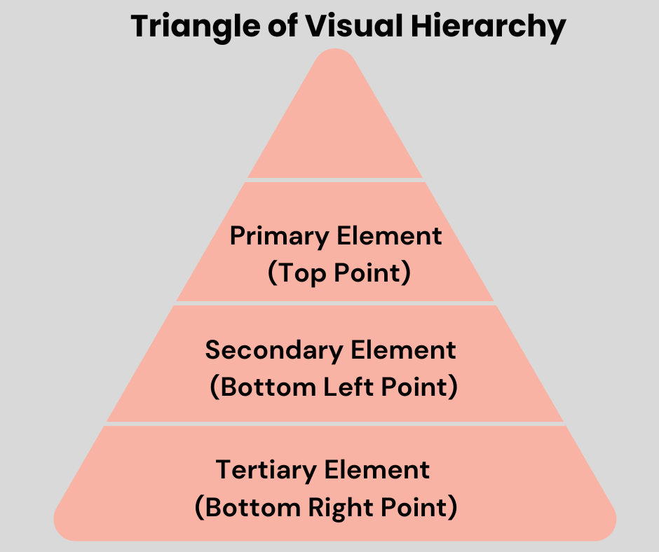
Structure of Visual Hierarchy Triangle
Here’s how the Triangle of Visual Hierarchy works:
- Primary Element (Top Point): This is the most important element in your design, often the focal point or the main subject. It’s placed at the top of the triangle, capturing the viewer’s attention first.
- Secondary Element (Bottom Left Point): This element supports the primary element and reinforces its message or purpose. It’s placed at the bottom left corner of the triangle, guiding the viewer’s eye in a diagonal line from the top point.
- Tertiary Element (Bottom Right Point): The tertiary element complements the primary and secondary elements, completing the triangle. Placed at the bottom right corner, it helps balance the composition and provides closure to the visual journey.
Applying Visual Hierarchy in UX Design
1. Homepage Design:
When it comes to applying visual hierarchy in UX design, the homepage, and landing pages hold critical importance. These areas serve as the initial touchpoints for users, and employing visual hierarchy effectively can significantly enhance their experience. Visual hierarchy assists in arranging and presenting information on the page in a way that aligns with user priorities.
2. Navigation Menus:
Navigation menus are vital components of user interfaces, guiding users through different sections of a website or application. Applying visual hierarchy to navigation menus ensures that users can easily find and access the desired content.

For example, If a user is on the “Home” page of a website, the “Home” link in the navigation menu could be highlighted to show that it’s the currently active page.
3. Call to Action (CTA) Buttons:
Call to Action (CTA) buttons prompt users to take specific actions, such as signing up, making a purchase, or starting a trial. Applying visual hierarchy to these buttons is essential to ensure users notice them and understand their importance.

Large free trial button on the Loop11 feature page
For example, for a “Sign Up” CTA button on a feature page, using a contrasting color, larger size, and bold typography can make the button stand out, encouraging users to click and complete the sign-up process.
4. Content Presentation:
The effective presentation of content is crucial in UX design, as it directly influences how users consume and interact with information. Employing visual hierarchy in content presentation enhances readability, engagement, and overall user experience.
Users often scan content before committing to reading it thoroughly. Visual hierarchy assists in creating a scannable layout by using elements like bullet points, numbered lists, and bolded text to draw attention to key points.
For instance, a specialized digital portfolio page would include a variety of visual hierarchy elements.
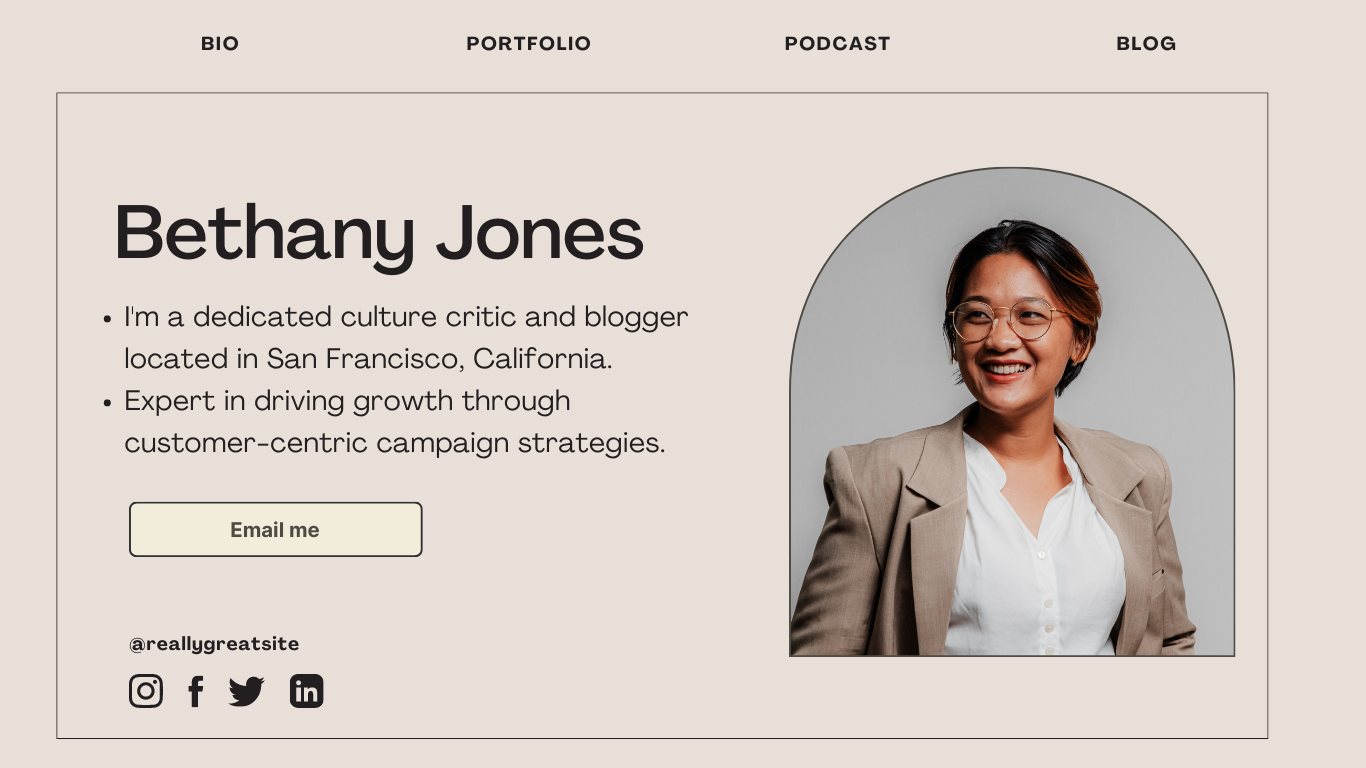
These visual cues help users quickly identify the sections most relevant to their interests, improving information absorption and engagement.
5. Forms and Input Fields:
Forms are integral components of many digital experiences, serving as a means for users to provide information and interact with a platform. By applying visual hierarchy you can structure the form in a manner that guides users naturally from one field to the next.

For example, the above form uses alignment, spacing, and sizing, that create a clear flow that allows users to move through the form without confusion.
Common Mistakes to Avoid
While employing visual hierarchy in UX design is essential for creating user-friendly and engaging interfaces, there are several common mistakes that you should avoid to ensure a successful implementation.
Inconsistent Hierarchy: Failing to maintain a consistent hierarchy across different pages or sections can confuse users. Inconsistencies in size, color, or placement of important elements disrupt the visual flow and make it harder for users to navigate and understand the content.
Overloading with Elements: Overcrowding a design with too many competing elements can overwhelm users and dilute the impact of visual hierarchy. A cluttered layout makes it challenging for users to determine what’s most important, leading to frustration and a reduced user experience.
Neglecting Mobile Responsiveness: Designing for a desktop alone without considering mobile responsiveness can undermine your visual hierarchy efforts. Elements that work well on larger screens might not translate effectively to smaller devices, disrupting the intended hierarchy and usability.
Neglecting Negative Space: Filling every inch of a design with content or elements can make the interface feel overwhelming. Adequate negative space is crucial for maintaining clarity and guiding the user’s attention to essential components.
Lack of User Testing: Skipping user testing can lead to assumptions about how users will perceive and navigate your design. Without real user feedback, you may overlook issues related to hierarchy that could affect the overall user experience.
By avoiding these common mistakes and being mindful of best practices in the visual hierarchy, you can create interfaces that effectively guide users, enhance engagement, and contribute to a positive and efficient user experience.
Conclusion:
To sum up, mastering the principles of visual hierarchy is a fundamental aspect of effective User Experience (UX) design. By strategically arranging elements, colors, and content, visual hierarchy acts as a guide, facilitating smooth navigation and accurate absorption of information for users.
This blog has deeply explored the core concepts that underlie successful visual hierarchy in UX design, providing invaluable insights to create engaging and user-friendly experiences.
It’s important to note that a well-executed visual hierarchy not only enhances visual appeal but also empowers users to engage with digital interfaces in an intuitive and meaningful manner, ultimately contributing to an overall positive user experience.
Frequently Asked Questions
- What is a visual hierarchy in graphic design?
Visual hierarchy in graphic design refers to the arrangement and organization of elements within a design to guide viewers’ attention, prioritize information, and communicate the relative importance of different elements.
- What is a visual hierarchy in web design?
Visual hierarchy in web design refers to the presentation of design elements to guide users’ attention, emphasize important information, and create a structured flow of visual content on a webpage.
- What are the golden principles of visual hierarchy?
The key golden principles of visual hierarchy include Size and Scale, Contrast and Color, Typography, Layout, and Composition. These principles work together to create a balanced and meaningful visual hierarchy, guiding users through the design in a logical sequence and allowing them to engage with content more effectively.
- What are the 4 elements of visual design?
The 4 elements of visual design are:
- Line: Lines are fundamental building blocks in the design, creating shapes, patterns, and divisions within a composition.
- Shape: Shapes are two-dimensional forms that can be simple (like squares and circles) or complex (like abstract shapes).
- Color: Color is a powerful tool that influences emotions, communicates meanings, and adds visual interest to a design.
Typography: Typography involves the selection and arrangement of fonts to convey information and evoke a specific tone or mood.

- Key Principles of Visual Hierarchy in UX Design - September 4, 2023
 Give feedback about this article
Were sorry to hear about that, give us a chance to improve.
Error: Contact form not found.