Harmony and balance are nature’s tools to make things look pleasing to the eye. The way our brains are wired, we feel attracted to symmetry, are mesmerized by it, and feel safe in it. Even if it’s hiding issues and calamities. Ever had a deep cerebral reaction to the way tornadoes move?
Me too.
On a rational level, we know they are dangerous and we need to run, but on another level, you can’t help but appreciate the devastating beauty in them, the sheer perfection in their coils, and the way they twist and spiral.
It’s almost the same reaction when we look at Davinci’s Mona Lisa. If you have ever secretly wondered, what’s so special about her, you’re not alone. Millions in the world just don’t get the hype around the world-famous painting. But for the knowing eye, she’s the absolute symmetrical perfection painted on canvas.
We bring this deep bias towards balance and harmony in our everyday interactions with graphic design, too. Designers who create UIs and website interfaces are acutely aware of the aesthetic-usability effect where we perceive aesthetically pleasing designs as highly usable and functional — even when they are not.
On the one hand, this creates frustrations for designers who want to improve on their subpar UIs, but on the other hand, it tells you just how important great-looking design is. While pretty websites are never enough, they can certainly mask a lot and bring your users close to your product. So, with so much riding on visually appealing designs, is there a way to create perfectly balanced and symmetrical aesthetics?
We believe the Golden Ratio is something that can help.
What is the Golden Ratio?
The golden ratio is a mathematical measurement, believed to have been developed in ancient Greece. It represents absolute balance, precision, and perfection. Denoted by the Greek letter phi (Φ), the golden ratio is represented by the number 1.618 (till infinity).
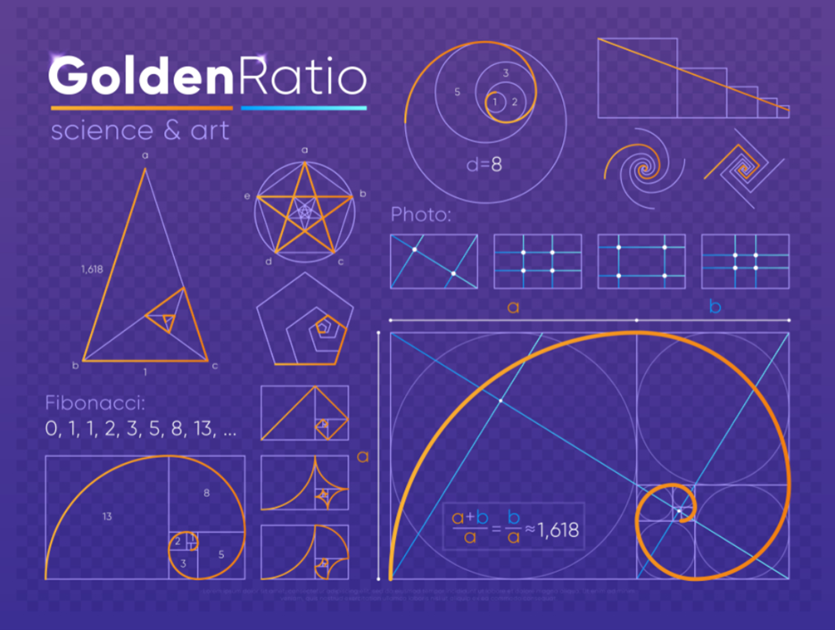
Mathematically, it’s termed as an irrational number because it can’t be expressed as a simple fraction, and its decimal representation goes on indefinitely without repeating.
Here is the mathematical equation for the golden ratio:
A/B = (A+B)/A = 1.618 = Φ
The easiest way to understand the golden ratio is by using the Fibonacci sequence. This is a sequence of numbers where you get the next number by adding the two preceding numbers. For example, 0,1,1,2,3,5,8,13,21… and it goes on.
The Golden Ratio is also called the Golden Mean, the Golden Section, or simply the Phi. But it’s also known as the golden spiral, which you only get when you turn the Fibonacci sequence into rectangles and lay them side-by-side.
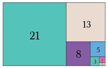
Looking closely, you can see a spiral shape emerging that converges to a focal point — the start of the numbering sequence.
The reason that the golden ratio is hailed as a magical, divine number is because it helps you create perfectly balanced layouts and compositions. Sequences and arrangements, that are found all over nature. From art to architecture, design to engineering, and from galaxies to the human body. The golden ratio is everywhere.
Some of the most innovative and creative works of art and design that are believed to have been created on the principle of the golden ratio include the Mona Lisa, the Sacrament of the Last Supper, the Pyramids of Giza, the Peruvian Man, the Parthenon, and several others.
In the modern brand identity world, the logo designs of leading brands, Pepsi, Apple, and the now-extinct Twitter bird logo, are all examples of perfect logo designs created on the principle of the golden ratio.
What does it achieve?
The golden ratio in design helps create aesthetically pleasing and visually balanced compositions. Here are some of the ways in which it contributes to graphic design.
- Proportion and Balance: Used to determine the size and placement of elements in a design, it creates a more harmonious composition, leading to a visually satisfying composition.
- Grid Systems: Designers structure their grid systems on the golden ratio to organize content in a way that’s easy to navigate for users and appealing to look at.
- Fibonacci Sequence: Designers convert the golden ratio into Fibonacci rectangles to create layouts that promote a natural flow of information, and highlight the focal point of the design.
- Visual Hierarchy: Following the golden ratio allows designers to arrange content elements in a natural hierarchical order where the eye follows the layout in the most natural way possible.
- Dynamic Symmetry: Dynamic symmetry takes the golden ratio to the next level. Instead of enclosing key elements on specific intersections, dynamic symmetry allows the creation of several more intersections, including diagonal, to create a more dynamic flow.
Golden Ratio’s Influence On Graphic Design
All the major disciplines within graphic design utilize the golden ratio or the golden spiral to create beautifully flowing layouts. Here are some in action.
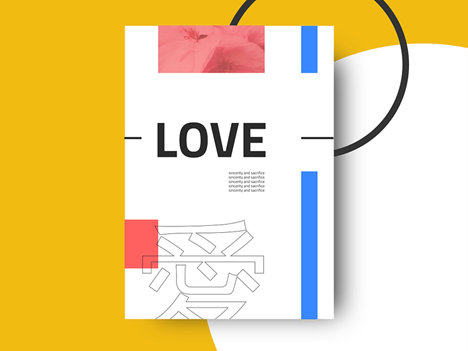
Logo design
You want your logo design to instantly reel people in and keep their focus. While pleasant-looking elements will play a role, a perfectly symmetrical and harmonious design is what will convey a well-conceived design.
In the WiFi logo below, the designer uses multiple golden spirals to create a 3D logo with bold flourishes and deep valleys.
The subtle gradients add a bit of movement to the logo, and you can kind of see the starting and end points of the pulsations across the design. Using circles within the golden ratio, the logo uses interlocking grids to guide the design.
Web design
Users are ideally going to spend a lot of time on a web interface. They’ll explore the navigation, roam around on the website, and explore how it works. The more aesthetically pleasing the website, the more time a user might spend on it.
A grid structure based on the golden ratio helps arrange key elements of the interface in a way that not only invites engagement but also conversion.
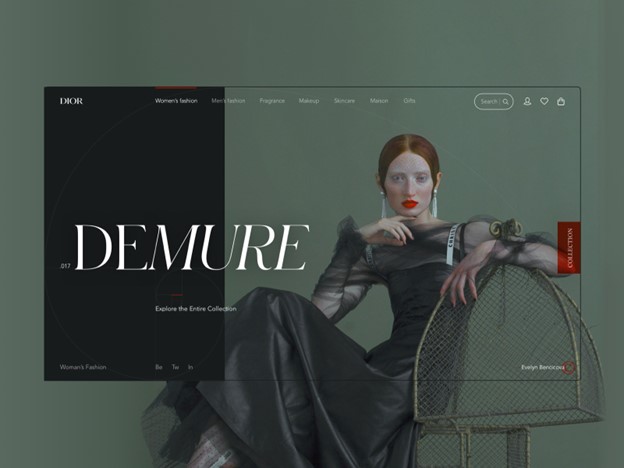
It puts your major fixtures right where the user focus will be the sharpest, and directs the navigation from there. When you look at the interface above, it’s the collection name ‘Demure’ that first attracts the eye. Slanted fonts create a deeper interest and you want to engage with the product for a bit longer.
Typography design
Coming up with the right sizing ration for any typographical system can be a process of trial and error. But graphic designers can look to the golden ration for help steeped in perfect math.
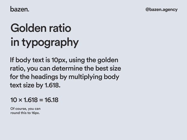
Removing all the guesswork from the equation, the golden ratio allows you to determine the best size for your headings in comparison with the body text. For example, if your body text is 10px, multiply that by 1.618, which will be around 16px, and that is your size for the heading text.
Publication design
Publication design includes a whole lot of things such as poster design, book covers, magazines, and more. Publication design is an important part of the print design industry and like all the other disciplines within graphic design, can immensely benefit by following the golden ratio principle.
When you are designing a book cover or a poster layout, you have to contend with several different elements and arrange them in the most aesthetic and functional way possible. Using the golden ratio or the golden spiral, you can lay out the content of your design in a way that flows naturally and looks pleasing.
It guides you to put your hero elements in the center of the spiral focus to draw the eye, and the flow of the spiral can guide the placement of the rest of the elements.
Packaging design
Very few graphic design layouts can be as busy as a packaging design. Not only do you need to add branding elements on the page but a whole lot of necessary information such as batch numbers, ingredients list, additional certifications, barcodes, and many more.
How do you keep it clean and looking beautifully harmonious? I think you know the answer.
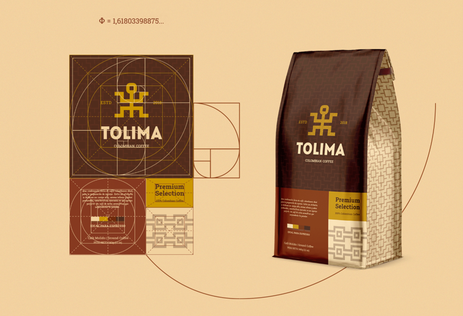
With the help of the golden spiral, the logo has been given its right place with plenty of white space around it to uplift the design. The dynamic symmetry in the lower part of the coffee bag contains the textual information in the perfect balance, ensuring harmony between different elements of the design.
The Takeaway
Make the golden ratio your best friend in the design room. Rely on 1.618 completely as its mathematical precision will always help you find a way out when you are at a design roadblock.

In her free time, Karla enjoys reading and knitting. She also has two pet cats called Salt and Pepper, who keep her company while she works on her latest writing projects. With a passion for all things creative and a dedication to excellence, Karla is committed to helping others achieve their goals through the power of effective content marketing.
- Graphic Design Harmony: The Golden Ratio’s Influence - January 1, 2024
- The Art of Making UX More Intuitive: Understanding Visual Hierarchy - November 20, 2023
![]()
![]() Give feedback about this article
Give feedback about this article
Were sorry to hear about that, give us a chance to improve.
Error: Contact form not found.