
UX, or user experience, is a vital trait to design user-friendly interfaces. In the ever-growing domain of user experience (UX) design, creating intuitive interfaces is of prime importance. At the end of the day, the victory of all digital products depends on how easily users can navigate and interact with them. One of the key components conducive to a seamless user experience is visual hierarchy.
We’ll delve into the art of making UX more intuitive by understanding the principles of visual hierarchy.
What is Visual Hierarchy?
Visual hierarchy is the arrangement of design elements in a way that guides the user’s attention and understanding. It plays a crucial role in helping users quickly grasp the layout, reason, and flow of a website or application. By fashioning an effective visual hierarchy, designers can ensure that users find what they need, when they need it, without feeling overwhelmed.
UX is interconnected with UI or user interface. While UX relates to the general experience of users, UI is based on the interaction between users and computers. A study by Forrester Research reveals that a well-developed UX increases conversions by 400 percent and UI by 200 percent.
The Elements of Visual Hierarchy
Visual hierarchy is composed of several essential elements, and knowing their combined functioning can help designers produce intuitive user experiences.
1. Size and Scale
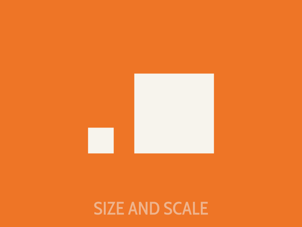
Size is one of the most straightforward ways to establish a visual hierarchy. Larger elements naturally draw more attention than smaller ones. In using size and scale, designers can emphasize significant information, such as headlines, important buttons, or call-to-action elements. Smaller elements, on the other hand, are ideal for secondary or less critical information.
2. Color
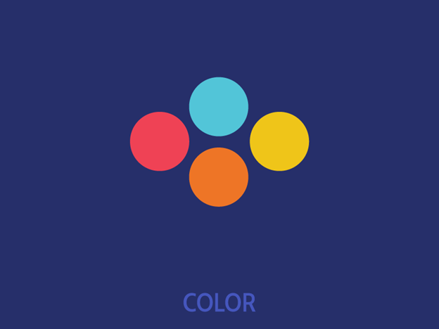
Color can be a powerful tool in establishing visual hierarchy. Bright, contrasting colors can make certain elements stand out and draw the user’s attention. For instance, a vibrant “Sign Up” button on a website with a neutral background color can be a focal point. Careful color selection can aid users in distinguishing between elements, like clickable buttons and non-clickable text.
3. Typography
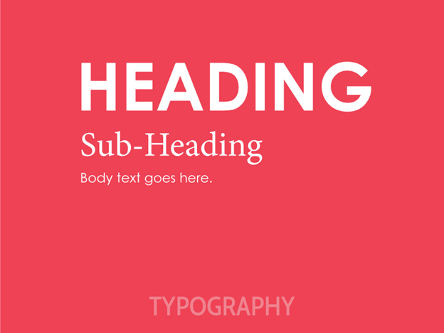
Typography goes beyond just choosing fonts. They encompass factors like font size, weight, style, and spacing. Bold and larger fonts are often used for headlines and paramount text, while lighter and smaller fonts can be employed for supporting content. Productive typography makes sure that users can scan and comprehend the information with no trouble. It also ensures that the business has the right font pair in the logo, website content is easy to navigate through, and graphics are interesting.
4. Contrast
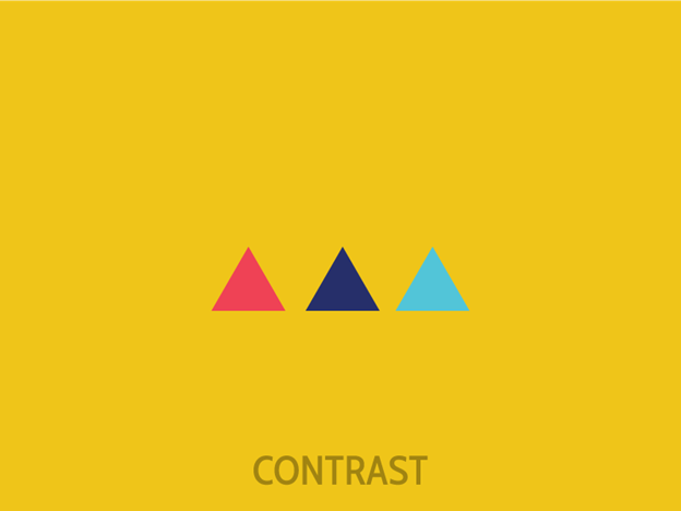
Contrast is about forming a noticeable difference between elements. This can involve contrasting colors, sizes, shapes, or any combination of these. High-contrast elements are more likely to be perceived as necessary, making it easier for users to focus on them. For example, using a bold, white font on a dark background can create a strong contrast that attracts attention.
5. Alignment
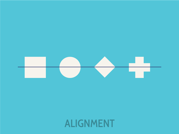
The alignment of elements in a design can influence how users perceive and interpret the information. Elements that are aligned with one another are often seen as part of the same group. Users navigate and understand the content better through alignment.
Principles of Visual Hierarchy in UX
To fruitfully implement visual hierarchy in UX design, you should consider the following principles:
1. Start with a Clear Information Hierarchy
Before diving into the aesthetics, it’s pivotal to construct a clear information hierarchy. Determine what information is most critical for the user and prioritize it accordingly. This forms the foundation for your visual hierarchy strategy.
2. Direct the Eye with a Focal Point
Create a focal point on your design where you want users to start. This can be a large headline, an eye-catching image, or a prominent call-to-action button. From this starting point, steer the user’s eye through the design in a logical and intuitive sequence.
3. Reduce Visual Clutter
Clutter can confuse and overwhelm users. To create an intuitive user experience, eliminate unnecessary elements and whitespace, ensuring that each element serves a purpose. This simplification contributes to users’ focus.
4. Consistency in Design
Consistency in design elements, such as fonts, colors, and styles, associates users with specific content types. For instance, using a consistent button style throughout the application allows users to instantly recognize interactive elements.
5. Test and Iterate
The key to a successful visual hierarchy is to test your designs with real users. Gather feedback and data to understand what works and what needs improvement. Continuous iteration and refinement based on user insights are instrumental in the creation of an intuitive UX.
Real-World Examples
Let’s explore some real-world examples to understand how visual hierarchy is efficiently employed in UX design:
Google’s Search Page
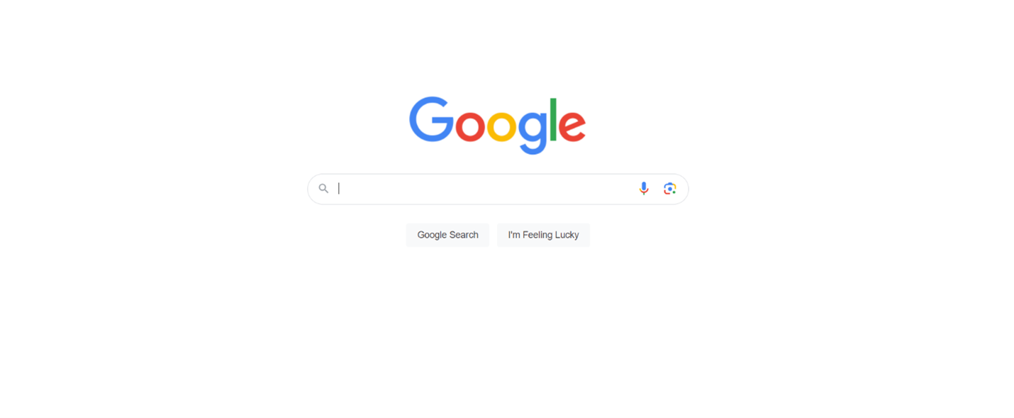
Google Search page is a major example of a minimalist design with a strong visual hierarchy. The search bar is the focal point, thanks to its size, position, and minimalistic design. Users immediately know where to enter their search query. The surrounding elements are intentionally minimal and unobtrusive, guaranteeing that the search bar remains the central focus.
Airbnb’s Booking Flow
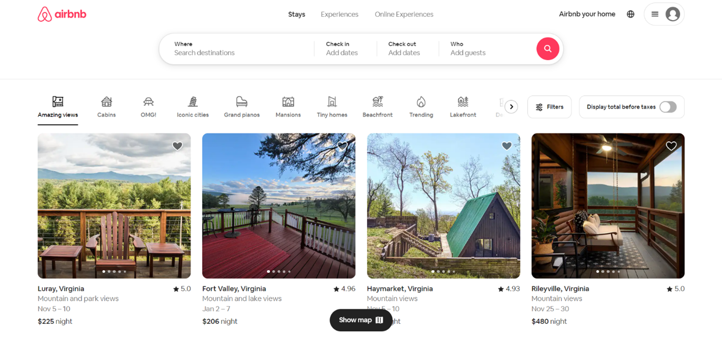
Airbnb’s booking flow is designed with a clear visual hierarchy. When a user views a listing, the “Check Availability” and “Book” buttons are prominently placed, using color contrast and size to make them stand out. This directs the user’s attention to the next steps in the process, simplifying the booking experience.
Apple’s Product Pages
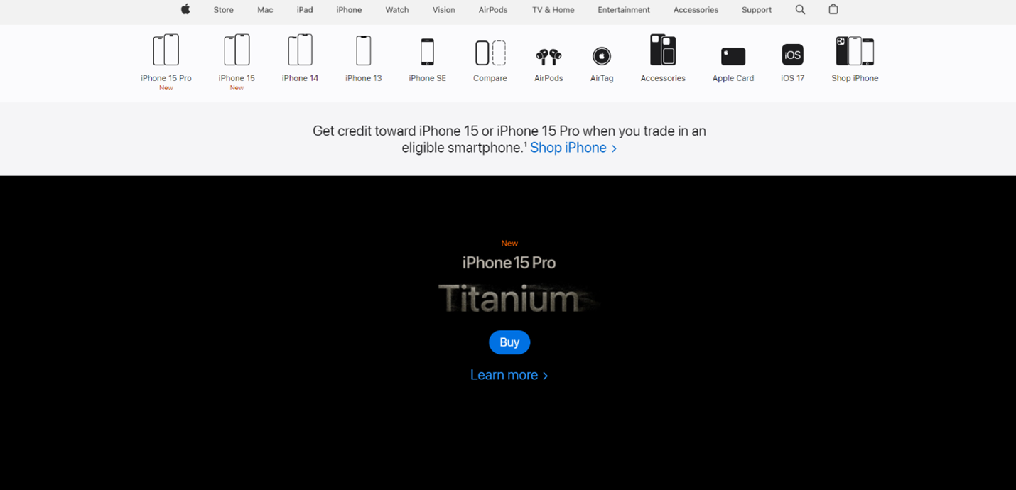
Apple’s product pages are known for their clean visual hierarchy. Key product information is presented at the top, utilizing large images, compelling headlines, and bold typography. Users can quickly grasp the product’s features, and the perpetual use of design elements across the site maintains a flawless experience.
Conclusion
In the world of UX design, understanding and mastering visual hierarchy is a prerequisite for providing intuitive user experiences. By strategically using size, color, typography, contrast, alignment, and other design elements, you can facilitate users with your digital product effortlessly. Remember that the art of making UX more intuitive is an ongoing process. User feedback and iteration refine your designs.
The principles of visual hierarchy are not limited to specific industries or platforms. Whether you’re designing a website, mobile app, or any other digital product, a well-executed visual hierarchy will lead to increased user satisfaction and healthier conversion rates. So, when you embark on your next design project, keep visual hierarchy in mind as your secret weapon for crafting intuitive, user-friendly experiences.

In her free time, Karla enjoys reading and knitting. She also has two pet cats called Salt and Pepper, who keep her company while she works on her latest writing projects. With a passion for all things creative and a dedication to excellence, Karla is committed to helping others achieve their goals through the power of effective content marketing.
- Graphic Design Harmony: The Golden Ratio’s Influence - January 1, 2024
- The Art of Making UX More Intuitive: Understanding Visual Hierarchy - November 20, 2023
 Give feedback about this article
Were sorry to hear about that, give us a chance to improve.
Error: Contact form not found.