Websites and Apps are all over the place with all businesses, big or small, hosting them to provide better customer engagement & service. This makes the design & development of website or app critical in achieving their goals. As businesses have different motives for having a website and apps and their products and services also differ, they decide on the design and platform based on their needs. There are several options available in terms of templates, structure, themes, and development platforms.
In this blog, we discuss what A/B testing is, how it can be used by Web Designers, and real-life case studies of A/B testing.
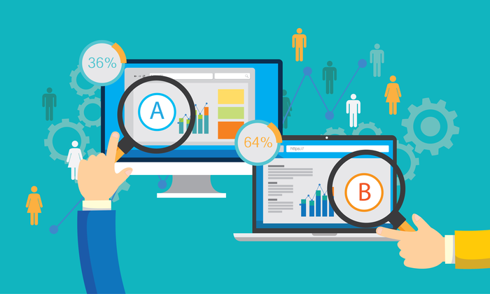
What is A/B Testing?
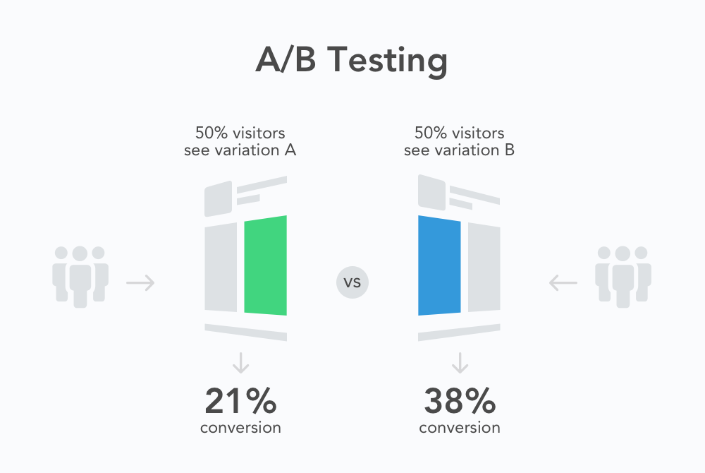
A/B Testing, also known as Split Testing or Bucket Testing, compares two variants of the same webpage or app and finds out which one will give better results. It is an experiment where two or more versions of the page are shown to the user randomly. Using statistical methods, which one will be better for a particular goal is determined. This eliminates guesswork and allows data-driven decisions, which results in more conversions and sales.
In the A/B test, a web page or an app screen is taken and modified to create another version of the same. The change can be as small as a button change or a complete revamp. Half of the site traffic is shown in the page’s original version(known as control), and the other half is shown the modified version(known as a variation) of the page. Data is collected with each engagement and analyzed with statistical software. It can be determined whether the change had a positive, negative or neutral effect.
A/B Testing and SEO
Google’s guidelines permit A/B testing and clearly state that performing such tests will not negatively impact your rank. However, in the case of cloaking, a practice in which the search engine is shown a different variant of a page compared to a typical visitor, the site can be demoted or even removed from search results. Running these tests for an extended period of time is also not recommended. Loop11 can help you with User Testing, which includes A/B testing.
Case Studies of A/B Testing
Case Study #1 Arenaturist.com Gets More Form Submissions
Arenaturist.com is a hotel booking engine; hence, its goal is to get as many bookings as possible. Consequently, their home page always displays a form, asking for details like the dates when the user is traveling, origin, destination, and the number of people they will be traveling with. This information is a vital step in their goal, and that’s why the company decided to go for an A/B test on their form and created a new version that received more submissions.
For the A/B test, a new form with a vertical Layout was designed. Their homepage’s original or “Control” version displayed the form in a horizontal bar just above the fold. Although the new version appears to take more space on the page due to its placement, the font & button size were not changed. The colors, fields, and content remained precisely the same.
Did this create an impact?
Yes, it did. The variation generated a 52% higher conversion rate for Anaturist.com than the original version. Considering the fact that this form is the first step in the booking process, that is a massive improvement.
Case Study #2 Brookdale Living Increases Conversion With a Static Image
Brookdale Living is an old age home that offers assisted living and care. They had a network of 640 such homes across the USA. Before they went for A/B testing, their site did not do much to encourage the visitors to learn more. A marketing agency added testimonials, credibility logos, and other USPs. They were unsure whether adding a static image or video would work better. So, they created both variants and went for A/B testing. You will bet on the variant with a video to be more successful, but you’re mistaken. The static image variant outperformed the video variant and resulted in $ 106,000 in additional revenue for the company.
This example clearly shows that it is not necessary that what is trending will work for everyone. It is better to go for A/B testing on your target audience and find out what works best.
Case Study #3 Change in Ben’s Product Page
Ben is a mobile telecom service provider based in Hague, Netherlands. The company offers two types of service to its subscribers – A SIM-only subscription and another in which SIM comes with a mobile handset.
They decided to go for A/B testing, in which Ben chose to show the color options of the handset prominently on the product page. The company found out that most of the customers were unaware they had the option of choosing the phone color along with the data & voice plans. Data collected showed that while the customers did notice the color palette, they could not figure out its basic function. So, a three-color option was shown adjacent to the phone, and the user could easily click and choose one.
This experiment continued for about two weeks, and it was found that by just making this small change, conversions went up by 17.63 %, and calls for replacing phones with a different color decreased significantly.
Subscribe to our Loop11 newsletter
Sign up to get our weekly round-up of UX tips and Loop11 updates straight to your inbox
Case Study#4 ShopClues Increases Visit-To-Order by 26%
ShopClues is an eCommerce firm that primarily operates in the Indian market. Although relatively new in the niche, it gives tough competition to the likes of Amazon, Flipkart, and Snapdeal, who are experienced players. ShopClues believes in constant change and runs experiments & tests month on month to improve its products & services.
One such experiment was based on optimizing the home page to increase sales.
Each home page element was analyzed carefully, and it was found that the main navigation bar links on the home page were getting many clicks, predominantly “wholesale,” while others were not.
ShopClues replaced the “wholesale” section with other marketing categories like the “Super Saver” bazaar. The company got an insight that it would make sense to send more meaningful visitors to the category pages rather than leaving them confused on the home page. The “Wholesale” section was moved to the left side of the site to make it more visually aligned and get better-qualified visitors. As expected, this repositioning helped customers to move to other category pages easily and not just wander. This change further improved ShopClues’s click-through rate on the “Wholesale” category and the company’s Visits-To-Order by 26 % from its Home Page.
Case Study#5 Ubisoft Increases Lead Generation significantly
Ubisoft is a leading French video game agency, well known for publishing games like For Honor, Tom Clancy’s, Assassin’s Creed, Just Dance, etc., delivering memorable experiences. Ubisoft uses lead generation and conversion rates as key metrics to analyze its overall experience. They had noticed that one of its Buy Now pages dedicated to the “For Honor” brand was not doing well.
After collecting visitor data using click maps, scroll maps, heat maps, and surveys, it was found that the entire buying process was too tedious. Ubisoft decided to go for A/B testing by completely revamping the page, reducing the up-down scroll, and simplifying the entire buying process. The test was done for three months, and the gaming company saw that the variant increased the conversions from 38% to 50%, and overall lead generation increased by 12%.
Case Study#6 HubSpot’s Email versus In-App Notification
Gathering Feedback from customers is not as easy as it seems to be. HubSpot decided to go for A/B testing to figure out the best way to reach the customers. There were two options:
- In-App notification
The experiment was sending an in-app notification & email alerting users that they were a lucky user of the month and would receive a $ 10 gift card if they left a review on the Capterra site. The emails received a response 1.4 times higher than the in-App notification. The result was that, unlike emails, in-app notifications are often missed or overlooked by users.
Case Study#7 Houseparty’s Engaging User Design
Houseparty is a social networking app where users can have face-to-face conversations with their close friends. On the original app screen, users were requested to give access to their phone contacts, and most users clicked the” Don’t Allow” button. Houseparty wanted to improve the onboarding funnel and how users are prompted to add their close friends via push notifications.
In the variant of the A/B test, Houseparty, instead of directly asking for access to phone contacts, displayed a page in which they requested access to phone contacts to show to the user their friends who are already on Houseparty and who can be added to their friend’s list on the app. The experiment result was a 15% increase in giving permission to access contacts, and users sent 2X more friend requests on the first day.
Conclusion:
With so much competition, designing a high-converting website is challenging, but A/B testing makes the task a bit easier by providing data-driven insights. This helps you in designing web pages that are in accordance with the preference of their target audience. As we have seen, testing springs sometimes surprises as the results are against the trend. Guess-work will put you at risk as your competitors will use A/B testing to their advantage. It does not matter which domain you operate in; fostering a culture of experimentation is a way forward to increase sales.

- Case Studies on Website A/B Testing - September 19, 2022
![]()
![]() Give feedback about this article
Give feedback about this article
Were sorry to hear about that, give us a chance to improve.
Error: Contact form not found.