Also called ‘interaction design’, user experience (UX) design is concerned with usability. This is crucial when designing a data-heavy UX for organizations dependent on data, from startups to enterprises.
Big data. Cloud computing. Data analytics. Many companies are implementing predictive and prescriptive analytics to improve users’ experiences intuitively. This requires Artificial Intelligence (AI) and Machine Learning tools that ingest, store, analyze, and present massive amounts of data in dashboards and reports.
While visualizing data is essential, it can also confuse and overwhelm if done incorrectly.
Using bar charts, pie charts, and line charts are some proven methods to design more usable and less overwhelming UX designs.
Maintaining simplicity, emphasizing clarity over style, and prioritizing critical data for users are also timeless best practices when designing for a data-heavy UX.
In this post, we’ll cover several of the top data visualization UX design trends, as well as some tips for delivering more actionable and easily digestible UX designs in 2022 and beyond.
1. Design for Scalability
Here is the thing.
According to IDC, global data creation and replication will reach 181 zettabytes in 2025 compared to 64.2 zettabytes in 2020. That’s a CAGR of 23% over the duration. The opportunity for UX designers is to realize that there will be increasingly more metrics to display on the dashboard.
For constantly growing products, ensure that the design can be adapted in the future. For example, consider enabling the client to scale up the design themselves.
An example design system you can model your product after is Google’s Material design guidelines.
For example, you can leverage open-source code to build adaptable components that you can update or upgrade as needed or collaborate with other UX designers — internal or consultants.
2. Responsiveness to Eliminate Overwhelm
Responsive design has trended as a UX design best practice in the past. But it has primarily focused on helping people browse the web and watch videos on smaller-screen devices like smartphones and tablets in portrait mode.
If your data-heavy UX design project targets larger screens (at least 1280 pixels wide), you will need to be creative about using the extra space.
Although you could use the extra space for more information, the current UX design trend is to display the most relevant information clearly or in more detail. Besides decluttering your dashboard, it also guides users’ attention to the most important data points, resulting in a less overwhelming user experience.
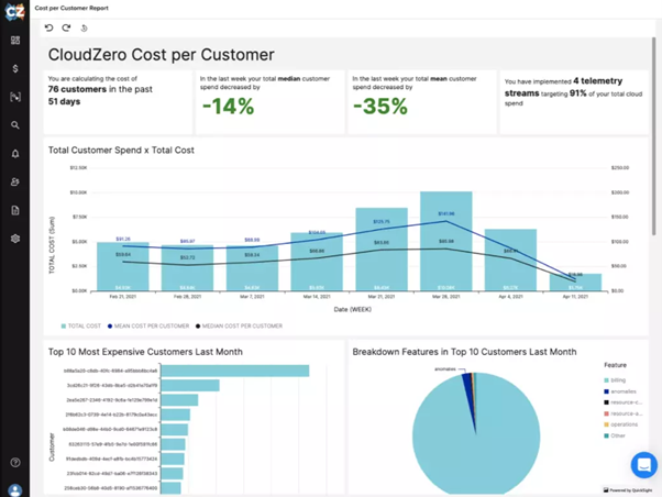
Picture this first CloudZero dashboard, for example:
Now picture this:
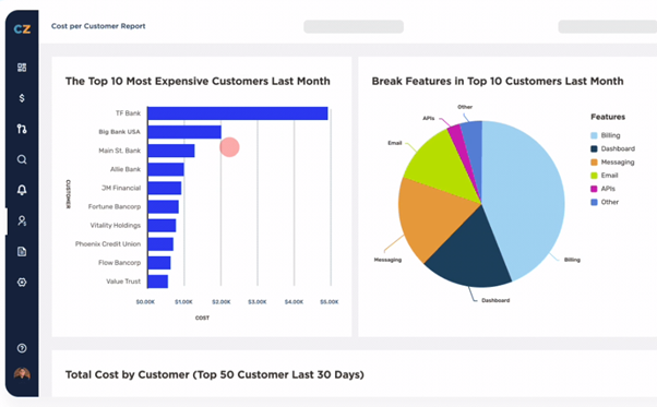
Users can get what they want with fewer clicks with the first dashboard. The second one is cleaner and more focused. It also highlights what their engineering and finance professionals want to see first when they log in. For more information, they can click the menu bar without leaving the page.
And, if you want to pack more information right on the dashboard, this Stripe dashboard gives a good example:
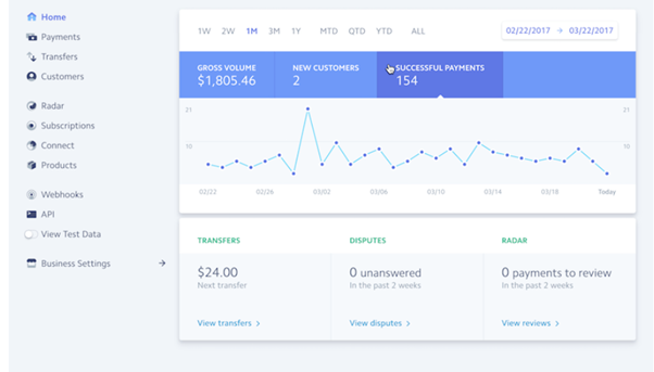
Here, Stripe combines simplicity, answers the most vital questions, and near-perfect margins across each card, while packing more information for the target store owner user.
Takeaway: If the user scans the data without understanding the purpose of each item and why it is important, they are likely to feel overwhelmed and lost in a maze of items they do not know where to start.
3. Data Tables That Prioritize While Showing More
Tables are still a good way to present lots of data, but designing them in a user-friendly and valuable way can be tricky.
A current trend in UX design is to highlight key data points with color-coding. Red markers, for example, indicate anomalies or items that require immediate attention.
This Payfit dashboard uses color-coding to prioritize key data that requires immediate or more attention first.
This design language has multiple applications. You can also color-code tasks by the team to ensure everyone can quickly locate and access the details they need to do their job without a lot of scrolling or clicking.
Other elements you can use today include cell padding (with adjustable heights and column sizes), managing big headers, row freezing, zebra stripes, alignment tips, linking data, pagination, sorting, and filtering and searching.
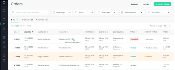
This Sharefox booking management system deploys several of these UX design strategies to help users comb through a large amount of data in little time.
Adding a drop-down menu is also an option. When a user clicks it, it slides down to reveal more details, followed by specific actions or tasks. This has gained popularity as a top UX design trend already.
A tap, swipe, or rollover will reveal more information. Slide-to-reveal data and zoom-in-to-reveal are also excellent, including for highlighting important data points. All using simple, intuitive, and natural gestures in 2022.
4. Video User Testing to Inform and Continuously Improve Data-Driven UX Designs
As users continue to interact with your design, you may decide to fix or redesign it based on their feedback. It is impossible to create a perfect data crunching design on the first try, which is why you’ll want to keep your design agile to accommodate continuous improvements or thorough redesigns.
But either of these options can be prohibitively expensive or time-consuming, or perhaps now isn’t the right time.
Instead, you can put yourself in your users’ shoes by capturing video and audio of your users in action, empowering you to see and hear their exact experience within your UX design or product.
With a user testing tool like Loop11, you can use moderated or unmoderated user testing, collect insights from a handful or hundreds of users, and test on any device your users use.
This approach lets you take advantage of data-driven, data-informed, and data-aware approaches to UX design to deliver useful data visualization.
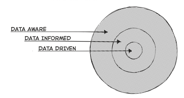
Data-aware vs data-informed vs data-driven UX design strategies. Image via Designing with Data
- Data-driven UX design refers to almost exclusively following data-backed decisions. It’s great for optimizing conversion rates and improving performance metrics.
- Data-informed UX design combines statistical data, user experience feedback, and intuition. Usability testing and structured A/B testing are examples of data-informed design processes.
- Data-aware UX design considers data in a broader sense. It is best applied when dealing with design challenges individually, rather than undertaking extensive redesigns or overhauls. With this approach, you cherry-pick the data collection, analysis, and reporting processes to guide you towards where to make UX design improvement and what changes to make.
Key takeaway: Assumptions can lead to developing solutions that aren’t very useful for the people for whom you designed them. Using data-driven, data-informed, and data-aware techniques like user testing will continue to be an important UX design best practice beyond 2022.
Frequently Asked Questions (FAQs) About Designing for Data-Heavy UX
The following are answers to some common UX design questions:
- What is a good UX design?
A good UX design improves usability rather than merely appealing to the eye. In data-heavy UX design, a good UX design helps the target users do their job or make a decision with the least amount of scrolling and clicking possible.
- What is a bad UX design?
When a design leads to overwhelm, clutter, and doesn’t prioritize the most important data for its target user, it may not be as useful as intended.
- What’s the difference between UX and UI when designing for data-heavy applications?
UX is not UI. UX emphasizes user experience, usability, prioritization, productivity, and seamless service delivery, while UI focuses on aesthetic appeal and emotional connection with users. Thus, UX and UI work together – not one without the other.

- Onboarding UX: Ultimate Guide to Designing for User Experience - October 4, 2022
- UX Design Trends: How to Design for a Data-Heavy UX in 2022 - July 4, 2022
![]()
![]() Give feedback about this article
Give feedback about this article
Were sorry to hear about that, give us a chance to improve.
Error: Contact form not found.