
In the digital realm, the journey from a product concept to user engagement hinges on integrating product management with website design. This synthesis elevates a site from a simple display to a conversion-centric, engaging experience. It necessitates thorough user testing and a responsive design process that resonates with users, with website findability and user experience as vital indicators of success.
This fusion of responsive design and strategic product insight is essential, shaping market presence and fostering consumer loyalty. Each user interaction and click is a testament to a strategy that places the user at the forefront, sparking a bespoke digital experience.
Understanding the Product Management Lifecycle
At the heart of any successful product lies a robust and dynamic product management lifecycle. This lifecycle is a meticulously crafted journey divided into distinct yet interconnected phases:
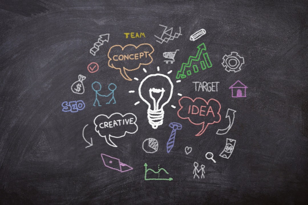
- Ideation. Drawing from market intelligence to seed the initial product concept.
- Development. Prototyping and user testing to refine the product’s features and usability.
- Launch. Market introduction and performance tracking for rapid iteration.
- Growth. Enhancing the product through continuous user feedback and benchmarking.
- Maturity. Sustaining market relevance with strategic updates and adaptations.
Within this lifecycle, user testing is a critical pillar, consistently applied to calibrate the product according to real-world use and expectations. It’s a vital tool for continuous improvement, making sure that every iteration addresses the users’ evolving needs.
Benchmarking complements user testing, offering a clear perspective of where the product stands in the competitive landscape, and guiding decisions to keep it ahead of the curve.
The integration of these practices into the product management lifecycle ensures that a product not only meets the market requirements but also adapts to changes, securing its longevity and success in the marketplace. This lifecycle is less a linear path and more a rhythm of growth, reflection, and refinement—a cycle that thrives on feedback and foresight.
Website Design Principles
Effective website design transcends aesthetics, embodying principles that bolster findability and user engagement. Central to this is a well-crafted information architecture, which simplifies navigation and improves the user experience.
Key website design principles:
- Intuitive navigation. Ensure users can navigate with ease, supported by logical structure and clear menus.
- Responsiveness. Prioritize mobile testing to guarantee functionality across all devices, considering the prevalence of mobile use.
- Accessibility. Create inclusive designs that cater to all users, expanding your reach.
- Consistency. Maintain a uniform design language to foster trust and brand recognition.
- Speed. Optimize load times to engage users and decrease bounce rates.
The design process evolves through user testing and prototype refinement, ensuring the final UI/UX meets user needs. As technology progresses, effective website design demands functionality and intuitive navigation, achieved through strategic planning and rigorous testing for a superior, user-focused online experience.
Integration of Product Management in Website Design
Integrating product management with website design infuses strategic acumen and actionable insights into the design process. It underscores the necessity for routine prototype testing and design evolution, ensuring the website not only showcases the product but also catalyzes its development through user input.
More than a mere step, this integration cultivates a dynamic relationship where the site and product grow in tandem, offering an adaptive user experience. It dictates that every aspect, from site architecture to content strategy, is deliberately designed to boost user interaction and product visibility.
This holistic approach transforms websites into active participants in the product lifecycle, platforms for deriving insights that inform continuous product refinement. It’s a nuanced strategy that turns websites into powerful conduits for product evolution and customer engagement. Consequently, a brand’s digital identity not only mirrors current user demands but is agile enough to anticipate and adjust to future market shifts, ensuring perpetual alignment with both user expectations and market trends.
Strategic Content and Layout
The creation of strategic content and layout is an intricate aspect of web design, calling for a deliberate and informed approach. It begins with rigorous user testing to ensure that the user’s interaction with the site is both intuitive and engaging. The design process unfolds from there, guided by insights and analytics to develop a structure that encourages interaction and conversion.
In this realm, working with trusted webflow partner can be particularly beneficial. Having experienced professionals on your side can bring to the table a unique blend of expertise in custom website creation that combines a compelling narrative with strong performance metrics. They advocate for a methodical design that aligns with the best practices in information architecture, setting the stage for content that is as findable as it is engaging.
This method goes beyond looks and story to enhance the user journey with tools like A/B testing, honing every website aspect for greater findability and user satisfaction. The result is a harmonious blend of aesthetics, function, and user focus for a potent digital presence.
Optimizing for Conversion
Optimizing for conversion is a strategic necessity, crafted through continuous A/B, mobile, and prototype testing. These methods aren’t merely procedural; they are essential in sculpting a user experience that maximizes conversion rates.
- A/B testing. Critical for comparing design elements, and fine-tuning them to enhance conversions.
- Mobile testing. Ensures a flawless experience on smartphones, a must for reaching the mobile market.
- Prototype testing. Prototype testing detects early usability issues that could deter user conversions.
Insights from these practices feed into an iterative design process, sharpening the focus on conversion optimization.
Essential optimization elements:
- Navigation menus: Designed for clarity, they guide users fluidly toward conversion points.
- CTA buttons: Their efficacy lies in strategic design and placement, essential for prompting user action.
- Content relevancy: Content must resonate with user intent to keep engagement high and direct towards conversion.
By refining these critical components based on feature feedback, a website’s design aligns perfectly with its conversion goals. It’s this cycle of testing, learning, and improving that elevates a functional website to a conversion-centric powerhouse.
Measuring Success and Iteration
Success in web design is quantified by how well a website aligns with ongoing benchmarks and user engagement metrics. The iterative design process is fundamental, driven by user and mobile testing feedback, for continuous site enhancement.
This cycle of refinement is critical; benchmarking guides it, establishing performance standards and fostering innovation. It ensures that every aspect of the site, from the user interface to content delivery, is fine-tuned for maximum engagement.
The process is cyclical and thorough. Each iteration refines the website’s effectiveness, informed by a deep understanding of user behavior and competitive positioning. The goal is to not just reach but to set industry benchmarks, keeping the website dynamic and ahead of the curve.
In essence, the website becomes a living entity, ever-evolving and adapting, aimed at surpassing user expectations and industry standards. This pursuit of digital excellence guarantees that a website remains relevant, engaging, and influential within the market.
Leveraging Technology for Enhanced Integration-
The integration of cutting-edge technology is essential for enhancing your website’s market presence. Advanced SEO strategies are crucial for improving the visibility of your website, ensuring it stands out in the competitive digital landscape. By leveraging these techniques, your site becomes more discoverable to your target audience, effectively increasing traffic and potential engagement.
Adaptive user testing is another key element, allowing for the optimization of the user experience by addressing real-time user feedback. This fine-tuning ensures your website is not only visible but also user-friendly and relevant to the visitors’ needs.
Predictive analytics complement these efforts by anticipating user behavior and market trends. This foresight enables proactive adjustments to the website, maintaining its relevance and appeal as user expectations evolve.
Furthermore, the seamless integration of technology underpins every aspect of the website’s design, from the sophisticated information architecture to the user testing performance. It empowers a robust digital ecosystem where the website’s functionality and content strategy are continuously improved, thereby reinforcing its visibility and prominence.
Conclusion
This method merges product management with website design, continually aligning business aims and user needs through rigorous user testing and A/B testing. A disciplined design process with Webflow experts transforms the website from a static display to an active participant in the product lifecycle, ensuring it’s a compelling user engagement hub. Your website, as your product’s digital embodiment, must make every interaction count for enduring user relationships.

 Give feedback about this article
Were sorry to hear about that, give us a chance to improve.
Error: Contact form not found.