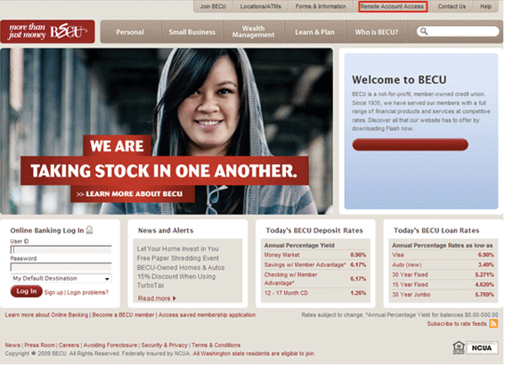
We often sneak a quick look at the projects our members are running and we came across this beauty by the clever guys at the interactive agency Possible, who did some re-design work on the BECU (Boeing Employee’s Credit Union) website (www.becu.org).
Their project was designed to give them the answer to just one question, “What do we call the place where our website visitors go to do their…you know…thingamybob banking that you do when you don’t do it at one of the BECU Neighborhood Financial Centers?”
A very simple project was constructed to get them precisely that one answer. Here’s what they did…
Five different hi-fidelity wireframe designs of the BECU homepage were created and hosted on a staging server. Three designs were identical except for the label to this unnamed section of the website. One placed the link in the primary navigation, rather than the utility navigation at the top, and the final design placed the link in the footer.
The alternative labels for the section were:
- Remote Account
- Access Mobile & Online Banking
- Remote Banking, and
- Online Banking (for the one in the footer)
Five separate projects were set up so there was no task order bias and the task was worded the same way for each project:
“Use the site to find how to view your banking information using your internet-enabled cell phone.”
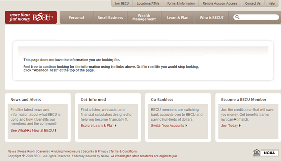
During the evalution, when participants selected a link that did not direct them to the ‘correct’ location they were presented with the screen below, which is particularly handy as navigating through a wireframed website where only the home page had any functional purpose could have been disasterously confusing for participants.
Four follow-up questions were asked, again always the same for each project. They were:
- How difficult was it to complete this task?
- How certain did you feel that the “[Name of the section]” link would take you to the information you were looking for?
- What specific information would you expect to see when you click on ” Name of the section”?
- What, if anything, would be a better name or label for this information?
All in all a quick, simple and inexpensive way of getting a precise link label to a section of their website growing in importance.
As for the results of the testing…well, go to www.becu.org to find out which option provided the best experience.
![]() Give feedback about this article
Give feedback about this article
Were sorry to hear about that, give us a chance to improve.
Error: Contact form not found.


