Did you know that businesses lose billions because of poor user experience? At the same time, statistical data shows that seamless, well-thought-out UX can increase conversion rates by up to 400%.
Now the question is: if you have a website, how do you improve your UX design?
There are many ways to do this, of course. And one of them is applying principles of human psychology to how your website looks and functions! And you don’t need to hold a degree in psychology to make it work for you.
In this article, we will guide you through 7 principles of human psychology that can help you boost your website’s UX. So let’s get right to it!
1. The Bandwagon Effect
In psychology, the bandwagon effect is a tendency people have to adopt or accept an idea, belief, behavior, or style primarily because other people are doing it.
We’ve all been subject to the bandwagon effect at some point in our lives. It’s like when people keep talking about this one very popular music band and how amazing their new album is, and you end up surrendering to the trend and checking them out. Next thing you know, you’re a die-hard fan.
And the same goes for people’s buying decisions. The bandwagon effect makes consumers unfamiliar with your product/service feel that it’s desirable. In other words, people trust other people when it comes to choosing what to use or buy – this is a way to decrease the cognitive load of making a decision.
How to Leverage This Principle
To make the bandwagon effect work for your website’s UX, tap into social proof.
Your website visitors should see what other people or brands are saying about your product or service to get a sense of public approval and recognition that will encourage them to become your new customer. This principle works especially well in CPG marketing.
The easiest way to do this is to display reviews and ratings on your website:
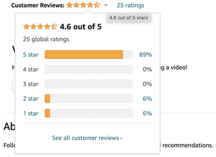
Image source: https://www.amazon.com/Battle-American-Mind-Uprooting-Miseducation/dp/0063215047
Or you can demonstrate what brands you have collaborated with:
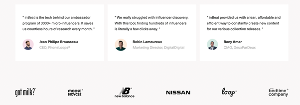
Image source: https://www.inbeat.co/.
2. Attention Span and Memory Limitations
Psychologists refer to memory capacity limitations as the constraints in the human ability to process and retain the information we receive both in the short and in the long term. To put it simply, we tend to forget things – especially when they are complicated or unintuitive to our perception.
On top of that, our attention span (the amount of time we can focus on one task before we get distracted) is pretty short. In fact, studies show that our average attention span is just over 8 seconds. It means that keeping people interested and motivated to interact with content is becoming more and more difficult.
How to Leverage This Principle
Keep these cognitive constraints in mind when you’re developing your website UX design.
You can hook your website visitors and encourage them to spend more time on your web pages without getting distracted or confused by implementing simple design features:
- Create an intuitive website interface. Users should not have to remember how to navigate it to find what they need. Use clear, structured design with simple, actionable directions;
- Do not overload your web pages with items or visual content. Otherwise, users will get confused and distracted quickly;
- Provide user assistance wherever possible. Internal links, visible buttons, and understandable menu bars with separate categories will come in handy.
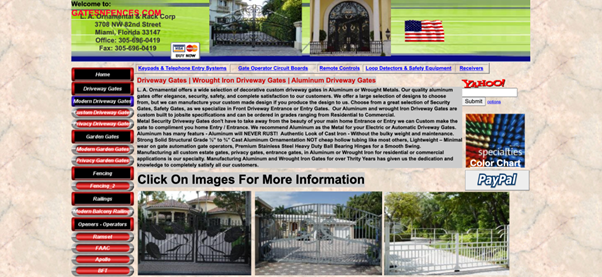
Image source: http://www.gatesnfences.com/Aluminum_Driveway_Gates_3.html.
Look at the website above – it is overloaded with images and text as well as a poor color scheme. This is an example of a website UX design made to want people to leave the page.

Image source: https://toiture819.ca/.
Now compare it to this website. It has a clear structure, no visual distractions, and the user understands right away where to find what they want without having to guess or remember.
3. Color Perception and Associations
Studies in color psychology indicate that different color schemes and combinations have an impact on people’s moods, behaviors, and – you guessed it right – purchasing decisions.
Besides, people associate various colors with certain emotions and connotations:
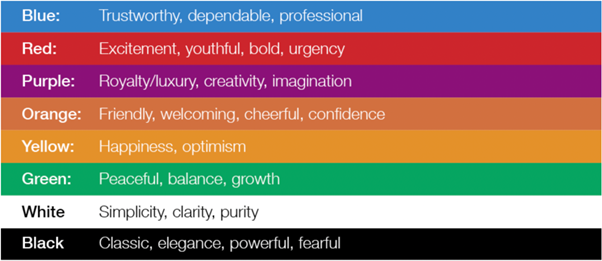
Image source: https://www.wix.com/blog/2017/03/psychology-design-how-to-use-colors-to-evoke-emotions/.
How to Leverage This Principle
Develop a color code for your website that will represent your philosophy and vision or inspire the right emotional response in the user.
All of your design elements such as your logo, call to action buttons, images, and more should be complementary to the color code you establish. Also, combine the colors in the scheme in a smart and aesthetically appealing way. For instance, you can use the 60-30-10 rule. Use the 60% of space for your dominant (usually a more neutral color) to form the basis of the palette, add another well-matching color to complement it for 30%, and then add the third color to accentuate details for the remaining 10%.
For example, look at the harmonious combination of green, white, and black in the example below:
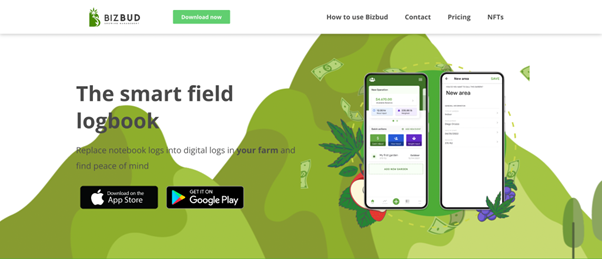
Image source: https://bizbudapp.com/.
4. The Isolation Effect (Von Restorff Effect)
The isolation effect is a psychological principle stating that people are more likely to remember unique elements and items among numerous everyday ones.
Think about it: in a basket full of green apples and one red apple, you’ll spot the red one right away. Even if you wanted to buy a green one.
So it’s all about the right accent or emphasis on a specific object. It can be underlined with the help of color, shape, size, etc. When put against the background of other, ordinary objects of the same appearance, it will be sure to attract people’s attention.
How to Leverage This Principle
You can implement the isolation effect in your website’s UX design by emphasizing certain CTA’s, buttons, or menu sections of your web page to make people pay more attention to them.
This way, you will also guide their choices and actions in a non-intrusive way.
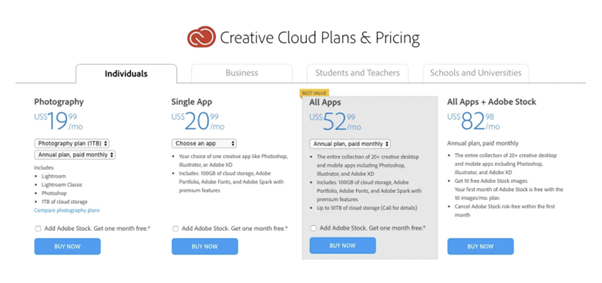
Image source: https://www.theverge.com/2019/5/2/18526985/adobe-creative-cloud-lightroom-photoshop-plan-price-hike.
5. Option Paralysis (Choice Overload)
This psychological principle states that when faced with too many options, people have a very hard time making a decision. It is especially the case with similar options that seem equally good.
What often happens during option paralysis is people start overthinking their choices and end up so cognitively and emotionally drained they simply opt to do nothing. For example when it comes to choosing a product, a consumer must:
- Read and understand the product description;
- Evaluate and analyze the available options;
- Compare them to competitors’ items;
- Make a buying decision.
When this cycle needs to be repeated too many times, it just gets to be too much for the potential customer.
How To Leverage This Principle
When developing the UX design for your web pages, don’t overload your website with too many options that can exhaust the user and make them give up on making a certain choice. Few available items to pick from will be easier to analyze and process. Here’s what you can do to improve website UX based on the principle of option paralysis:
- Don’t include too many CTAs on your web page;
- As for textual content (product descriptions, reviews, etc.) – make it concise;
- Pick the options to display wisely – here, less is more;
- If you do need to display many items on your web page – structure them. Use categories and sections to simplify the process of choice for the user.
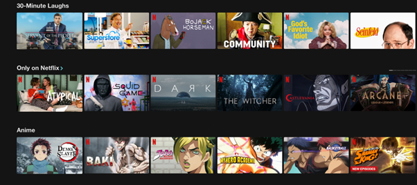
Image source: Netflix.
For example, this is what Netflix does very well – to prevent users from falling victim to option paralysis, it structures the content to facilitate the users’ decision-making process.
6. Jakob’s Law
Jakob’s law is about the balance between novelty and familiarity. It states that people prefer familiar patterns even when they come in contact with new experiences.
Jakob’s law is connected with our reliance on mental models. Mental models are patterns in reality that repeat themselves and we use them as frameworks for thinking and perceiving the world. They help us simplify new complex situations based on our previous experiences.
In other words, we apply what we already know to new experiences to make them more predictable and comfortable.
How to Leverage This Principle
When it comes to website UX design, Jakob’s law states very bluntly: users spend more time on their websites than on yours. And they want your website to look familiar and easy to navigate based on their previous online experiences.
Hold on, it doesn’t mean you need to copypaste an entire Facebook design and interface just because people use it a lot. But you can implement common patterns and functions popular with other sites to improve the UX.
Consider e-commerce websites. Many of them use almost identical design patterns when it comes to displaying product categories. This way, users feel familiar with the interface and can start shopping right away. Compare eBay and Etsy menu bars, for example – they have a similar layout, search line, and menu options:
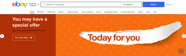
Image source: https://www.ebay.com/.
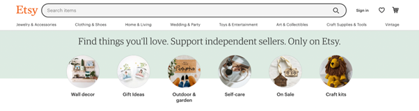
Image source: https://www.etsy.com/.
7. The Chameleon Effect
This is another universal principle in human psychology. It describes people’s tendency to mimic other people’s behavior, mannerisms, facial expressions, and even moods to match the current social situation or environment.
To put it differently, the chameleon effect is about our empathetic responses to reality. And it is not only about communication. This “emotional contagion” can also occur when we interact with objects, places, or other experiences.
How to Leverage This Principle
You can use “emotional design” to enhance your website’s UX and make users feel a certain way when they visit your web page. Imagery, color schemes (remember point 3?), and the overall mood you project on with your site will affect people’s emotional responses and evoke empathy.
Look at the Adidas Pride Month campaign “Love Unites” web page:
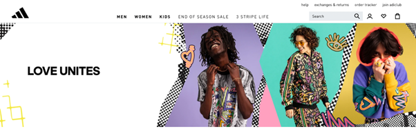
Image source: https://www.adidas.com/us/pride.
The bright colors and cheerful models evoke a sense of joy and belonging in the potential customers who will be more likely to buy the products in this clothing line.
You can also use emotionally charged symbols – take mascots for example – on your website to encourage users to interact with the interface and spend more time on your page. Duolingo leverages this principle with their famous owl mascot so many users love. It also makes the website interface more engaging and interactive.
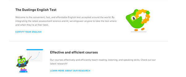
Image source: https://en.duolingo.com/.
Conclusion
Website UX design is not only about the technical stuff. After all, websites are made for people – and as you can see, human psychology shapes users’ perceptions of the pages they visit online.
Leverage the principles of human psychology to provide a seamless, pleasant user experience to your website visitors. And remember – even seemingly subtle details go a long way when it comes to website UX.

- 7 Principles of Human Psychology for Improving Your Website’s UX - July 12, 2022
![]()
![]() Give feedback about this article
Give feedback about this article
Were sorry to hear about that, give us a chance to improve.
Error: Contact form not found.