


If you picture how products are displayed in a grocery store, you can notice certain trends. Items most likely to appeal to women will be placed at the eye-level of the average woman’s height. Men are more likely to buy more expensive versions of products, so those are placed in their average line of sight. The reason for this is because grocery stores have long understood how to take the content they are selling and arrange the store layout around it.
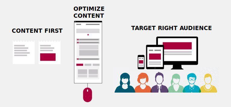
This content first approach has been slow to gain ground when it comes to web design but is gathering momentum. Content first design means tailoring your website’s design and layout around the subject, product, or service you intend to feature. Many website hosting services will offer templates to use, and it becomes easy to force your pictures and posts to fit into the pre-designed layout. This is a great way to get a website up and running quickly but can lead to trouble down the road when you are trying to add to it or expand, and the flow just isn’t working.
Content Influences User Navigation Needs
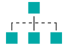
Suppose you are designing a website that needs to lead the user from one area to another, a hierarchy of needs, which leads to what’s on offer. In that case, a basic template is not going to provide the correct flow.
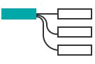
Begin by creating a chart of the type of content you will be displaying. It isn’t important to have all of it created, but a placeholder list can help you arrange what areas flow into the next. Flowchart design tools are useful in creating a base layout design and are a great way to see where bottlenecks or confusion might occur.
As you begin to create your lists and chart out how different areas connect to each other, holes or missing sections will be discovered. It is far easier to correct this in a flowchart diagram than it is to have to rearrange multiple pages on a website suddenly.
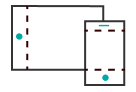
Mobile Device Displays
People don’t keep going to sites that are poorly laid out or aren’t optimized for the device they are most likely to use. Mobile devices require specific configurations to make sure links, buttons, and menus all appear in the right place. If the content you are providing is likely to appeal to those who use primarily mobile devices, then an equal amount of effort needs to be given to mobile layout as the desktop layout.
Fortunately, many website hosting services have mobile site optimization options available along with a preview to make sure it looks right before being published. If you already have a site up and running, using the data analytics tool available from your web hosting service can give you a lot of useful information to determine what kind of devices are displaying your site.
Placeholder Content
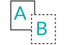
It is common to design a website to use placeholder text and content to give the designer character limits and the like to work with to give the site the appearance of how it will look. This is usually referred to as lorem ipsum, which is thought to have been used by a 15th-century typesetter who was trying to put in scrambled filler text to make a sample book.
This technique allows a designer to see a block of text with full sentences and paragraphs. There are pros and cons to this approach. It gives the content writers more time to create without having the pressure of having it ready well in advance. A major flaw to it, however, is remembering to remove all of it when it comes time to publish.
Creating large batches of lorem ipsum is an excellent option to use during your initial layout phase. If you use a flow chart design tool for the layout, adding in large text boxes of filler content can also add a realistic feel to the design before you even get to the more complicated web design portion. Be sure to keep the correct labels at the top of these boxes to keep the flow moving correctly and stay organized.
Using Content Models and Layouts to Facilitate Communication
You may have multiple groups working on the design of your website, in which case it would be helpful for all of them to be using the same terms and references. A layout design and content model that can be shared between the content creators, the web designers, and the project manager, if there is one other than yourself, can enable everyone to be working from the same reference.
This approach will also cut down on some of the back-and-forth adjustment loops that can crop up when using multiple entities on the same project. For example, suppose you discover that the preferred button layout can only support a certain number of characters before they wrap or become unreadable. In that case, that kind of notation can be made along with the reasoning and can cut down on corrections.
Some things to keep in mind when applying content first design:
· Start with a list of the types of content you plan to put on your site. This includes text areas, buttons, images, and anything that will take up space.
· Create a workflow. Try it with a flowchart design tool to begin with for each page on your site. This can seem tedious but is well worth the effort to find places where there is no flow or connection point. It will also tell you how many pages you will eventually need, and if you are using a web hosting service this can influence the cost.
· Test out different design options using filler text if the actual content isn’t ready yet. The actual content is always better. It leaves less room for unexpected character lengths, for example, but using lorem ipsum can be a quick and easy solution.
· When multiple people are involved in the process, a shared planning document can help facilitate and cut down on needless repetition.

 Give feedback about this article
Were sorry to hear about that, give us a chance to improve.