Are you looking to improve the user experience of your website or app? If so, you may want to consider something that seems counterintuitive at first: adding more empty space.
When it comes to UX design, white space (also known as negative space) is often overlooked. Many business leaders and design teams make the mistake of trying to cram too much information on a single page, but this approach can backfire.
In fact, research shows that 84% of people prefer simple, clean designs instead of overcrowded pages.
Today, we’re going to look at how white space can dramatically improve your design. You’ll learn how to get the most from the empty space on your website with practical examples and actionable strategies you can start using right away.
Let’s dive in!
Understanding White Space
White space, contrary to what the name suggests, doesn’t necessarily have to be white. It refers to any space between different parts of your design. In other words, it’s the breathing room that gives your content and offers room to shine.
There are two types of white space you should know about:
- Macro white space – Represents larger spaces between major elements, like the margins around your page or the space between different sections. This type of spacing helps create structure and organization in your design.
- Micro white space – This is a smaller space between less important elements, such as the space between lines of text, between list items, or around images. While less noticeable, micro white space is crucial for readability and visual comfort.
The human psychology behind white space is fascinating. When used correctly, it can make your site feel less overwhelming to visitors. It creates a sense of elegance and allows users to process information more easily.
People are more likely to take their time and check out what you’re offering if they don’t feel overwhelmed and rushed, which is exactly what happens when you try to put too much information in one place.
If you want more context on how this can impact your site, consider this: 94% say site design is how they establish their first impression of a business. Empty space plays a crucial role in that first impression because it makes people understand who you are, what you’re offering, and why it should matter to the reader.
Benefits of Space in UX Design
Adding the right amount of white space to your website or app comes with several important benefits:
- Enhances Readability – Proper spacing between lines of text and paragraphs makes your content much easier to read. This is especially important on mobile devices, where 73% of users will leave a site if the design affects their experience.
- Promotes Focus and Attention – When elements have room to breathe, users can focus on what matters most. White space helps direct attention to your core message or call to action by reducing visual clutter and cognitive load.
- Increases Interaction and Engagement – Designs with appropriate white space tend to see better engagement metrics. Users spend more time on pages that are easy to navigate and understand, leading to lower bounce rates and higher conversion rates.
- Aesthetic Appeal – Clean, spacious designs simply look more modern and professional. They create a sense of intentionality that users appreciate and trust, which can significantly impact how people perceive your brand.
- Improved Comprehension – Studies have shown that including white space between paragraphs and in the margins can drastically improve people’s understanding of your site. This means visitors are more likely to understand and remember your message.
- Boost Conversions – A/B testing your design can improve conversions by 12%. Part of this process is finding the right balance between content density and empty space.
Tips for Adding White Space to Your Site
Now that we understand the importance of white space let’s look at some practical ways you can incorporate it into your web design.
Prioritize Content Hierarchy
Use white space strategically to highlight the most important parts of your page, which can help you guide users’ attention to key actions or information.
For example, surrounding your call-to-action button with ample white space will make it stand out and naturally draw the eyes of your audience. Similarly, adding more space above a heading than below it helps users understand the relationship between the heading and the content that follows.
One thing to avoid here is giving equal spacing to all elements. This creates a flat hierarchy where nothing stands out. Instead, use varying amounts of white space to create visual cues that show the importance of the information you want people to see.
Balance Content and Space
Next, finding the right balance between content and white space is crucial. Too much content can create clutter, and adding a ton of empty space might leave your page feeling empty or lacking substance.
A good rule of thumb is to ensure that no more than 40% of your screen is filled with text or images. The remaining 60% should be divided between white space and functional elements, such as navigation.
You’ll want to resist the urge to fill every available space with content, trust signals, and calls to action. White space should be an active design choice, not just leftover space.
Adjust Line Spacing and Margins
One of the simplest yet most effective ways to incorporate white space is through your typography settings:
- Increase line height (leading) to about 150% of your font size for body text
- Set paragraph margins that give your text room to breathe
- Add comfortable padding around text contained in boxes or cards
These small adjustments can dramatically improve readability without requiring you to totally rework your design.
Experiment with Negative Space
Creative use of negative space can define and highlight areas of focus and create a more natural flow for your readers.
Some websites even use negative space to create hidden images or shapes that add a layer of sophistication to their design. The famous FedEx logo, with its hidden arrow between the ‘E’ and ‘x,’ is a classic example of this technique.
Each empty area should serve a purpose, whether it’s to separate, highlight, or create visual interest. So, before you fully invest in this strategy, be sure to think carefully about the purpose of the empty space.
Test with Users
Realistically, it doesn’t matter how good your design looks to you; what matters is how your audience perceives it. You’ll want to gather feedback on your use of white space during usability testing so you can be sure it improves navigation and understanding.
Watch how users interact with your site. Try to identify whether people are able to find what they need quickly and easily. You can do this with heatmaps or by tracking on-page engagement.
Ask yourself: Do they skim content comfortably? Are they missing key information? These observations can help you refine your approach to white space.
It’s a good idea to test with many different groups of potential customers so you can make the best choice for your visitors.
Real-World Examples of Effective White Space
Now, let’s look at some businesses that are using white space effectively:
Apple – Apple’s website features a generous use of empty space. Product images float in a sea of white, which is intended to draw attention to the sleek design of their devices. This aligns perfectly with their brand identity of simplicity and elegance.

Image Source: Apple
Google – Google’s homepage is perhaps the ultimate example of white space in action. By surrounding their search bar with ample empty space, they’ve created one of the most recognizable and user-friendly interfaces in the world.

Image Source: Google
Medium – This popular blogging platform uses white space to enhance readability. The clean layout, comfortable line spacing, and generous margins make even long-form content enjoyable to read.
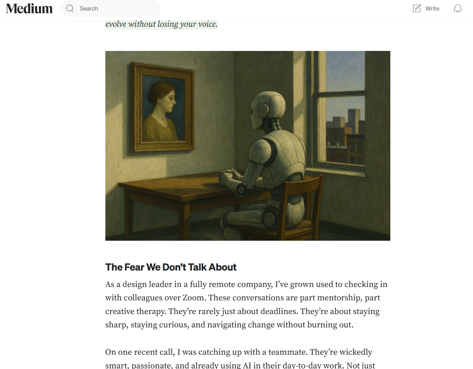
Image Source: Medium
Dropbox – Dropbox uses empty space to keep things simple when their product may otherwise be perceived as a complex service. Their homepage uses minimal text surrounded by plenty of breathing room to communicate their value proposition.
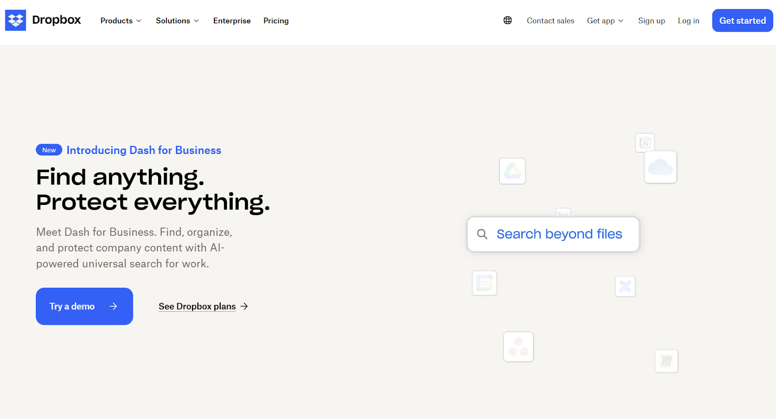
Image Source: Dropbox
Each of these examples shows how you can use this design element to highlight brand values and create a well-rounded user experience.
Implementing White Space in Different Contexts
The way you use white space should adapt to different contexts:
- Mobile Design – On smaller screens, white space needs to be used more strategically. While you’ll need to reduce some macro white space, maintaining adequate micro white space is crucial for readability.
- Landing Pages – For pages designed to convert, use white space to create a clear path to your call-to-action. Eliminate distractions and use space to highlight the benefits of your offer.
- Blogs and Content – For text-heavy pages, generous space in margins and between paragraphs helps prevent reader fatigue and makes your content more approachable.
- eCommerce – Product pages benefit from white space that lets product images shine. Clear separation between products, descriptions, product reviews, and purchase options can result in a better shopping experience for your customers.
Final Thoughts
As you can probably tell by now, white space is a crucial part of web design that all businesses need to consider when working on their website.
There are a ton of great benefits if you’re willing to take your time and work through some of the strategies we’ve outlined today.
It may take time and testing to get things right, but once you do, you can expect to see more people spending time on your site.
But it’s important to remember that you’ll still need to make slight tweaks over time so you can be sure you’re giving your audience the best experience possible every time they visit your site.
![]()
![]() Give feedback about this article
Give feedback about this article
Were sorry to hear about that, give us a chance to improve.
Error: Contact form not found.