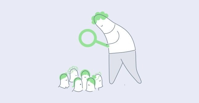
Landing pages have been around for quite some time, but it never hurts to improve upon the way we design them in order to make them as effective as possible. After all, a major aspect of a successful landing page is its UX design. Read on to discover how to craft an effective UX design for your landing pages.
Keep It Simple
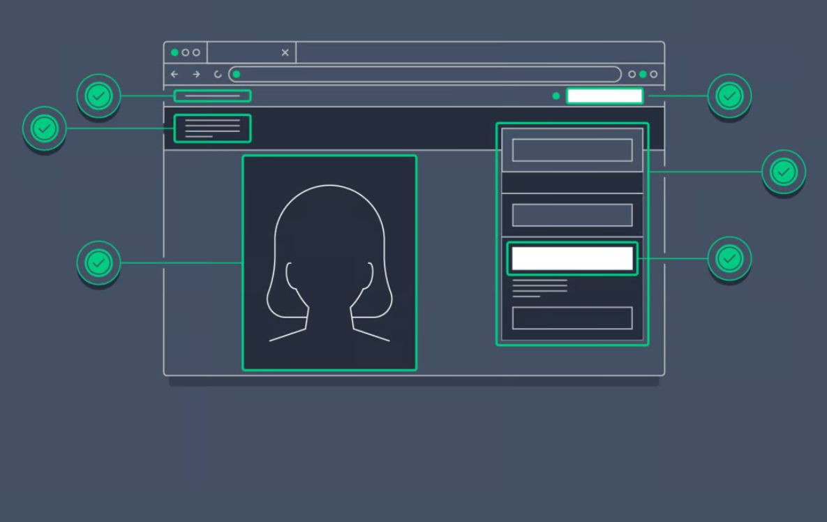
When it comes to designing the UX of your landing pages, simplicity is key. A landing page that is cluttered with too much information can overwhelm visitors and make it difficult for them to understand what the page is about or what action they are supposed to take. Therefore, keeping your landing page simple and with a clear visual hierarchy will help people focus on your message and increase the chances of conversion.
In order to design landing pages to be easy to read, make sure that the message you incorporate is clear and concise, andthat it communicates what the page is about and what visitors can expect to find in an unambiguous way. Use an effective headline and subheading, ones that clearly convey your value proposition and how you can solve the visitor’s problem with your offer.
When it comes to the overall look and feel of the landing page, have a limited color palette and enough whitespace to make your message stand out properly. Whitespace is the empty space around design elements, and it can help make your landing page more visually appealing and easier to navigate while drawing attention to important elements on the page itself.
As for the text, you should choose fonts that are easy to read, and avoid throwing in too many different fonts on the page. Instead, stick to one or two fonts that are consistent with your brand’s visual identity and use them throughout the entire page.
Form a Strong CTA
The call to action (CTA) is one of the most important elements of a landing page, and certainly one of the cornerstones of great UX design. It is the ultimate goal of whatever prior text you include on the page to explain its purpose, presented in the form of a button or link that visitors click to take the action you desire.
To create an impactful and effective CTA, there are several things you should keep in mind:
- Be specific. Your CTA should be straightforward and clear about what the visitor is going to get when they click. It should contain action-oriented language such as “Sign Up Now” or “Get Your Free Trial Here.”
- Use contrasting colors. No matter what your CTA says, you should make sure that it stands out from the rest of the page. To make it more visually prominent, use a color that contrasts with the background and draws attention to the CTA as opposed to other elements on the page.
- Use a single CTA. As previously explained, a landing page should have a specific goal or objective, which is why it is best to use a single CTA that focuses on that one goal. Multiple CTAs on a single landing page can be confusing, the effect of which may be that visitors simply click out due to being faced with too many links or choices.
For example, if your website represents your service business, its CTA would be different than if you were selling products. The service landing page should be a part of the sales funnel to navigate customers to contact you and retrieve more information before hiring your company.
Throw in Social Proof
Incorporating social proof in the form of satisfied customers’ testimonials into a B2C or B2B landing page builds trust with visitors. After all, people are more likely to take action if they see that others have done the same before them and have come out with positive experiences.
However, for your social proof to have the desired effect, it should not detract from the overall UX design of the landing page. Do not scatter screenshots of positive feedback or reviews throughout the page. Instead, create a smaller section on the page, headlined by something like “Here’s what others have said about our product,” and then include some of the most relevant examples of people who spoke about how your offer has helped them.
Including video testimonials and other forms of reviews on the landing page shows visitors that your brand is a credible one. Always showcase reviews that are relevant to the product or service you offer on the page, instead of vague feedback surrounding your company.
Use Inspiring Visuals
Inspirational, high-quality visuals are a powerful way to connect with visitors and further encourage them to take the action you describe on your landing page. When done effectively, visuals reinforce the message you wish to convey, and also create a stronger sense of need or urgency around your offer.
The images you use should not only be visually appealing and high-res, but also make sense in relation to the product or service you offer. Avoid using generic or staged stock photos, as these can be a turn-off for visitors and make your product seem like a scam.
Images, videos, infographics, and other kinds of visual material are best suited for showcasing the product or service in action and demonstrating the benefits it provides. For example, if you design the landing page to promote your free project management software that people can download upon signing up for your mailing list, you should use screenshots and short video previews displaying the tool’s best features.
Optimize for Mobile Devices
Today’s internet users are increasingly on the go, and they expect to be able to use their smart devices to access any online address quickly and efficiently. Hence, it is absolutely essential to optimize your landing pages for mobile viewing.
To enable this smooth access, the UX design of a landing page should be simple and easy to navigate and load via mobile device. Thus, your landing page needs to have a responsive UX and UI design that adapts to the screen size of the device visitors use to access the page. Responsive design means that visitors can easily navigate the page without having to zoom in or scroll horizontally, and that they won’t have to wait too long for anything to load as they do so.
And, while images and videos can be a powerful tool to enhance your point and build a connection with visitors, they can also slow down the loading times on a mobile device. To optimize your visuals for mobile browsing, use compressed samples, or even a content delivery network (CDN), to ensure that images load quickly on smart devices.
Takeaway
To conclude, following these best practices will help you create a landing page that not only looks great but also effectively communicates your message, builds trust and credibility with visitors, and boosts your conversion rates. Remember to test and iterate your design to continuously improve the user experience and drive even better results.

- 5 Steps for Great Ecommerce UX Throughout the Funnel - January 16, 2024
- Designing Intuitive Payment Flows for Enhanced User Experience - October 31, 2023
- Gamification in UX Design: Enhancing User Experience and Engagement - September 26, 2023
![]()
![]() Give feedback about this article
Give feedback about this article
Were sorry to hear about that, give us a chance to improve.
Error: Contact form not found.