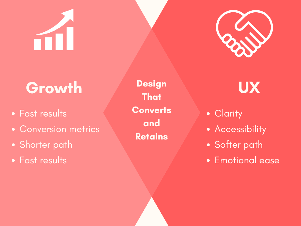
Product teams often feel stuck between two priorities. Growth wants faster signups, more clicks, and higher revenue. UX wants clarity, ease, and consistency across the experience. These goals can seem like they’re pulling in opposite directions.
One team pushes to optimize every screen for conversion. The other wants to remove friction, even if it means fewer CTAs or a longer path. The result is often tension, not because the teams are wrong, but because they’re solving different parts of the same problem.
Growth and UX are both trying to move the user forward. When they work together, your product becomes easier to use, faster to adopt, and more profitable. You don’t need to choose one over the other.
In this article, we’ll explore how to bring them into alignment. You’ll learn how to spot friction that hurts growth, test for both delight and performance, and structure your team around flow not silos.
Why UX and Growth Feel at Odds (But Shouldn’t Be)
At first glance, growth and UX seem to operate on different timelines and priorities.
- Growth teams focus on short-term performance. They look at signups, clicks, trial activations, and how quickly users move through the funnel.
- UX teams focus on the experience itself. They aim to make every interaction feel clear, intuitive, and emotionally smooth.
The disconnect usually happens when speed overtakes strategy. Growth may push for more aggressive tactics to hit KPIs. UX may slow down changes to protect consistency or prevent confusion. When these efforts aren’t coordinated, it creates a fragmented product. Users feel the strain even if the metrics look good on the surface.
That’s where things start to break. You might see an onboarding flow packed with tooltips that no one reads. Or a homepage with five CTAs fighting for attention. Or a checkout form that hides crucial details until the final step. These are signs of decisions made in isolation.
But growth and UX don’t need to compete. They’re both aiming to help users succeed. The difference is in the lens they use. When both sides actively share insights, align on what success looks like, and involve users in the process, the product becomes stronger. It becomes something people use and want to return to.
Identify Points of Friction That Aren’t Adding Value
Friction in a user journey isn’t always a mistake. Sometimes it’s necessary to slow things down just enough for users to make informed choices. But when friction exists only to push metrics, it often creates frustration.
Think about pop-ups that appear before someone has a chance to read the page. Or forms that block access to content without explaining the value first. Or check out user flows that add unexpected steps at the last moment. These patterns may look like optimizations on paper, but they often lead to confusion, mistrust, or drop-off.
Start by observing how users actually behave. Use heatmaps, recordings, or user interviews to spot areas where people hesitate, scroll past, or exit completely. Look at what’s happening at those points, and ask if those steps are truly helping anyone.
If a step doesn’t improve clarity or support a meaningful choice, remove it. Every piece of the journey should support the user’s progress. The smoother the experience, the easier it becomes to say yes.
Use UX Research to Inform Growth Experiments
Growth thrives on testing, but testing works best when it’s grounded in real insight. That’s where UX research comes in. It shows you how users think, what they feel, and where they get stuck.
Too often, teams run A/B tests based on guesses. They shift button colors or move CTAs without knowing what problem they’re solving. In the same way you can test different images to understand which converts better. UX research helps connect those tests to actual user behavior. It tells you why people hesitate, what they ignore, and what they’re trying to do next.
Let’s say users aren’t clicking a primary CTA. Heatmaps show they see it, but research reveals they don’t trust what happens after. That insight might lead to a microcopy change that clarifies the next step. Or you might shift the button position to match natural scroll patterns. In both cases, research sharpens the test and increases the odds of a real win.
The goal is not to slow growth down. The goal is to make every experiment smarter. When you test with empathy and data together, your product gets better, and your numbers follow.
Design with Momentum in Mind, Not Just Conversion Points
Users don’t experience your product in neatly defined steps. They move through it based on curiosity, intent, and how smoothly each interaction leads to the next. That movement is momentum, and your design should protect it.
When teams obsess over individual conversion points, they often interrupt that flow. A sudden pop-up, a forced sign-up wall, or an unexpected redirect can break the rhythm. These moments shift the user from engaged to cautious. Instead of continuing, they pause or leave.
Strong UX keeps the momentum going. Each screen should lead naturally into the next. Every call to action should feel like the obvious next move, not a detour. Think about how someone gets from the landing page to activation. What slows them down? What encourages them to keep going?
For example, if your product includes customer support or human interaction, you can add an easy-to-find WhatsApp link created with a wa.me link generator to reduce friction. This way, instead of searching for contact info, users tap the link and start chatting. That keeps the flow alive and the user in motion.
Design with motivation at the center. Anticipate what the user needs to feel confident in the next step. That’s how you increase conversions without creating pressure. When the path feels smooth, people move forward on their own.
Real-world Example: Enhancing Checkout Clarity with Microcopy
An e-commerce site specializing in car care products observed that users were hesitant to add bundled kits to their carts. The product pages featured an “Add to Basket” button but lacked clarity on what the bundle included.
- Challenge: Users were uncertain about the contents of the bundles, leading to hesitation and lower conversion rates.
- Solution: The team introduced a simple “View Bundle” link above the main call-to-action. This allowed users to see the detailed contents of the bundle before making a purchase decision.
- Result: This minor addition led to a 17.18% increase in conversions, demonstrating the significant impact of well-placed microcopy on user behavior.
This example shows how understanding user behavior lays the groundwork, while clear, purposeful microcopy gives users the confidence to move forward. When UX and growth work together, conversions follow naturally.
Build Trust First, Optimize Later
Quick wins can cost you more than you think. If a tactic feels pushy or deceptive, users remember. And once trust is gone, it’s hard to get it back.
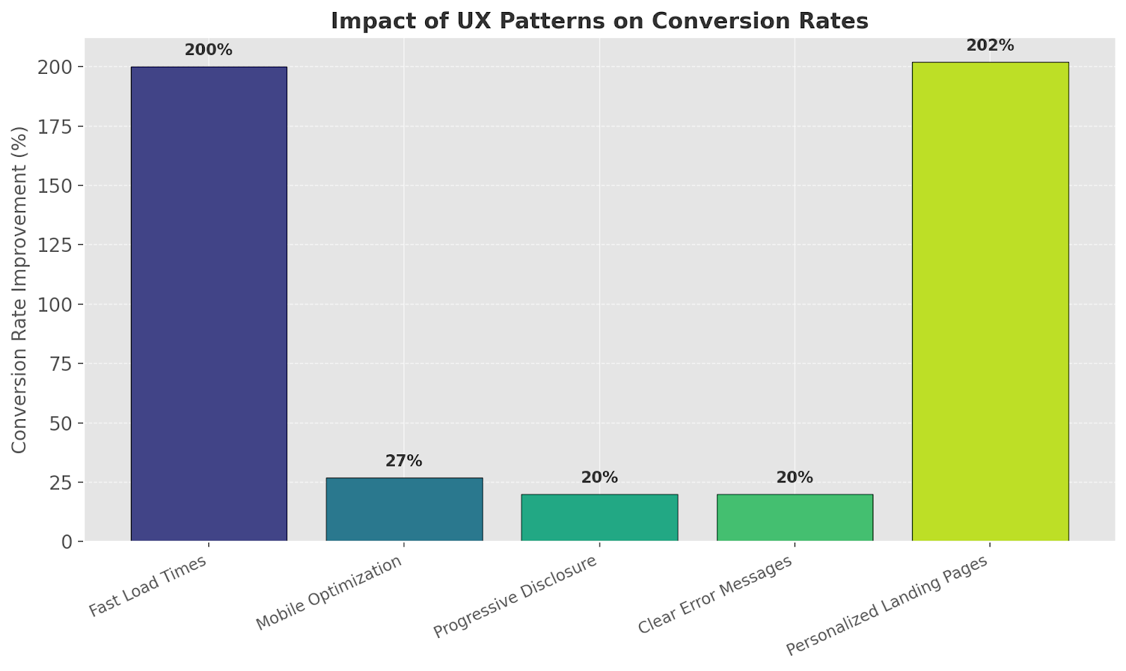
Good UX builds that trust from the first click. Fast-loading pages, mobile-friendly layouts, and clean visual design all send a message: this product is reliable, and the team behind it knows what they’re doing. Even small signals, like consistent button behavior or clear error messages, add up.
Here’s a quick look at how trust-driven design decisions like fast load times and progressive disclosure translate into real conversion gains.
One way to keep users engaged without overwhelming them is through progressive disclosure. Instead of showing everything upfront, reveal details as people move deeper into the experience. Small touches like offering an optional reverse image search for product photos can also build trust without adding friction, giving cautious users a simple way to validate what they see. This keeps the interface simple and focused while still offering full transparency.
Think about pricing pages that show basic plans first, with deeper feature breakdowns available when the user clicks “Compare.” Or signup forms that start with just an email field and expand only if the user shows intent to continue.
When users feel in control, they’re more likely to trust the journey and stick around for what comes next.
A/B Test for Delight, Not Just Clicks
Most A/B tests are built around surface-level wins. A higher click-through rate is great, but it doesn’t tell you if the experience was actually better.
If you’re only tracking clicks, you’re missing what happens after.
- Did the user feel confident?
- Did they enjoy the interaction?
- Are they more likely to return?
Start measuring outcomes that go deeper. Use short post-interaction surveys to capture how users feel right after they engage. Track Net Promoter Score (NPS) trends over time. Analyze churn to see which experiences contribute to long-term loyalty.
A good place to start is onboarding. Instead of testing for speed alone, test for comprehension. Do users understand what your product does after the first session? Are they able to complete a meaningful action without support?
When you test for satisfaction, not just action, you create experiences people remember for the right reasons.
Align UX Metrics with Growth KPIs
Growth teams track numbers that tell a business story: CAC, LTV, MRR. UX teams focus on the user side task success, ease of use, and satisfaction. These metrics may seem unrelated, but they often point to the same outcomes.
A product that’s hard to use increases support costs and churn. A feature that’s intuitive and enjoyable drives engagement and word-of-mouth. Both sides are measuring the same system from different angles.
Look for shared ground. Activation, engagement, and retention are metrics both teams can influence and own. If users can’t complete key tasks, activation suffers. If the interface feels clunky, engagement drops. If the value isn’t clear, retention falls off.
One way to bring teams together is through a shared dashboard. Include both UX and growth metrics in one place. Let designers see the impact of their work on revenue. Let growth teams track how usability affects conversions.
When everyone works from the same data, alignment becomes easier, and decisions become smarter.
Embed UX Thinking Into Growth Culture (and Vice Versa)
Growth and UX are not separate tracks. They are ways of thinking that shape how a product evolves, how decisions are made, and how users experience value. When these mindsets stay isolated, opportunities get missed. However, when they are integrated, both the product and the business benefit.
This starts with how teams are structured. Instead of placing growth and UX in different corners of the org chart, bring them together around shared goals.
Create squads that include a growth PM, a designer, a UX writer, and a data analyst. Give them ownership over a specific journey, like activation or onboarding, and let them work as one unit.
This kind of collaboration has produced strong results across industries. At Booking.com, designers and marketers worked side by side to test copy and layout changes, improving clarity while increasing conversion rates. At Spotify, UX researchers regularly present findings to growth teams to guide feature launches and campaign timing.
What matters is not just who owns which metric, but how those metrics are defined and pursued. When teams think across functions instead of working in isolation, the product gets sharper, and users feel the difference.
Conclusion: Growth and UX Are on the Same Team
Sustainable growth depends on how your product feels to the people using it. A clear, helpful experience builds confidence and keeps users coming back. When teams focus on that experience, growth becomes more consistent and more meaningful.
UX supports every part of the journey. It helps people understand what your product does, how to get value from it, and why it’s worth their time. That creates the foundation for better engagement, stronger retention, and healthier long-term metrics.
The best results come when UX and growth teams plan together, share insights, and work toward outcomes that matter to both users and the business.
Take time to review your product from the user’s point of view. Ask what feels smooth, what feels confusing, and where trust could be stronger. Look for places where the experience could do more of the heavy lifting, without relying on tactics that create pressure or confusion.
Improving those details is what drives lasting growth.

- How to validate UX decisions before development - February 2, 2026
- How to Reduce Friction in Remote Usability Studies Through Better Asset Collection - January 5, 2026
- Optimizing the UX of Your Online Store from First Click to First Sale - December 1, 2025
![]()
![]() Give feedback about this article
Give feedback about this article
Were sorry to hear about that, give us a chance to improve.
Error: Contact form not found.