


My mother-in-law, visiting us for a few weeks, almost burned down the house the other day.
It’s not what it sounds like – she’s very nice and we get along great. The problem is our stove. Its sleek, minimalistic design makes it too easy to turn on the wrong burner without realizing it. In other words, it lacks effective affordances.
“Affordance” is an industrial design term for a visual clue about how something works. The purpose of an affordance is to convey to the user exactly what they need to know in order to use the product correctly.
Affordances are embedded into so many everyday products that we hardly notice them.
Affordances can be used to make websites more usable too. Let’s take a look at some examples of three common forms of affordances: color, words, and arrows.
1. Color
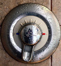
The shower dial in the image above uses the universal colors for cold and hot – blue and red – to indicate which direction the dial should be turned for cold and hot water.
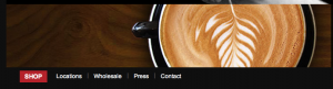
In a different way, the website of Ritual Roasters uses the contrast of the bright red to highlight the Shop link and direct the user where to go.
2. Arrows
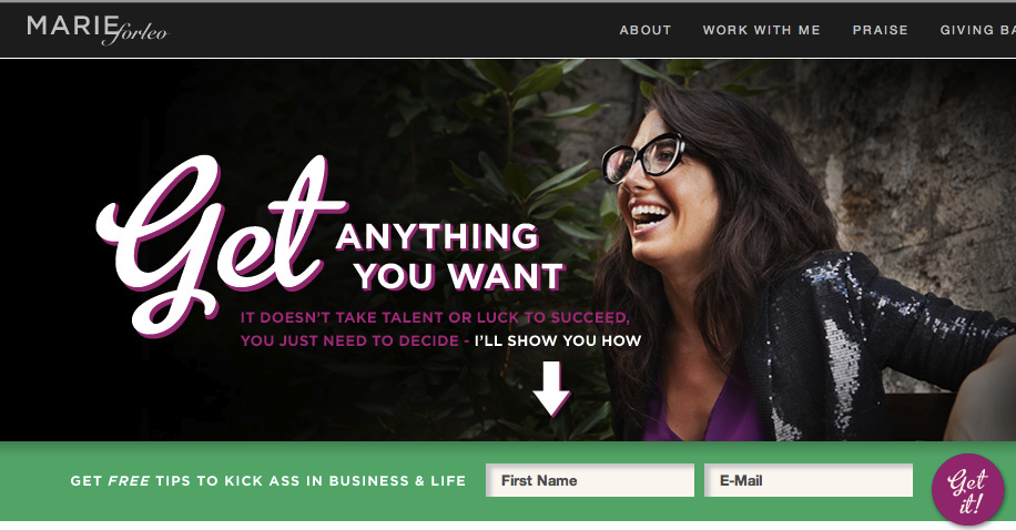
Arrows are even more explicit. They basically say, “Follow me here”. The arrow on marieforleo.com directs your eyes to exactly where she wants you to go: her newsletter sign-up.
3. Words
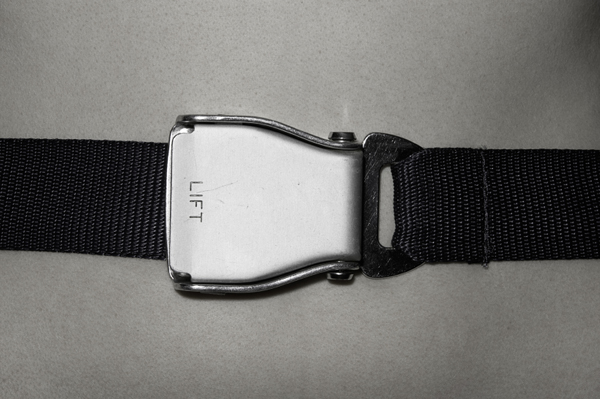
Have you noticed that every airplane belt buckle is etched with the word “Lift” on one side? We all know how to open a buckle (I think), but I suppose in the case of a plane emergency every second you don’t spend fumbling counts.
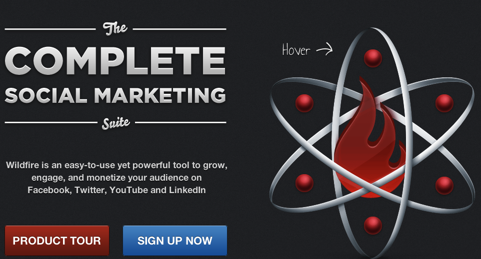
The website of the social media tool Wildfire uses a word affordance too – but with a twist. It has a cool six-pointed shape, each point of which is clickable. Notice the “Hover” label with the arrow pointing towards it?
Here’s what’s interesting: the “Hover” affordance is temporary. It’s displayed only when the page is first loaded, and after a few seconds it disappears. You’re given just enough time to grasp how the six-pointed thingy works before the training wheels come off and you’re left simply with their cool design.
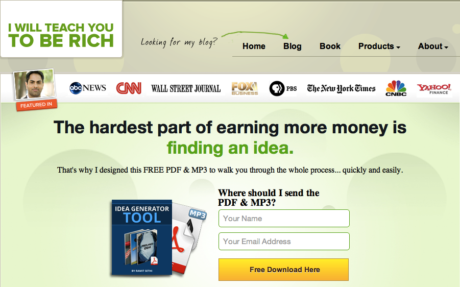
4. Combination
iwillteachyoutoberich.com uses all three forms of affordances. There’s an arrow, labelled “Looking for my blog?”, pointing towards the blog link, and the “Free Download button” is unmissable in bright yellow:
Has usability testing shown that your users are taking too long to find an important feature on your site? Consider adding a more explicit affordance to point them in the right direction.
![]()
![]() Give feedback about this article
Give feedback about this article
Were sorry to hear about that, give us a chance to improve.