Most bad UX is not a design problem. It is a psychological problem nobody accounted for. A user does not abandon a checkout flow because the button color was wrong. They abandon it because the page asked their brain to do more work than it was willing to do at that moment.
Understanding the psychology behind how people process interfaces can change how you approach every design decision, from your first wireframe to your final round of user testing.
These six laws come from cognitive psychology, not design theory, which is why they hold up so consistently across products, industries, and devices. They were not invented by designers trying to sound clever. They were observed in how human attention, memory, and decision-making function, long before anyone applied them to a screen.
Why Psychology-Backed UX Pays Off
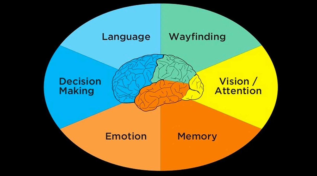
Designers who design around how the human brain works see real and measurable improvements almost immediately:
- Fewer support tickets: Once people stop getting tripped up on the same confusing step, your inbox stops filling up with the same “how do I…” question over and over.
- Faster task completion: When an interface matches how people already think, they move through a flow without stopping to figure out what you meant.
- Stronger conversion rates: Users stop fighting the screen and start trusting it, usually without ever noticing why it suddenly feels easier.
- Fewer arguments over taste: Once your team understands these laws, design reviews stop being about whose opinion is loudest and start being about patterns you can point to and test.
- A faster design process overall: Every decision has a reason behind it now, instead of coming down to whoever spoke last in the meeting.
- Fewer redesign cycles down the line: Teams that bake psychology into how they work tend to get it right the first time, because the early version already reflects how people behave instead of how the team assumed they would.
The 6 Laws Of Psychology For Superior UX Design
1. Hick’s Law
Hick’s Law states that the time that is taken to make a decision increases with the number and complexity of choices available. A navigation menu with thirty links is not generous. It is exhausting, and most users will simply leave rather than work through all of them.
Cut your options down to what matters. If a page needs to offer more than five or six choices, group them logically or reveal them progressively. This single change will improve website findability more than almost any other tweak you can make to a navigation structure.
2. Fitts’s Law
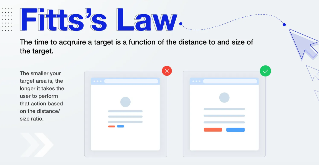
According to Fitts’s Law, the time required to reach a target depends on the distance to it and its size. Tiny buttons placed far from where a user’s attention naturally lands will always underperform, no matter how clever the copy on them is.
Primary actions need to be big, close to the user’s natural focus point, and impossible to miss. On mobile, users tap with their thumbs rather than clicking with a precise mouse cursor. A thumb covers more surface area and is harder to control accurately. In other words, small or poorly positioned buttons get missed or accidentally tapped far more often.
Add to that the limited screen size of a phone, and there is simply less room to make buttons large and well-spaced in the first place. That combination makes thoughtful button sizing and placement far more critical on mobile than on desktop.
3. Jakob’s Law
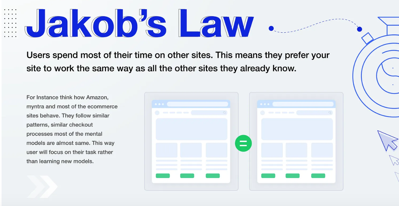
Jakob’s Law states that users spend most of their time on other websites, so they expect yours to work the same way those do. A shopping cart icon in the top right is not a creative risk worth taking. It is a convention people rely on without thinking twice about it.
Familiar patterns reduce cognitive load instantly. Save your creative energy for your product, not for reinventing a search bar nobody asked you to reinvent in the first place. This is also where working with an experienced web design agency pays off in the long run, since teams that build sites daily already know which conventions are worth keeping and which details are worth fighting for.
For example, the long-term gain shows up in ways that go beyond the initial launch. A team that has built websites across small businesses, eCommerce stores, and enterprise platforms brings a conversion rate as they take every layout decision with proper data. Mobile responsiveness gets handled as a core requirement rather than an afterthought, which matters when more than half of all web traffic now comes from phones.
Similarly, SEO considerations get into the structure from the start rather than being retrofitted later. Many businesses also stay informed by following trusted SEO resources such as Marketing Lad to keep up with evolving search trends and best practices. And because the team has navigated these same decisions across hundreds of projects, the feedback cycles are shorter, the revisions are fewer, and the site that goes live is far more likely to hold its value over time rather than needing a full overhaul within the first year.
4. The Von Restorff Effect
Most people walk past a row of identical buttons without registering a single one. Change the color of just one, and their eyes land on it before they’ve even decided to look. That’s the isolation effect at work, sometimes called the Von Restorff effect, and it explains why one standout item gets noticed and remembered while everything around it fades into the background.
This is the whole reason A/B testing works as well as it does. Make one element visually different from everything else, and you’re not left guessing what people will see first. You already know, because attention is drawn to contrast almost automatically, long before conscious thought gets involved.
5. The Peak-End Rule
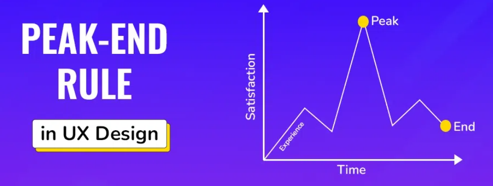
People judge an entire experience based heavily on its most intense moment and how it ends, not on the average of every step along the way. A flawless onboarding flow that ends with a confusing confirmation screen will be remembered as confusing, full stop, regardless of how smooth everything before it felt.
Audit your last screen and your highest-friction screen with the same intensity. Those two moments carry more emotional weight in a user’s memory than the other fifteen screens combined, even if those fifteen screens technically worked fine.
6. The Aesthetic-Usability Effect
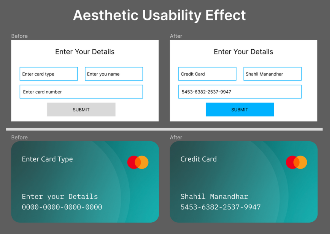
Users perceive aesthetically pleasing designs as easier to use, even when the usability is identical to a less polished version. This does not mean usability does not matter. It means a clean and well-considered visual layer buys you goodwill while users figure out how things work, giving them more patience before frustration sets in.
This is why benchmarking visual changes against real user behavior matters so much. A redesign that looks better but performs worse is a trap that pure aesthetic judgment will never catch on its own, since the team reviewing it will likely fall for the same bias the users do.
For marketplace product pages, this effect is especially visible: strong imagery, clear hierarchy, and benefit-led copy can make a listing feel easier to understand before a shopper reads every detail. An AI creative studio for Amazon listings can help teams turn a product ASIN into consistent detail-page images, Premium A+ content, brand assets, and search-ready copy while preserving a clear visual system. The same principle applies to email experiences, where modern email template creators use proven visual hierarchy, spacing, and consistent branding to make newsletters and transactional emails feel more intuitive and easier for recipients to engage with.
How to Apply These Laws In Your Design Process
1. Map Your Interface Against Each Law Individually
Walk through your product screen by screen, and ask which law is being violated. Most usability problems trace back to one or two of these six.
2. Test Early, Not After Launch
Run prototype testing on wireframes before development begins. It can catch Hick’s Law and Fitts’s Law violations while changes are still cheap to make. Many designers now use the Best AI UI Design Tools to create interactive wireframes, generate interface variations, and validate usability concepts faster before moving into development, making it easier to identify and fix UX issues early.
3. Validate With Real Users
A psychological principle tells you what is likely. User testing tells you what is happening with your specific product and audience, including whether critical email sending touchpoints like account verification or password reset emails create unnecessary friction..
4. Check How Your Design Performs for AI Agents
As AI agents are now browsing and completing tasks on behalf of users, clearly structuring your information architecture will help human visitors and automated agents easily navigate your site.
5. Re-test After Every Meaningful Change
A redesign that applies all six laws perfectly on paper can still fail in practice. Benchmarking studies before and after a change can confirm whether the psychology translated into better behavior.
Let Psychology Lead Your Next Design Decision
These six laws are not just for studying purposes. They show up in every abandoned cart, every confused first-time user, and every five-star review that mentions how “easy” something felt to navigate.
Designers who build with psychology in mind stop guessing and start predicting how their audience will respond.
The fastest way to confirm whether your interface respects how people think is to put it in front of real users and watch what they do. Run your next usability study with Loop11 and see where psychology and your design process line up, or where they don’t yet.

- The 6 Laws Of Psychology For Good UX Design - July 21, 2026
 Give feedback about this article
Were sorry to hear about that, give us a chance to improve.
Error: Contact form not found.