If you’re a new designer who thinks UX and UI are interchangeable, I’ve been there. We all start somewhere. For me, it was in a coffee shop, pretending I knew what a wireframe was while secretly Googling “What is a wireframe?” on the slowest Wi-Fi imaginable.
I learned a lot the hard way. So I thought I’d write the article I wish I’d read when I first jumped into design: one part confession, one part warning label, and a dash of unsolicited advice. Let’s talk about the things I wish someone told me before I designed 15 screens for an app that never saw the light of day.
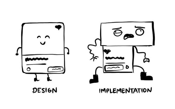
1. UX and UI are not the same thing
I used to think UX/UI was like salt and pepper: always together, doing the same thing. Nope. They’re more like the architect and the interior designer. Both essential, but very different.
UX (user experience) is about how things work. UI (user interface) is about how things look.
UX is the invisible stuff that makes a user say, “That was easy.” UI is the stuff that makes them say, “Wow, this is slick.” Both matter, but confusing the two is like hiring a plumber to decorate your living room. You might get functional pipes, but the throw pillows will suck.
2. Pretty doesn’t mean usable

Ah, the rookie trap: spending 90% of your time choosing the perfect shade of blue. Yes, the button looks like it belongs in a high-end fashion ad. No, the user still doesn’t know what happens when they click it.
Usability > Aesthetics. Always.
Don’t get me wrong, visuals matter. But no one cares if your dashboard has a stunning gradient if it takes 5 clicks to find the logout button. I’ve learned to ask myself: “Could my grandma figure this out without texting me for help?” If the answer is no, back to the drawing board.
3. Research is not optional
I used to open Figma the way chefs open their knife sets: ready to create magic. Except I skipped the part where you talk to people first.
Design without research is just guessing. Research doesn’t have to be a 60-slide deck. It can be:
- Talking to 5 users.
- Watching how someone uses a competitor app.
- Asking dumb questions and listening carefully.
You’ll be surprised how often users say things like, “I don’t even use that button.” That button you spent 2 hours aligning pixel-perfectly.
4. Good copy is half the design

I once made a form that said “Submit” as the CTA. The user had no clue what they were submitting. Data? Feedback? Their soul?
Good microcopy guides users like a friendly tour guide: calm, clear, and never annoying. Invest time in writing labels, error messages, and buttons that make sense. Your users don’t need to solve riddles.
5. Your clients don’t care about your fonts
You know what clients care about? Results. Solving a business problem. Making their users less angry.
Sure, some will pretend to care about typography, but really they want:
- More sign-ups
- Better engagement
- Fewer support tickets
Design is not just for show. It’s a tool. The sooner you start thinking like a problem-solver, the faster you level up.
6. Figma is your best friend (if you let it be)

Figma and I had a rocky start. Too many features, too many shortcuts, too many times I accidentally grouped things that shouldn’t be grouped. But once you get the hang of it, Figma saves your life daily.
Learn Auto Layout. Learn Components. And for the love of pixels, use plugins.
One that really made a difference for me: Made in Figma. It’s like having a pre-built design brain at your fingertips. Need ready-made screens, flows, or social templates? Boom. You’re not starting from scratch. Clients think you’re a wizard. But you know it only took 3 clicks.
7. Feedback isn’t personal (even when it feels like it)
There will come a day when a client tells you, “This design isn’t working for me,” and it’ll feel like someone told you your baby is ugly.
It’s not personal. It’s not about your talent. It’s about context, understanding, and sometimes it’s just the wrong shade of orange.
The more you seek feedback, the better you get. It’s not a weakness. It’s a strategy.
8. Breakpoints will break you

Designing responsive layouts is like juggling knives while blindfolded. You think it looks great on desktop, then you open it on mobile and everything’s in chaos.
But here’s the trick: design for mobile first. If it works there, it usually works everywhere else.
And use grids. Please. Grids are your friends. They keep your layouts from looking like a Picasso painting (and not in a good way).
You can find helpful stats about the benefits of responsive design here.
9. Design systems are not boring
I used to think design systems were for the nerds. Turns out, nerds rule.
Having a system saves you hours of repeating the same work. It keeps your design consistent, scalable, and easier to hand off. Trust me, future-you will thank present-you for creating that button component.
10. You don’t have to do it all
Designers often feel like we have to know everything:
- UX
- UI
- Code
- Animation
- Strategy
You don’t. Focus on your strengths. Learn just enough of the other stuff to collaborate well. Jack of all trades, master of one, is a better goal.
To summarize
If you’re just starting out, take heart. The imposter syndrome never completely goes away, but you learn to live with it. You learn to laugh when a client asks for a “pop” of color. You learn to charge more than $200 for 50 screens.
And if you can avoid some of the mistakes I made? Even better.
Remember: great design isn’t about flashy portfolios or trendy fonts. It’s about making stuff that works, and sometimes, making it faster with a little help.
Now go out there, break some rules, get feedback, and design smarter.

- UX isn’t UI, and other things I wish I knew starting out - August 11, 2025
![]()
![]() Give feedback about this article
Give feedback about this article
Were sorry to hear about that, give us a chance to improve.
Error: Contact form not found.