A conversion funnel is simple on paper: turn visitors into leads, leads into users, and users into paying customers.
But in practice? It’s never that linear.
Most marketers blame poor performance on traffic quality, call-to-action placement, or ad fatigue. And while those can be issues, they often miss the real problem: the user experience is broken somewhere along the way, and they can’t see it.
That’s where usability testing comes in.
In this guide, we’ll show you how to use it to diagnose hidden funnel friction, validate assumptions, and uncover the invisible drop-offs that analytics alone can’t explain. You’ll learn how to test each stage—from landing page to checkout—and translate those insights into fixes that actually move the needle.
If your analytics are screaming “something’s off” but you can’t see what, this is for you.
Why Conversion Funnels Break
Most conversion funnels don’t fail because of one glaring issue. They break quietly, one small misstep at a time.
Let’s unpack where it goes wrong:
Assumptions > Evidence
Here’s what happens far too often: a team builds a funnel based on what they think users want. Not what users actually do.
It’s an easy trap. You’ve got cognitive biases creeping into every decision: confirmation bias, false consensus, survivorship bias. That internal hunch about “what users expect”? It’s usually based on your own experience, not theirs. And so the funnel gets built on intuition instead of evidence.
Misaligned Intent
The funnel might look good on paper, but the flow feels disjointed to the user.
Maybe the landing page promises one thing (“See a demo in seconds”), but the next step hits them with a form, a waitlist, or a generic thank-you page. That disconnect breaks trust fast.
It’s not always a traffic problem. Sometimes it’s a clarity problem. Or a promise problem. If every step in your funnel doesn’t reinforce the same narrative, users won’t follow it through.
Friction Points Go Unnoticed
Even if your funnel is “technically working,” subtle UX issues can wreck performance.
Unclear CTAs. Confusing layout. Fields users don’t want to fill out. Pop-ups layered over buttons. Even visual inconsistencies, like overused stock photos, can subtly erode trust, so it’s worth running a quick reverse image search to see where else your key images appear online.
The problem is, analytics won’t tell you that. You’ll see the drop-off, sure—but not the frustration behind it. And unless you’re actively watching real users try to convert, you’re flying blind.
Mobile vs. Desktop Gaps
This one’s underrated.
Your funnel might be converting fine on desktop, but then you check mobile, and bounce rates are through the roof.
Mobile funnels introduce a whole new layer of friction:
- Buttons that are too close together
- Slow load times over 4G
- Scroll fatigue on long forms
- Poorly optimized layouts
- Poorly executed landing page images
And yet most SaaS teams treat mobile like a resized version of desktop, not a completely different experience. If you’re not testing both, you’re only seeing half the picture.
Image Source: Freepik
How to Spot the Gaps Before They Kill Conversions
Most teams rely on funnel analytics to find problems. And to be fair, it’s a solid starting point. But that’s all it is: a starting point.
Funnel Analytics Only Show You Half the Story
Bounce rates, drop-offs, low click-throughs – they’re not answers. They’re symptoms.
Google Analytics might tell you that 62% of users abandoned your pricing page. But it won’t tell you why. Were they confused? Did something break on mobile? Did your copy create doubt instead of urgency?
To fix what’s broken, you need to go beyond the numbers. You need qualitative insight.
Session Recordings & Heatmaps
This is where tools like Hotjar or FullStory step in.
Session recordings help you see real behavior in real time – mouse hesitations, scroll loops, rage clicks. Heatmaps show you how far users scroll, where they click, and where they ignore you completely.
They’re great for spotting micro-friction.
But they’re still passive. You’re observing behavior, not understanding intention. You don’t know what they were hoping to find… or why they bailed when they didn’t find it. That’s where usability testing fills the gap.
Why Usability Testing Is the Missing Link
Usability testing turns assumptions into evidence.
You’re not guessing anymore – you’re watching real users try to complete your funnel while they narrate what they’re thinking.
“This form feels long.”
“I’m not sure what happens after I click this.”
“This looks like an ad—I almost skipped it.”
These are the insights that fix broken funnels. Because usability testing doesn’t just show you what’s happening, it shows you why. If your analytics are throwing red flags but you still don’t know what’s wrong, this is how you close the loop.
Real users. Real feedback. Real fixes.
What Is Usability Testing (and What It’s Not)?
Usability testing is simple but powerful. It means watching real people interact with your funnel to spot where they get confused, frustrated, or stuck. You give them a goal (like signing up or checking out), and then observe how they actually try to accomplish it.
No leading. No assumptions. Just raw insight.
And here’s the key: usability testing is not the same thing as A/B testing or QA.
Let’s break that down.
- A/B testing is about performance. You’re comparing two versions to see which gets more clicks or conversions.
- QA is about functionality. You’re checking whether buttons work, forms submit, and links don’t 404.
- Usability testing? It’s about experience.
You’re not just testing what works, you’re testing what makes sense to a real human who’s never seen your product before.
Still, a lot of teams dismiss it. Here’s why – and why they’re wrong:
“We already did user testing pre-launch.”
But funnels evolve. Messaging changes. Traffic sources shift. What worked six months ago might be confusing now.
“It’s too expensive.”
It doesn’t have to be. Five scrappy user tests with your target audience will give you more insight than a month of analytics reports.
“We don’t have time.”
Then you definitely don’t have time to fix broken funnels in the dark.
Usability testing is your shortcut to clarity. No guesswork. No boardroom debates. Just proof.
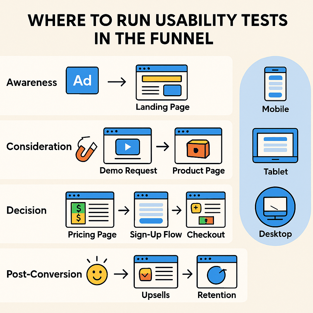
Where to Run Usability Tests in the Funnel
If your funnel has cracks, usability testing will show you exactly where and why they’re costing you conversions. But not every stage needs the same kind of scrutiny. Let’s break down where to focus your testing for maximum impact:
Awareness: Ad → Landing Page
This is the moment of truth. Your ad sets the promise, and the landing page must pay it off quickly.
Run usability tests here to answer questions like:
- Does the messaging feel consistent from ad to page?
- Do users immediately understand what they’re being offered?
- Are they compelled to keep going, or do they bounce within seconds?
This stage is where first impressions are made… or lost.
Consideration: Lead Magnet → Demo Request → Product Page
At this point, users are interested but skeptical. Your job is to clearly communicate value and knock down friction before they ask, “Is this worth it?”
Usability testing helps you spot issues like:
- Vague product descriptions that raise more questions than they answer (clear example here)
- Lead magnet pages that over promise or underdeliver
- Demo flows that confuse rather than convert
You’re looking for the exact moment where curiosity turns into doubt.
Decision: Pricing Page → Sign-Up Flow → Checkout
This is where hesitation kills conversions. You need to know:
- Where do users hesitate, stall, or abandon the process?
- Are your pricing tiers clear or overwhelming?
- Are your sign-up forms too long, too complex, or just plain annoying?
Usability testing here helps you remove barriers that analytics alone won’t flag.
Post-Conversion: Onboarding → Upsells → Retention
The funnel doesn’t end at the sign-up. You should be testing:
- Is onboarding intuitive?
- Do users reach their first “aha” moment quickly?
- Are upsells logical and well-timed, or intrusive and confusing?
If users don’t reach value fast, they churn. Testing here keeps them around.
Test on Mobile, Tablet, and Desktop Separately
Here’s a mistake we see all the time: Teams test their funnel once, on desktop, and assume it’s “done.”
But mobile users behave differently. Their attention span is shorter. Their navigation is clumsier. Their patience for load times? Nonexistent.
You need to test each device format independently.
What converts beautifully on a desktop might be a disaster on a 5-inch screen. Mobile funnels can also include interactive elements like SMS opt-ins or scannable entry points – so if you’re using QR codes to drive users into the funnel, be sure to track QR codes across devices. Are they scanning but bouncing? Are they landing on a page that’s not mobile-optimized? If so, you’re bleeding traffic without even realizing it.
Different devices. Different behavior. Different friction points. And you won’t know until you test.
How to Set Up Effective Usability Tests
Usability testing isn’t complicated, but you can’t wing it if you want meaningful results. A sloppy test will only give you surface-level feedback.
Here’s how to do it right:
#1 Define a Clear Goal
Before you run a single test, get clear on what you’re trying to learn.
- Are you testing whether users understand the value proposition?
- Are you testing if they can navigate from the landing to sign up?
- Or are you looking for friction in your pricing or checkout flow?
Don’t try to test everything at once. Focus on one goal per test. You’ll get cleaner insights.
#2 Choose the Right Users
This part’s non-negotiable.
Your testers should reflect your actual audience. If your SaaS is built for HR managers at mid-sized companies, don’t test it with startup founders or general consumers.
Bad-fit testers = irrelevant feedback.
#3 Tasks to Give Users
The best usability tests are simple, realistic, and open-ended. You’re not scripting them – you’re guiding them.
Examples:
- “Find a plan that suits your business.”
- “Request a demo for this specific feature.”
- “Try to buy X product in under 2 minutes.”
Then watch how they try to do it.
#4 Tools to Use
You don’t need a massive UX budget to do this well. These tools make it easy to test, observe, and gather insights:
- Maze – great for prototype testing
- Lookback – ideal for live moderated sessions
- Hotjar – for heatmaps and passive session recordings
- Loop11 – for recruiting and running quick tests at scale
#5 Record, Observe, Ask
During the test, observe silently. Let the user struggle, if they do—that’s where the gold is.
Afterward, ask follow-up questions. What confused them? What did they expect to happen? Or send a short survey to capture thoughts while they’re still fresh.
The key is balance: observe the behavior, then uncover the reasoning behind it. That’s where the real insight lives.
What to Look for in Test Results
Once the usability tests are done, the real work begins. You’re not just reviewing recordings – you’re listening between the lines, watching for subtle cues, and piecing together the unspoken story of where your funnel falls short.
Start with hesitation.
If users pause unexpectedly, scroll back to reread something, or hover indecisively, that’s your first signal. These moments of hesitation usually mean something’s unclear, whether it’s the copy, layout, or simply what’s expected next. Even if they complete the task, those pauses reveal where the experience isn’t as smooth as it should be.
This matters even more when you’re offering a product that sells simplicity, like an easy-to-use CRM for sales teams or a drag-and-drop email builder for small business owners. If your interface promises ease but the funnel creates friction, that disconnect can be jarring. Users expect a user-friendly CRM for sales teams to feel intuitive from the first click, not just after they sign up.
Then look for unexplained drop-offs.
Sometimes users begin a task with clear intent, like starting a sign-up flow or clicking into a pricing page, only to stop halfway through for no obvious reason. No errors. No broken flow. Just silent abandonment.
That kind of behavior points to hidden friction. Maybe the pricing raised doubts. Maybe the layout overwhelmed them. Usability testing helps surface those invisible roadblocks.
Now, pay close attention to the comments users make as they navigate.
Phrases like “I thought this was going to…” or “Wait, where do I go now?” are more than confusion—they signal misaligned expectations. Somewhere between the landing page and the next step, the promise shifted. That’s a trust issue, not just a UX one.
Finally, don’t overlook emotion.
Users might not say they’re frustrated, but their tone, facial expressions, or body language often will. A sigh, a furrowed brow, and a sudden drop in engagement are just as telling as the tasks they fail.
The goal isn’t just to see what went wrong. It’s to understand why. And when you tune in to the full picture – verbal, visual, behavioral – you’ll know exactly what to fix.
Turning Insights Into Funnel Fixes
Now that you’ve spotted the issues, it’s time to do something about them.
But before you rush in with a dozen tweaks and half a dozen hypotheses, pause. The goal isn’t to patch over problems – it’s to solve them at the root.
Prioritize High-Impact Fixes
Start where the damage is most expensive. If a blocker appears early in the funnel, like confusion on the landing page or a form that deters 60% of mobile users, that’s a high-impact fix.
The same goes for anything affecting a large segment of users. If your pricing page causes hesitation for first-time visitors, fix that before obsessing over a niche edge case three clicks deep.
Focus on what will move the needle, not what’s easiest to adjust.
Don’t Just Patch – Redesign If Needed
Not every issue can be solved with a clearer headline or a better tooltip. Sometimes the whole flow needs a rethink. Maybe your sign-up process has too many steps. Maybe the CTA is buried below the fold because the layout was never designed with intent.
If usability testing shows that a key page or flow is fundamentally broken, be willing to rebuild. Incrementalism won’t save a flawed experience.
Validate Changes with Follow-Up Testing
Here’s where a lot of teams slip: they make changes, then move on.
But without retesting, you don’t know if the fix actually worked – or if it just broke something else. Usability testing isn’t a one-time task. It’s a feedback loop.
After implementing changes, run another round of tests. Same user types, same tasks. Look for the same hesitation points. Did they disappear? Shift? Multiply? Iteration is how you turn insights into actual conversion lifts, not just cleaner UX.
If you’re not validating your fixes, you’re just guessing again.
Conclusion
Most funnels don’t break because of bad traffic. They break because users hit friction they don’t know how to explain, and teams don’t know how to see.
That’s where usability testing comes in.
Watching real people navigate your funnel shows you exactly what your analytics can’t: the hesitation, the confusion, the moments where good intent quietly dies. If you’re ready to turn insight into real impact, start small.
Pick your top-exit page and run a short usability test with five users. No overthinking. No perfect script. Just observe what gets in the way.
Fixing your funnel starts by watching someone else try to use it. You just have to be willing to look.

- How to validate UX decisions before development - February 2, 2026
- How to Reduce Friction in Remote Usability Studies Through Better Asset Collection - January 5, 2026
- Optimizing the UX of Your Online Store from First Click to First Sale - December 1, 2025
![]()
![]() Give feedback about this article
Give feedback about this article
Were sorry to hear about that, give us a chance to improve.
Error: Contact form not found.