Ensuring positive outcomes on your website necessitates an in-depth understanding of your target audience’s wants and needs. However, one of the major opportunities most brands miss is failing to align their web design choices with the type of experience their ideal customers seek. Here’s what we mean by this.
Great websites — ones that are user-friendly in a way that engages visitors and guides them toward a conversion — are highly focused. Yet, in an attempt to delight and impress consumers, many businesses make their digital presence unnecessarily complex. Unfortunately, this doesn’t drive sales. Instead, it causes visitors to become overwhelmed, increasing their risk of exiting the sales funnel and reducing their likelihood of becoming customers.
So, what’s the solution to this conversion obstacle? One of the simplest methods to prevent prospects from slipping through your fingers is to minimize complexity on your website. And smart UX design could be the key to reaching that goal.
Are you interested in reducing cognitive load on your site? Here’s how simple UX drives better outcomes.
The Connection Between UX Design and Cognitive Load
Before you can take action to simplify your site’s UX design, it’s crucial to understand the connection between this aspect of web development and users’ cognitive load.
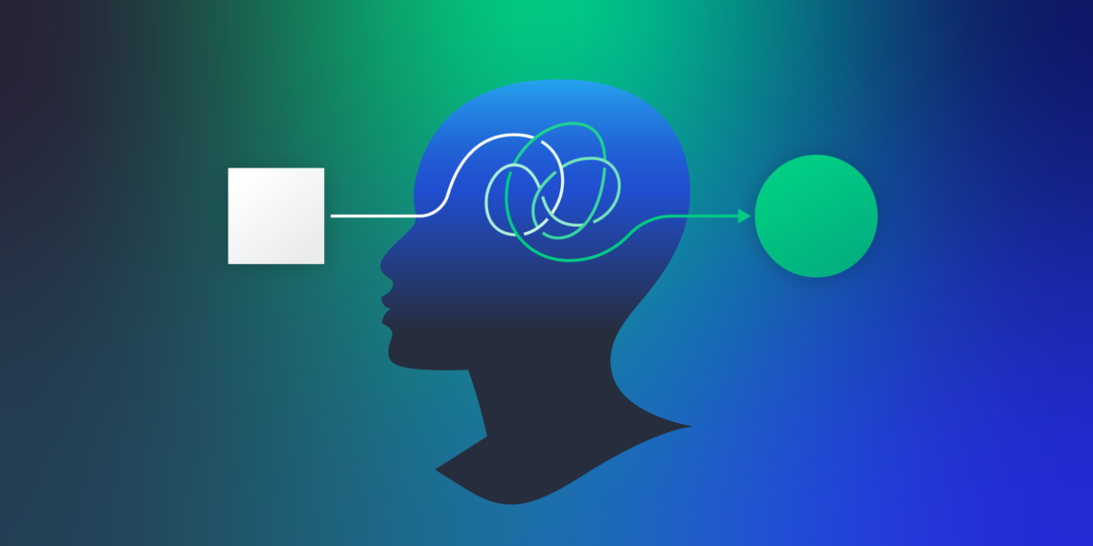
Essentially, complex website experiences (visually cluttered, overly stimulating, or insufficiently focused on visitors’ primary desired outcome) cause users to experience information overload. This leads to mental fatigue and, consequently, to reduced engagement and conversion rates.
Furthermore, a website that is not sufficiently streamlined may reduce (instead of aiding) product understanding. Or, it may cause visitors to experience analysis paralysis, which is a phenomenon where shoppers overthink their decision so much that their fear of making the wrong choice completely outweighs the perceived benefits of making a purchase decision (causing them to leave the sales funnel altogether).
The good news is that good UX design can prevent most of these scenarios. However, for you to successfully implement the right optimization tactics in your online presence, it’s crucial to first understand what constitutes a bad user experience.
In general, poor UX includes (but is not limited to):
- Slow website load speed.
- Inadequate mobile optimization.
- Cluttered visual design.
- Unclear conversion pathways.
- Poor copy readability scores.
- Complex website navigation.
- Information dumping.
- Lack of user-centric functionality.
Once you’ve identified these UX-related conversion obstacles, you can start resolving any potential issues on your website so as to reduce your target audience’s cognitive load and create a streamlined and enjoyable user experience that drives results.
So, let’s take a closer look at how you can address these elements of UX design to boost website engagement and conversion rates.
Pared Down Aesthetic Design
Minimalism may be going out of style in the (offline) design world. Nevertheless, that does not mean that maximalism is in when it comes to user experience. On the contrary. Simplicity still remains the easiest method for you to prevent web visitors from feeling overwhelmed when interacting with your site.
The reason for this is pretty straightforward. Pared-down aesthetic design prevents web visitors from becoming distracted by too many attention-seeking elements. When it (intelligently) employs visual hierarchy and cues, it can guide user attention. Furthermore, using sufficient negative space creates a physical separation between diverse concepts, ensuring that web users have enough time to consume, process, and understand your content without forcing them to move on before they’re genuinely ready to.
It also doesn’t hurt that most consumers prefer minimalist-leaning websites — especially those that are simple and familiar.
With this in mind, when aiming to reduce on-site cognitive load and help your prospects extract maximum value from your content, aim for visual simplicity.
For inspiration on how to do this, check out the Spotminders homepage. You’ll notice that this brand doesn’t avoid colors or visuals in its web design. Nevertheless, the page employs a clear visual hierarchy to enhance user experience. The design dedicates the most digital real estate to core value propositions, followed by high-value CTA buttons, trust-building social proof elements, and content that elevates product understanding and increases visitors’ purchase intent.
Source: spotminders.com
Customer-Oriented Website Navigation
One of the most effective methods to prevent web users from becoming overwhelmed while browsing your website is to build simple navigation menus that help them find what they need without frustration.
What’s fascinating, however, is that most sites don’t pay attention to this aspect of user experience.
According to Baymard’s research from 2025, 58% of desktop and 67% of mobile sites’ homepage & category navigation performance ranks as “mediocre” or “poor.”
There are multiple reasons for this:
- Some designs fail to align mobile homepages with their desktop counterparts.
- Others underperform at categorization, presenting visitors with too many (or overtly complex) options for where to click next.
- Some sites use subpar UIs, which make it difficult for visitors to understand where they are on a website (and where they can or should navigate to next).
Fortunately, reducing the cognitive load your navigation menus place on potential customers can be relatively simple — as long as you adopt a customer-oriented logic for designing digital pathways.
Essentially, by outlining a clear and simple roadmap for your potential customers (along with opportunities for personalized product education), you can prevent them from becoming fatigued by information that’s irrelevant to their customer experience, thus streamlining their movement through your sales funnel.
For example, check out how DialMyCalls implements this UX design tactic on its website. Knowing that it targets multiple customer personas, this brand creates separate landing pages for each of its many audience segments. What stands out about its approach, however, is that it doesn’t force web visitors to scroll through several content blocks before allowing them to take a deep dive into their specific use case. Instead, Dial My Calls includes a Who Uses Us section in its main navigation menu, where it encourages visitors to choose the exact way they intend to use the brand’s solution, helping them receive a more relevant and purposeful brand experience while avoiding mental fatigue.
Source: dailmycalls.com
Improved Copy Readability
Complex website copy is one of the leading causes of increased cognitive load. When a text is too long, poorly formatted, or uses unnecessarily complicated language, it inevitably leads to mental fatigue, reduced content comprehension, and (consequently) decreased value proposition understanding.
So, when exploring design opportunities to boost your web visitors’ user experience and assist their movement from brand awareness to conversions, consider optimizing your on-site text for readability.
The great news is that you can do this with minimal UX design knowledge. In fact, free tools — like Hemingway — can help simplify your web copy and make it more accessible to your audience.
Of course, if you prefer to make improvements manually, there are a few things to keep in mind.
- Text color and contrast hugely impact readability. So, either stick to traditional (black on white) color palettes for your written content. Or use tools like WebAIM’s Contrast Checker to ensure web visitors have an easy time reading on-site copy.
- Avoid using excessive jargon — particularly when targeting non-expert customers. Instead, use simple language and short sentences. Moreover, mind the length of your paragraphs, as all of these elements can unnecessarily reduce text readability.
- Formatting strategies such as using bullet points or emphasizing keywords with bold or italics can be exceptionally effective for highlighting high-value concepts. They’re even more beneficial to designing enjoyable web browsing experiences if you consider the fact that most web users don’t read online, choosing to scan pages for important information instead.
For a great example of how effectively copy readability can reduce cognitive load, check out Freeburg Law. Instead of bombarding potential customers with legal jargon, this business tries to make intimidating topics (at least a bit) more accessible through the use of simple terminology, formatting, and relevant visual elements.
Source: tetonattorney.com
Gradual Progression Through the Buyer’s Journey
Sometimes, the issue with your site’s UX design creating unnecessary cognitive fatigue isn’t the language you use to describe your offer. Instead, it’s simply that you’re expecting your audience to understand too much info within too little time.
That’s why progressive disclosure is so essential for creating accessible web experiences that genuinely drive conversions.
Just think about this concept in the following way. Consumers rarely go from awareness to conversion within a single brand interaction. Instead, they purposefully move through the buyer’s journey, evaluating their options until they’ve gained sufficient insights that enable them to make an educated purchase decision.
So, if you can make your website’s design reflect the buyer’s journey by making product education gradual and intuitive, you can effectively enhance your target audience’s user experience, reduce the likelihood of them getting overwhelmed, and ensure a higher level of product understanding.
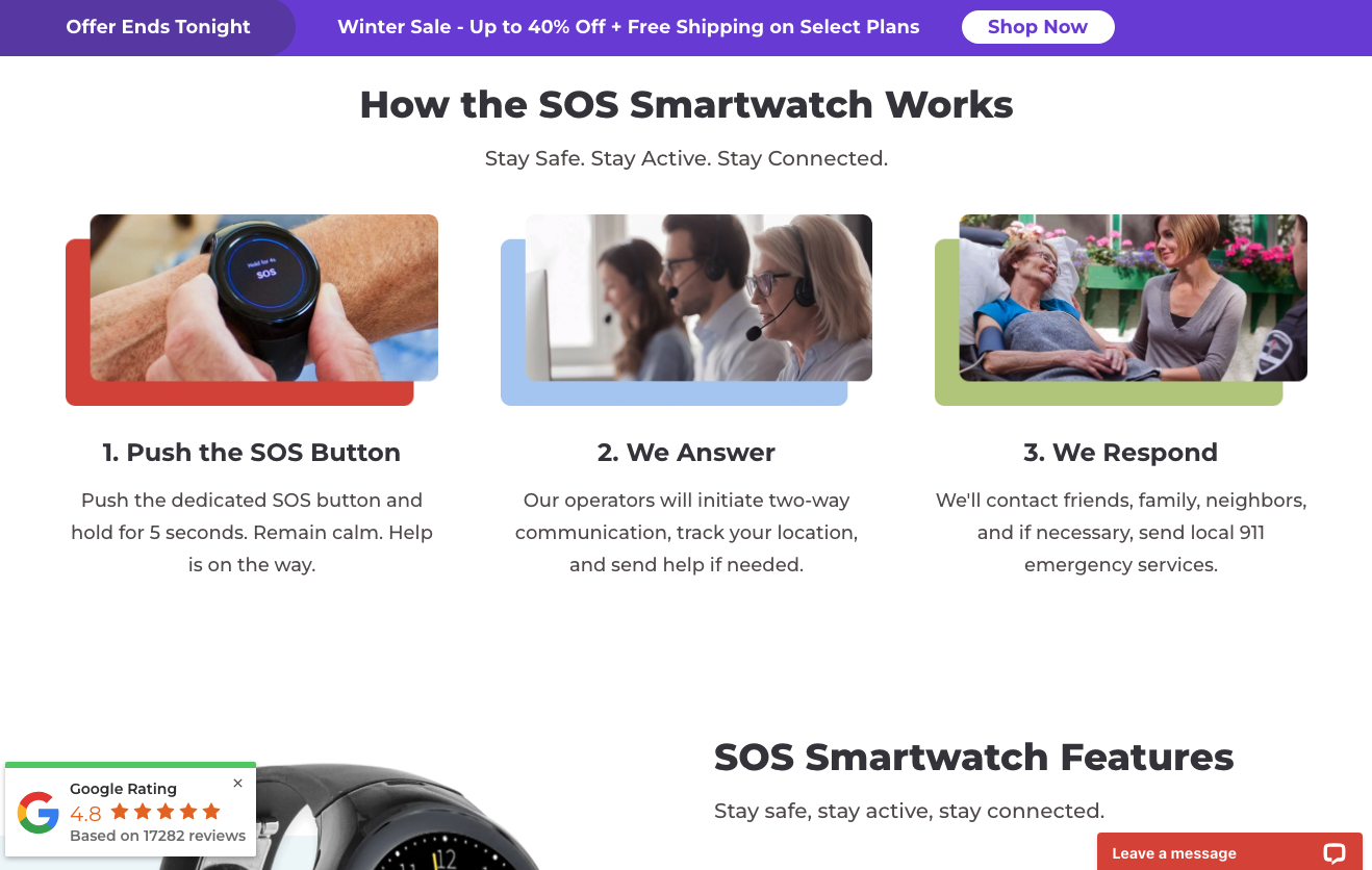
For example, Bay Alarm Medical does it beautifully on their SOS Smartwatch landing page. Here, the business presents web visitors with multiple bite-sized instances of educational content about its solution. These elements include a 3-minute explainer video, a step-by-step How It Works section, a Features section, as well as additional content dedicated to outlining the benefits of using an SOS Smartwatch compared to alternative wearable technology.
Source: bayalarmmedical.com
Clear CTAs and Direct Movement Through the Funnel
In some cases, the best method to reduce cognitive load isn’t to avoid overwhelming web visitors with various website elements. Instead, it’s making their movement through the buyer’s journey exceptionally logical by using clear and outcome-focused calls to action.
Ultimately, great design guides user attention and action. It does so through visually enhanced attention cues that either address your target audience’s pain points or describe desirable outcomes they wish to attain.
What’s fascinating, however, is that encouraging web visitors to progress through the buyer’s journey can be exceptionally simple.
Something as elementary as optimizing your CTA buttons for visibility and engagement can be more than sufficient to drive better outcomes without causing your audience to experience mental fatigue.
Check out how RE Cost Seg implements this UX design strategy on its website. Knowing that its target audience has a very specific goal they wish to accomplish — reducing taxable income — this business effectively uses CTA buttons to assist them with pain point resolution. The “See if you qualify” button in the hero section of the New York Cost Segregation landing page guides prospects to a consultation request form — the ideal next step for prospects in the lower stages of the buyer’s journey. The “Learn more” option, on the other hand, encourages web visitors to read the on-page content to educate themselves about the brand’s offer, facilitating gradual product understanding through a series of highly accessible educational content.

Source: recostseg.com
User-Centric Site Functionality
Finally, when it comes to reducing web visitors’ cognitive load by investing in UX design, it’s essential to always remember why your target audience visited your website in the first place.
Think about it from this viewpoint. Consumers interact with brands because they have specific pain points that need to be solved. And many buyers expect (or at least prefer) immediate resolution, with research data indicating that 72% of people demand immediate, real-time service when interacting with brands.
Furthermore, new studies indicate that convenience is becoming an increasingly important conversion factor in digital retail. In fact, many buyers are even willing to pay a 5% premium for more convenient shopping experiences.
With this in mind, when aiming to reduce mental fatigue and avoid informational overload, explore ways your site’s UX design could resolve customer pain points within a single touch.
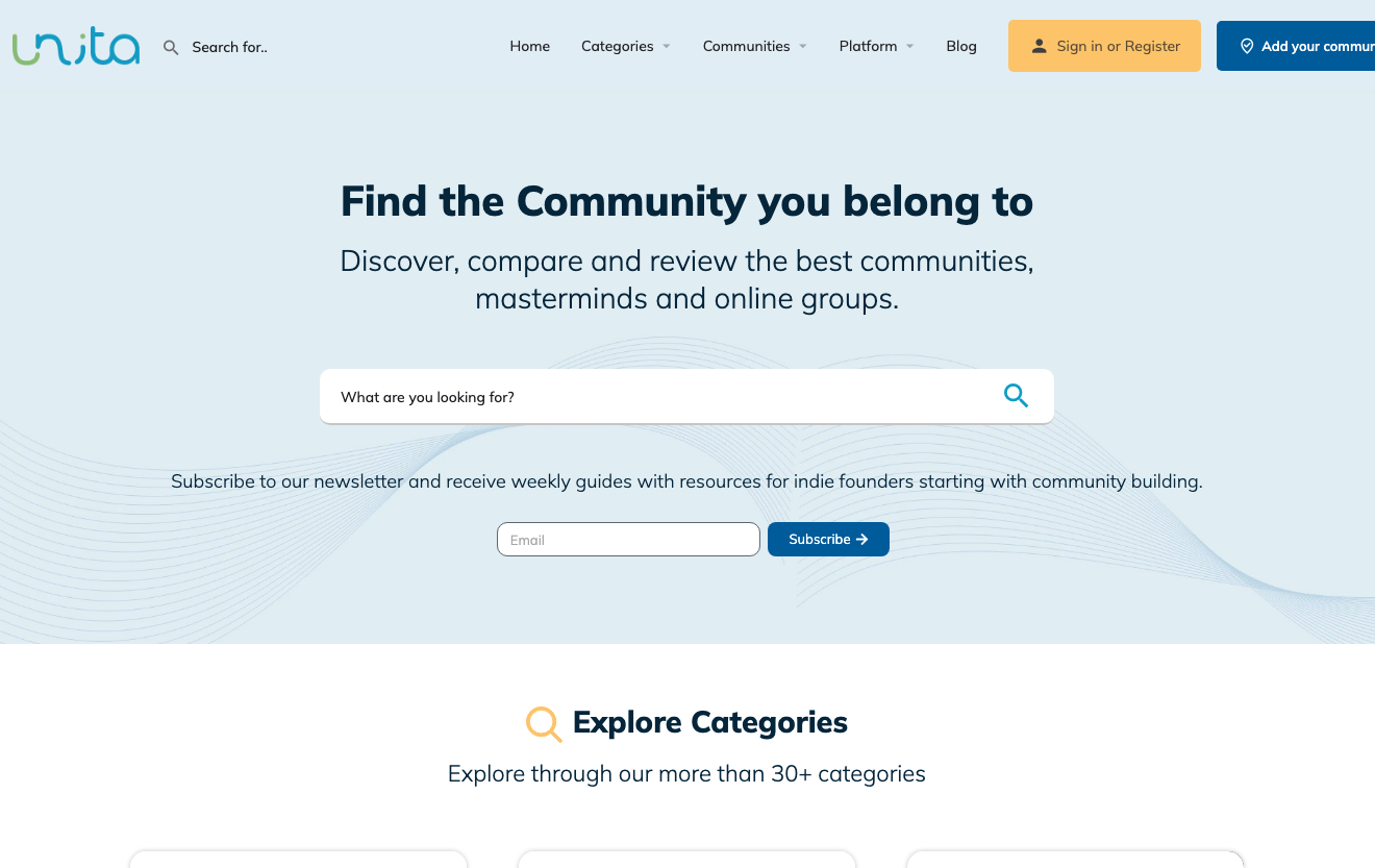
Adding user-centric site functionalities to your site — such as the community search bar on the Unita homepage — can be a great way to avoid cognitive fatigue and create streamlined customer experiences that enhance brand credibility and boost customer satisfaction.
Source: unita.co
Final Thoughts
Great user experience design isn’t just functional from a technical standpoint. Much more importantly, it’s entirely user-centric in ways that assist and ease consumers’ movement through the buyer’s journey, while making the entire process feel easy.
The tactics outlined in this article are all excellent methods to enhance on-site browsing experiences by reducing cognitive load. And the best thing is that they’re all relatively simple, meaning you can easily implement them in your online presence to drive better business outcomes.
So, give them a try. Adapt them to your brand’s specific needs and test how they work for you. Chances are, they’re going to create an enjoyable digital setting for your potential customers to learn about your products, making them more willing to move into the bottom stages of your sales funnel and automatically elevating their customer experience (and brand loyalty) as well.

- How UX Design Shapes Modern Customer Trust - June 23, 2026
- Reducing Cognitive Load: How Simpler UX Drives Better Outcomes - April 20, 2026
- UX Essentials Every Website Needs to Stay Trustworthy in 2026 - January 19, 2026
![]()
![]() Give feedback about this article
Give feedback about this article
Were sorry to hear about that, give us a chance to improve.
Error: Contact form not found.