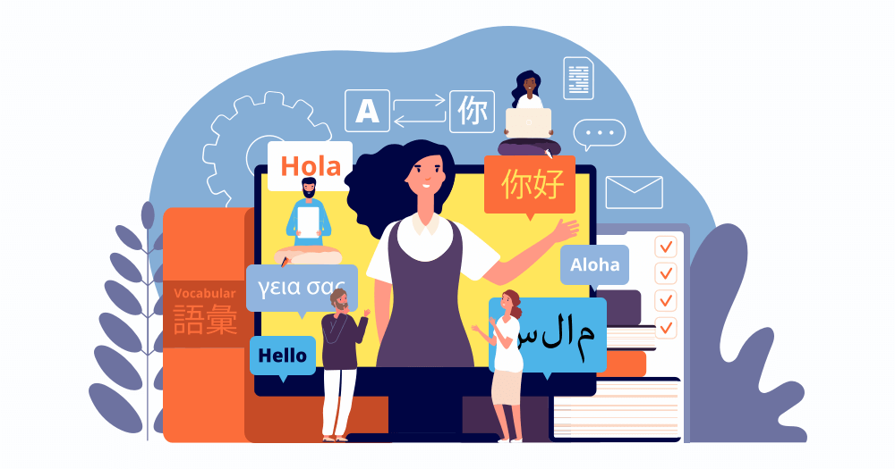
People aren’t as patient as they think they are. Nowhere is this more apparent than in first impressions. We’re quick to judge, not just each other, but books, films, and, importantly, for UX: websites and apps.
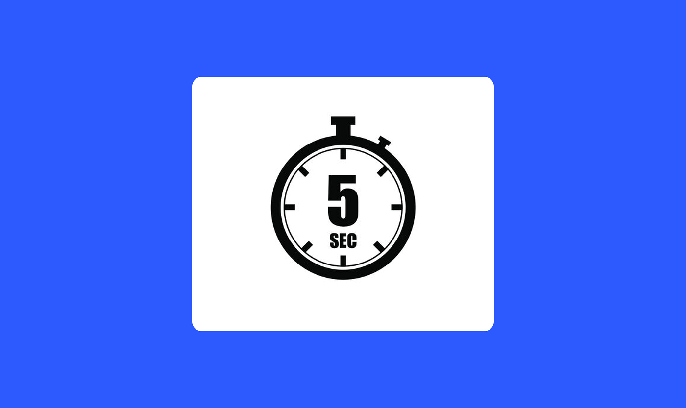
In about five seconds, our brains decide whether something is worth our time. Trust or doubt? Stay or leave? This is the five-second brain in action, and it doesn’t take any prisoners.
Designing for this animal instinct forces us to provide honest answers to uneasy questions, and in the end, will drown out the noise and focus on the goals of a website. In this article, I’m going to tell you how to design for those first few seconds, when patience is in short supply and impressions have staying power.
The Science Behind the 5-Second Brain
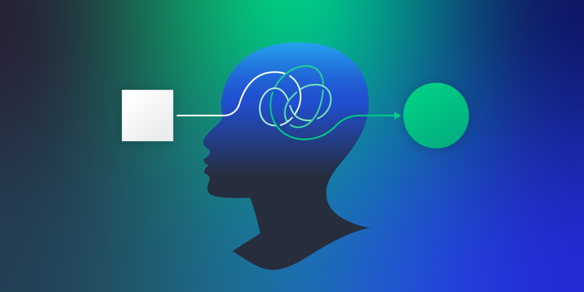
Evolution has optimised human perception to process information as quickly as possible. Long before the first screen ever existed, our survival depended on how quickly we could identify potential threats, opportunities, and patterns. So every time we experience something new, this same core programming is running in the background, beneath our civilised exteriors.
According to psychologists, there are two modes of thinking. The first is automatic, fast, and emotional. The second is slower and more analytical. It might not surprise you to hear that our five-second brain is based firmly in the first camp. It scans quickly, taking ‘thought’ cuts and filling in the blanks – focusing on simple shapes, colours, movement, and desperately seeking patterns with which it’s familiar.
This is why, when done right, a new website’s design can reassure you and feel trustworthy before you can even put your finger on why. Your brain has been incredibly busy in just a few seconds. It’s already formed a rough story based on visual details and layout. The best information architecture supports this by organising the content in a way that feels intuitive, if invisible.
What Users Look For in the First 5 Seconds
Let’s dig a little deeper into what the brain is doing during those few precious seconds. It’s asking a few questions:
- What is this?
- Is this for me?
- Can I trust it?
Based on the first two questions, the first thing designers need to consider is communicating a clear value proposition. If you can explain the purpose of your website as quickly as possible, along with why your site is perfect for your target audience, then users will feel an initial sense of reassurance. Visually, this value proposition should be placed prominently, like in a headline area. If the visitor only reads one sentence on the website, it should be this one.
The other question centres on trust. But, initially at least, trust isn’t rational. Users don’t have time to scroll through reviews or credentials. In this instance, trust is emotional and purely visual – more of a sense of whether your site is legitimate in the first place.
To handle this particular problem, the solution is simple. Make sure that your website has a clear, consistent design that feels authentic, with images that are real and professional, rather than generic stock photos. At first glance, this can win the trust of users’ sceptical, animalistic brains. For good measure, you can also showcase user reviews and awards, as social proof will help you retain users after the first five seconds.
Clean and Clear
As one of the foundations of the five-second design process, clarity makes sure that there isn’t anything on your site that can be left to interpretation.
This begins with a core idea. If you had to distil everything down to one message, what would it be? What do users need to understand immediately? Practically speaking, your headline will probably do a lot of the heavy lifting. It needs to efficiently answer the aforementioned ‘what is this?’ and ‘is it for me?’ questions in plain language – I’d encourage a more conversational tone for this, rather than trying to be too flashy with your wordplay (it could do more harm than good).
Search engine optimisation (SEO) is an essential element of all good web design, but please do your best to make your website for human users, not search engines. Any SEO Agency worth its salt can tell you that black hat practices, like keyword cramming, will actively drive users away. The key is striking a balance that optimises SEO in organic ways that improve website findability without negatively impacting users’ experiences.
Strong Visual Hierarchy
When we visit a well-designed website for the first time, our eyes will know where to go first, then second and third. That’s because its visual hierarchy is clear. The most important elements are large, while the secondary components are smaller. Contrast draws the eye like a magnet, so favour bright colours for must-see elements. What’s more, make the most of the space on your landing page. If a title is surrounded by acres of white space, it gives the impression that it is important.
The overwhelming majority of users scan web pages in patterns. The most common for landing pages is the ‘Z’ shape, because there’s less information on the page and more space. On other, more content-heavy pages, consider that users will be using the ‘F’ shape to scan through information, so position it appropriately.
Reduce Cognitive Load
It’s easy to overwhelm the five-second brain. If you have all sorts of extra bells and whistles on your site, like AI agents and flashy animations, they’re bound to compete with your core message and therefore add unnecessary friction.
Reducing cognitive load is all about giving users’ brains as little work to do as possible. Users already have their own mental models based on their years of experience browsing the internet and interacting with websites.
These models inform how they expect to navigate and interact with websites. So if your website tries a little too hard to reinvent the wheel, it could actually give users’ brains a lot more work to do. At worst, it can be enough to totally alienate them altogether.
Embrace minimalism to trim the fat and stick to the core message. Design trends come and go, but over the years, minimalism has proven itself to be timeless. Perhaps there’s a reason for that.
Final Thoughts
From a designer’s point of view, it’s easy to view the five-second brain as an irritating flaw in human thinking, but I like to think of it as more of a feature.
Yes, it would be much more convenient if users could give you some extra leeway, maybe ten seconds, plus a second, third, and fourth chance would be better.
Instead, the reality of the situation adds pressure to designers, knowing that their site must get its messaging across and gain the user’s trust in such a short window of time. But designers who lean into this to make their lives easier. In a lot of cases, it’s just a matter of removing unnecessary friction or making sure it’s never there to begin with.
If you’re designing without boundaries or direction, then it’s easy to pack your site with additional features that can make it more confusing, overstimulating, and sluggish. When you’re designing for instinct, your site will be more approachable, and your message will be more impactful.

- Designing For the 5-Second Brain - February 18, 2026
- 4 Ways to Design a Website for Humans, Not For Screens - January 13, 2026
![]()
![]() Give feedback about this article
Give feedback about this article
Were sorry to hear about that, give us a chance to improve.
Error: Contact form not found.