The average shopper lands on your website with one finger hovering over the back button. You have milliseconds to make your case.
Before they read a word, their brain is already working, judging your layout, your colors, your loading speed, your sense of order. A clean design says you’re credible. A laggy page suggests you’re not worth the wait. And a cluttered mess? That’s a fast goodbye.
According to research, users form their first impression of a website in just 0 milliseconds. That means the first scroll, the first image, even the way your menu unfolds—it all sends a signal. Get it right, and attention turns into trust. Trust leads to action. And action leads to that all-important first sale.
Great UX isn’t about making things pretty. It’s about making decisions easier, journeys shorter, and friction disappear before it’s felt. When a store feels like it was designed for them, shoppers don’t think. They move.
In the crowded world of e-commerce, user experience is your brand’s opening line. It’s how you prove you’re worth someone’s time and how you earn the right to their business.
And it all starts with that first click.
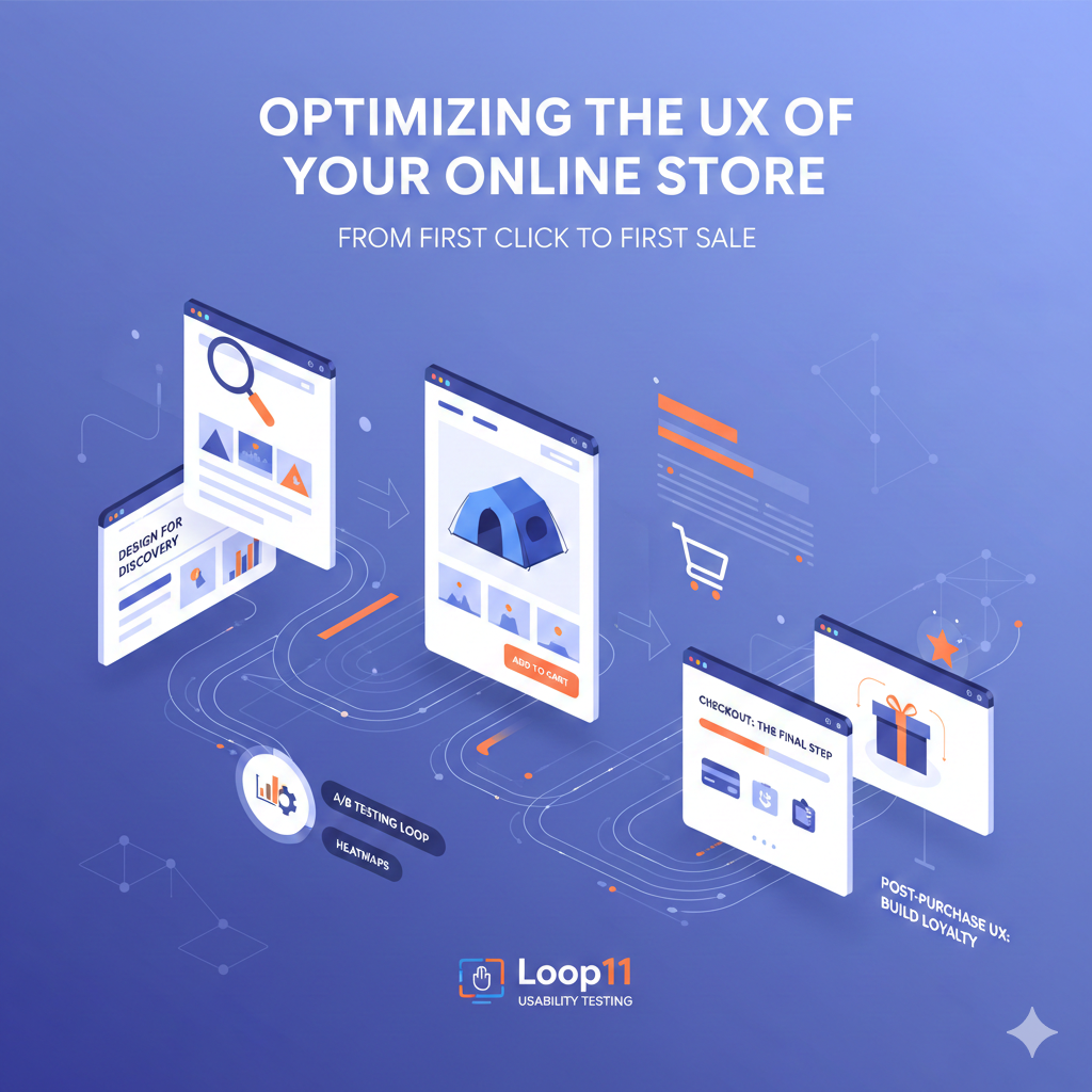
Design for Discovery: The First Click
Every online journey begins with discovery, and the quality of that moment determines what follows. Before shoppers can connect with your product, they need to find it easily and feel guided, not lost. The path from landing page to product page (like this one for an emergency tent) should move naturally, with every element working together to create momentum.
Speed plays the leading role in that first impression. Research shows that a single extra second of load time can lower conversions by nearly 7 percent, which means even a minor delay can drain attention before it ever becomes intent. Shoppers expect immediacy, and when a site feels slow or cluttered, their focus disappears long before your offer can make its case.
Strong design bridges curiosity and confidence. A clear visual hierarchy, consistent spacing, and thoughtful contrast help the eye travel effortlessly across the page. Navigation should be straightforward, not inventive; categories should be distinct and labeled in a language users already understand. When movement feels natural, exploration becomes effortless, and each click builds trust rather than resistance.
The best stores create a sense of direction from the first moment. Discovery feels rewarding, not random, and every scroll feels like progress toward something worth finding. Adding short, engaging visuals made with an AI video maker can enhance this flow, turning a passing glance into a guided journey.
The Product Page: Your Digital Sales Floor
The product page is where interest turns into intent. It’s your store’s stage, your digital sales floor, the moment where a shopper decides if your product is worth their attention or their credit card.
Every detail should serve a single purpose: to help the customer say yes. That means clean visuals, concise copy, and an effortless layout. The visitor’s eye should move naturally from image to price to the “Add to Cart” button without distraction.
Strong product imagery is non-negotiable. According to Shopify data, high-resolution, professional images can increase conversions by up to 30 percent. Use multiple angles, zoom features, and videos where possible. Let people experience the product, not just look at it.
Trust also plays its part. Display reviews, shipping details, and return policies where users can see them without scrolling. Small signals of transparency can turn hesitation into confidence.
The product page doesn’t need to surprise. It needs to reassure. When every element works together, it transforms curiosity into commitment.
Checkout: The Make-or-Break Moment
Checkout is where excitement meets hesitation. It’s the final stretch, and every second counts. Studies show that nearly 70 percent of online shopping carts are abandoned before payment. Most of those losses aren’t about price. They’re about friction.
Shoppers drop off when forms drag on, when they’re forced to create accounts, or when surprise fees appear too late. The fix lies in simplicity. Keep checkout short, clean, and predictable. Ask only for what’s essential.
Offer flexible payment methods—credit cards, PayPal, digital wallets, and buy-now-pay-later options. Let customers choose the route that feels natural. Small touches like auto-fill, progress indicators, and visible security badges can ease hesitation and speed completion.
Think of checkout as a quiet conversation, not a transaction. It should feel smooth, safe, and certain. Each step should affirm the decision to buy, not challenge it.
Post-Purchase UX: Keep the Conversation Going
The first sale isn’t the end of the journey. It’s the start of a relationship. What happens after checkout decides whether your new customer becomes a repeat one.
A strong post-purchase experience keeps momentum alive. Start with clear confirmation pages that reassure shoppers their order went through. Add tracking details that show progress in real time. Transparency builds confidence. Silence creates doubt.
Follow up with thoughtful communication. A confirmation email shouldn’t just be a receipt. It’s a moment to reinforce trust. Thank the customer, show related products, and invite them to stay connected.
Smart brands extend UX beyond the website. They use friendly packaging, easy returns, and follow-up surveys that make customers feel heard. Each of these touches is a small investment in loyalty, and loyalty compounds over time.
A buyer who enjoys their first experience is more likely to come back. Data from Bain & Company shows that increasing customer retention by just 5 percent can lift profits by up to 95 percent. Good UX doesn’t just close sales, it creates advocates.
The Iteration Loop: Keeping your UX Ahead
A great user experience isn’t a finish line. It’s a moving target. Shopper behavior changes, technology evolves, and what worked last quarter might quietly stop converting today. The best e-commerce teams treat UX as a living system that’s always learning.
Start with testing, not guessing. A/B testing reveals what layout, copy, or color choices actually influence conversions. Heatmaps and session replays expose where users hesitate or drop off. Usability testing tools like Loop11 make it simple to watch real shoppers interact with your store, uncovering small friction points that analytics alone can’t show.
Pair those insights with analytics from platforms like Google Analytics, Hotjar, or Crazy Egg to track where your audience flows—and where they fade. Use that data to refine navigation, adjust messaging, or simplify checkout steps.
Keep a click tracker sheet to document patterns across campaigns and design updates. Tracking these details over time reveals what drives consistent results and what needs a rethink.
UX optimization is never one big redesign. It’s a rhythm of small improvements that build momentum. Each tweak, test, and insight adds up to a smoother path from click to conversion, and that’s how you turn good design into measurable growth
Industry-Focused UX Strategies
Every industry plays by its own rules. What excites a beauty shopper might bore a tech buyer. What comforts a home décor customer might confuse a coffee connoisseur. Great UX adapts to each context, blending intuition with intent.
1. Health and Beauty
Trust sits at the heart of every health and beauty purchase. Shoppers want clear information, gentle visuals, and a sense that the brand genuinely understands their needs. A clean layout, thoughtful ingredient breakdowns, and transparent product details all help reduce hesitation. When design feels fresh and honest, customers feel safe to explore and buy.
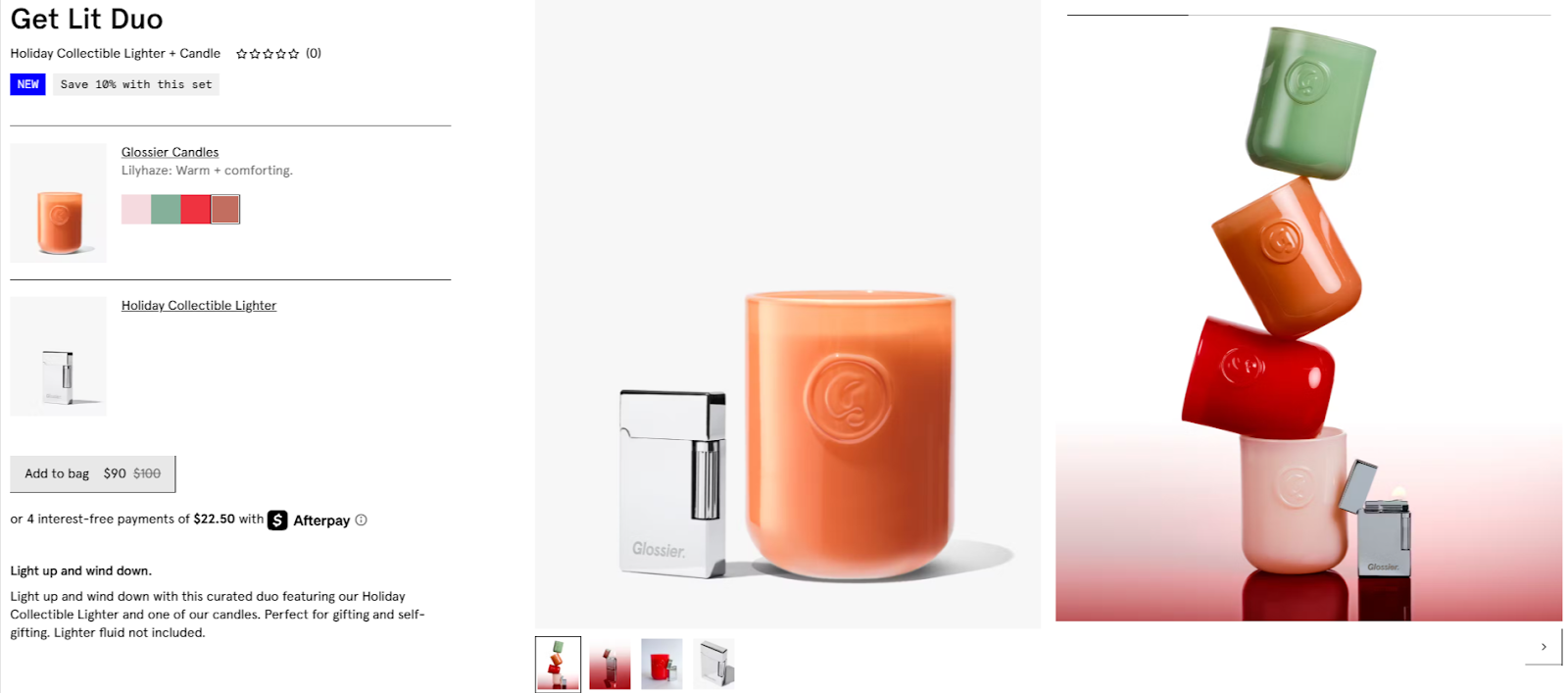
Glossier has turned this into an art form. Its minimalist product pages use whitespace, friendly tone, and real customer reviews to create a sense of authenticity. Nothing distracts from the essentials; every element supports credibility. It’s a reminder that in beauty, UX isn’t about sparkle but about sincerity.
2. Fashion and Apparel
Fashion shoppers look for clarity, confidence, and rhythm in their experience. Crisp visuals, precise filters, and interactive size guides turn uncertainty into assurance. Smooth navigation, quick-loading imagery, and responsive design keep exploration fluid. When every touchpoint feels intuitive and tailored, shoppers stay engaged and trust the fit, on the page and in their cart.
3. Coffee and Specialty Food Brands
Taste is sensory, but digital experiences can still make it vivid. Brands like Dripshipper prove it’s possible. The platform lets entrepreneurs build a private-label coffee brand in a single day, guiding them through logo uploads, product selection, and store launch with clear steps and clean visuals. The interface feels light but powerful, removing friction from what would otherwise be a complex setup.
Over forty coffee and tea options, from single origins to flavored blends, can be displayed with intuitive filters and crisp imagery. Testimonials and transparent fulfillment details reinforce trust, while consistent designers choice keeps the focus on action. It’s a lesson for any specialty brand: simplicity converts faster than flair, and clarity can make something as intangible as aroma feel real.
4. Electronics and Gadgets
Complex products demand simple paths. Customers compare specs, models, and prices, often across multiple tabs. Apple sets the gold standard here. Their clean product architecture, guided configuration, and visual storytelling make even high-tech features approachable. Every page flows like a narrative instead of a manual.
5. Home and Lifestyle
Comfort drives this category, both in what people buy and how they buy it. A well-spaced layout, soft color palette, and uncluttered interface make shoppers feel at ease as they browse higher-value, more personal items. The best UX here mirrors the feeling of a well-designed room—everything in its place, everything with purpose.
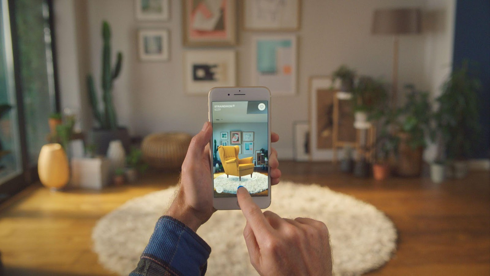
IKEA sets the benchmark with its augmented reality tools that let customers visualize furniture in their own spaces before purchasing. The interaction is simple and playful, yet it reduces doubt and builds confidence. That mix of practicality and delight turns hesitation into action, proving that in home and lifestyle retail, comfort and conversion often move in the same rhythm.
6. Subscription Services
Recurring revenue lives or dies by user satisfaction. The best subscription sites emphasize control and flexibility. Simple plan management, transparent billing, and friendly onboarding turn first-timers into long-term subscribers. However, failing to address common UI UX design mistakes can undermine even the most well-intentioned strategies. Whether it’s coffee, skincare, or snacks, the UX has to remind users why staying feels easy.
Final Thoughts
User experience is the foundation of every thriving online store. It builds trust, shapes emotion, and leads shoppers naturally toward a decision. A site that feels quick, intuitive, and reliable earns belief before a single product is added to the cart.
That belief grows with consistency. Every refined layout, faster page, or smoother checkout becomes part of a pattern your customers can rely on. The more natural the flow feels, the more confidence it creates.
Great UX doesn’t ask for attention. It guides it. It turns hesitation into movement and turns each interaction into an experience that feels effortless. When visitors sense that ease, they don’t just buy once—they return.
From the first click to the first sale, UX shapes the rhythm of success. It is the pulse that keeps your store alive, the quiet influence behind every conversion, and the difference between being seen and being chosen.

- How UX Teams Misread Usability Test Results (And What to Do Instead) - March 23, 2026
- How to validate UX decisions before development - February 2, 2026
- How to Reduce Friction in Remote Usability Studies Through Better Asset Collection - January 5, 2026
![]()
![]() Give feedback about this article
Give feedback about this article
Were sorry to hear about that, give us a chance to improve.
Error: Contact form not found.