User testing, or usability testing, helps you find what part of your website or app is hurting the user experience. Many UX teams run these tests incorrectly because they recruit the wrong people or guide participants through tasks.
Now, if you want to understand these mistakes and how to avoid them, this guide will help. You’ll learn what user testing is, the 8 mistakes that skew results, the methods that work best, and the tools that make testing faster and more reliable.
Read on to learn how to conduct effective testing sessions and stop wasting your time.
What Is User Testing?
User testing involves observing people using your website or app to identify usability problems. It’s one of the most reliable ways to identify where your design doesn’t meet expectations before launching your product.
Let’s get into more detail about what it is and how it works.
Core Purpose and Definition
You see how people move through your user interface in real situations in a user testing session. First, you recruit participants who match your target audience. Then you give them tasks to do, and watch how they perform those tasks (it often hurts when people scroll past an element you argued about for days, but it happens).
The goal behind these tests is to find out functionality problems prior to making your website or app live. For instance, a button on your app may seem perfectly fine to your team, but an actual user might stare at it for 30 seconds to figure out what it does, and then give up.
Common Testing Methods
Some of the most popular user testing methods are moderated sessions, remote testing, and unmoderated tests. You’ll also see in-person labs and mobile device testing for specific projects.
We’ll discuss moderated sessions first. They allow a facilitator to observe users live and ask follow-up questions when problems appear.
And what happens in remote testing? Well, it gives you access to participants across different locations who are testing from home. This type of testing often catches issues that you’d otherwise miss in lab settings.
Most of all, remote testing also reflects how people use sites today, plus the way they switch between devices and environments.
Then come unmoderated tests, which work differently. This is when users follow written instructions on their own time. These tests provide you with data on how people behave when they’re using your product naturally, without any outside influence.
What Are the 8 Important User Testing Mistakes?
When you run user tests without the right approach, a few common errors can distort insights, slow down progress, and lead you to make decisions based on bad data.

The most frequent mistakes include:
- Setting unclear goals
- Recruiting the wrong participants
- Helping testers too much
- Using technical jargon
- Testing too late in the process
- Giving confusing task instructions
- Running only one round of testing
- Letting confirmation bias influence your findings
We’ll dig deeper into these mistakes and share how to avoid them.
Mistake 1: No Clear Goals
One of the biggest mistakes UX teams make is running tests without determining precisely what information they need from participants. Everyone just watches users click around, but the results don’t point them toward any clear next steps… all because nobody has established what problems to look for.
Say you test a flight-search page without defining a goal like “Do users understand how to filter by price?” Will the results actually guide any changes?
You get the idea.
To avoid this mistake:
- Set Clear Objectives: Decide what you want to learn before you start testing.
- Write Three Guiding Questions: Define the main things your test needs to answer, then build your tasks around them.
- Make Goals Measurable: Use simple metrics like time to finish or number of steps.
- Coordinate Your Team: Tell the goals to everyone in your team before the session so they know what to watch for.
Mistake 2: Wrong Participant Selection
If you recruit your friends or colleagues for the testing, it may make things run more smoothly for you, but the feedback won’t reflect your actual users.
For example, your coworker who builds websites will navigate your mobile app completely differently from the way your target audience will.
Not only that, but testing with the wrong demographics also wastes time and delivers misleading data. Seriously, if you’re building tools for retail shop owners, you need genuine retailers testing them, not students (different people, different professions, different priorities).
Follow the tips below to avoid these errors:
- Screen Participants Carefully: Make sure the people you recruit match your actual users.
- Ask About Relevant Experience: Check whether they’ve used similar apps and faced the problems you’re trying to solve.
- Use a Short Screener Survey: Filter out people who don’t fit your target audience before inviting them to the test.
- Include New and Returning Users: See how both first-timers and experienced users interact with your product.
Mistake 3: Helping Users During Tests
Do you know what happens when facilitators guide test users through difficult tasks rather than letting them figure things out? You completely miss the real navigation problems users will encounter when nobody’s there to help them.
Suppose someone hesitates at a confusing menu, and you jump in with “Oh, just click that button.”
It’s a good thing you like helping others, but in this particular case, you’ve lost the chance to see where your interface actually breaks down.
You can avoid this mistake during testing by considering these suggestions:
- Stay Silent: Let participants work through challenges on their own and reveal where your intuitive navigation still needs work.
- Get Testers to Talk: Ask users to explain what they’re thinking instead of jumping in with help.
- Help Only When Needed: Step in only if they’re completely stuck, and note it so it doesn’t skew your results.
Mistake 4: Technical Jargon With Participants
It’s pretty common for UX researchers to use terms like UX or information architecture during sessions. Unfortunately, they little realize how much these words confuse test participants.
When you use jargon, respondents focus on decoding your questions, which keeps them from completing the tasks. Honestly, how would they give sincere feedback when they’re trying to figure out what “user flows” means?
The practices below minimize these blunders:
- Use Simple Task Prompts: Give clear and action-based instructions like “Show me how you would find the pricing page,” so that real users can focus on the task rather than deciphering design concepts.
- Avoid Design Jargon: Skip terms like prototype or user flows during usability testing because most people outside the design process will not understand them.
- Ask Questions in Plain English: Keep your prompts short and clear. This way, prospective customers can complete tasks and find relevant content without confusion.
- Test Your Script on a Non-Designer: Try your instructions on someone outside your company first. If they get stuck, you know your mobile app or website tasks need simpler wording.
- Keep Questions Short: Long prompts distract users and make it harder to observe their natural behavior on a landing page or product pages.
Mistake 5: Late-Stage Testing Only
Many UX teams wait until development finishes, and then they run the usability research. That’s a bad approach because by then, your code is locked in, and it feels nearly impossible to make any changes.
Meanwhile, your potential customers are probably already using your site or app, and once they run into challenges while trying to access your services, they may leave permanently. It often leads to a clear drop in conversion and overall user experience.
Want to know how to keep these issues from occurring? Here’s how:
- Test Prototypes Early: Find problems while they are still inexpensive to fix during the design process.
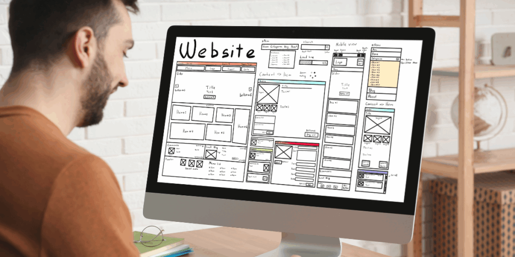
- Use Wireframes First: Run your first round of usability testing on simple wireframes before anyone writes code.
- Review User Flows Regularly: Look at important paths in your site or app early so you can rectify navigation issues before development is locked in.
- Validate Changes Quickly: After updating your prototype or mobile app layout, run short follow-up tests to confirm the problem is actually solved.
Mistake 6: Unclear Task Instructions
The worst thing about poorly written instructions is that they confuse participants, who then keep trying to figure out what you expect them to do. They’ll often open random pages just to look for further information that the task never mentions.
Let’s say someone reads “Navigate to the product section and explore the features”. They’ll just sit there wondering if you’re asking them to click everything or simply scroll around (you can see them thinking “Wait… what exactly do you want?”).
Here are some steps to avoid similar problems:
- Run Pilot Tests First: Test your instructions on a small group to see if the wording actually makes sense.
- Give the Script to a Colleague: Watch someone in your company try the tasks. If they ask questions, your real users will too.
- Check Instructions on Different Devices: Try the tasks on a mobile device and on a desktop site to confirm the steps are clear in both environments.
Mistake 7: Single Testing Round
Many companies run only one usability test and assume everything is fixed. Then they launch the site or app and later see customers still struggling with basic tasks.
In reality, one round of testing doesn’t catch subtle issues, much less those that appear after real users spend more time with the interface.
Here are some recommendations for you:
- Schedule Multiple Testing Rounds: Run usability testing at different points in the development process to confirm that your fixes actually worked.
- Start with Wireframes: Test simple wireframes first, then move to prototypes, and repeat the sessions before launch.
- Review Customer Behaviour Over Time: Look at how real users interact with your site or app after repeated use so you can catch issues that do not appear in early tests.
Mistake 8: Confirmation Bias in Testing
We’ve seen that some teams design tests to show their ideas are good instead of finding what is broken. They specifically write tasks that push users toward success and ignore negative feedback during analysis. The results then only point you in the wrong direction.
Always remember one thing: usability testing is not about proving that everything works.
Avoid your confirmation bias errors this way:
- Look for Failures on Purpose: Focus on moments where users struggle because they reveal the weaknesses in your design process.
- Use Conflicts as Insight: Treat user frustration as valuable information that helps you improve what you plan to launch.
- Pay Attention to Problem Areas: Notice the moments that feel uncomfortable in usability testing as opposed to ignoring them.
What Tools Improve User Testing Quality?
Prototyping tools like Adobe XD or Figma, and session recording platforms like Hotjar or FullStory make user testing faster and more effective.

We use these tools at Matter Solutions to conduct tests quickly and collect clearer data. They also help us explain to stakeholders why we need to update their design process.
We’ll walk you through these tools now.
AI Prototyping Tools
Some prototyping tools, including Figma and Adobe XD, now come with AI features that speed up the design process for mobile apps. This software uses machine learning to refine layouts and generate design variations automatically.
More importantly, using AI allows teams to test different concepts quickly without committing resources to full development. That’s how, when a navigation structure doesn’t work for your target audience, you’ll know about it before anyone writes a line of code.
Session Recording Platforms
The best part about recording tools like Hotjar, FullStory, or Microsoft Clarity is that they capture exactly where users struggle with product pages or checkout flows. And if you use video recordings, you’ll see the hesitation, confusion, and exact moment someone abandons a task.
Also, your associates can watch the sessions later to understand user needs without joining live tests.
In our experience, recordings prove very helpful when you analyze feedback from different types of users across mobile devices. You can identify patterns across multiple sessions that weren’t obvious during individual tests. Even more, you may notice users clicking images they believe are interactive.
Pro tip: Use Uizard or Galileo AI to create fast mockups and test early prototypes.
Improve Your User Testing Process Now
Now you know how user testing finds out problems before they cost you customers, but only if you avoid the common mistakes. And the difference between useful insights and wasted time depends on how well you prepare.
In general, strong user testing gives your business a real competitive advantage by preventing delays and redesigns.
Contact us if you need support running user testing to get clear and actionable results. We help businesses create websites and mobile apps that users can navigate without confusion.
- 8 Critical Usability Testing Mistakes And How To Avoid Them - December 8, 2025
![]() Give feedback about this article
Give feedback about this article
Were sorry to hear about that, give us a chance to improve.
Error: Contact form not found.


