
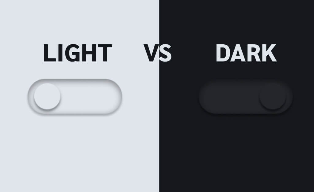
Dark mode has become the go-to aesthetic of our digital lives. From mobile apps to dashboards, everything today seems to come with a dark theme option. It looks modern, feels premium, and fits perfectly into the futuristic design language dominating tech. Because of this, many teams assume dark mode automatically improves user experience. But the truth is far less glamorous: dark mode is not a universal UX win.
While it absolutely shines in specific environments and use cases, forcing it everywhere can weaken readability, increase cognitive effort, distort brand identity, and even reduce user trust. In this article, we dig beneath the surface-level hype to understand the psychology, accessibility concerns, and contextual nuances that make dark mode far more complex than most designers acknowledge.
1. Why Dark Mode Became a UX Trend in the First Place
Before criticising dark mode, we need to understand why it initially took off. The rise wasn’t accidental, it came from a mix of technological, cultural, and behavioural shifts.
The OLED Effect
When OLED screens became mainstream, dark themes were promoted as battery-friendly. This created a perception that dark mode was not only stylish but also “smart” and efficient. Users associated it with performance, even though this benefit only applies in specific hardware conditions.
Design Culture Shift
Around the same time, the digital design world was moving towards minimalism and cinematic aesthetics. Dark interfaces aligned perfectly with this trend, giving products a sense of depth, drama, and visual maturity.
Night-Time Usage Boom
People increasingly use devices late at night, and dark mode felt like the natural solution for reducing glare. This positioned it as the “eye-care friendly” choice, even though this claim is only partially true.
These factors turned dark mode into a trend, but trends don’t always equal usability.
2. The Myth of “Dark Mode Is Better for Your Eyes”
It’s one of the most repeated claims in tech, yet it’s oversimplified. Dark mode is not automatically easier on the eyes, it completely depends on the environment.
Where dark mode truly helps
In dim lighting, bright screens can feel harsh. Dark mode reduces glare and can make browsing or reading short content more comfortable. For simple scrolling or UI navigation, it offers a relaxed ambience that many users appreciate.
Where dark mode becomes a problem
In bright environments, dark mode performs poorly. Human eyes evolved to process dark text on light backgrounds, similar to reading ink on paper. When you reverse that contrast, the eyes must work harder, especially in well-lit spaces. Studies show that dark mode leads to:
- increased pupil dilation
- reduced clarity
- slower reading
- more eye fatigue during long-form reading
If you’ve ever tried reading a long article in dark mode on a sunny day, you’ve felt this strain firsthand.
3. Readability and Legibility: Dark Mode’s Biggest Weakness
Dark mode creates challenges that designers often underestimate. It requires far more precision than light mode to maintain comfortable readability.
The contrast trap
When designers use low-contrast greys instead of pure white text (often for aesthetic reasons), legibility drops significantly. This particularly affects:
- users with astigmatism
- users with low vision
- older users who rely on high contrast for clarity
Around one-third of the global population has astigmatism, meaning dark mode inherently disadvantages a huge number of users.
Halation issues
Bright text on a dark surface can create a glowing or “halo” effect, especially on cheaper displays. This optical “bleed” makes text blur together and reduces reading accuracy.
Typography imbalance
Dark mode amplifies typography problems. Thin fonts look too faint, bold fonts look too heavy, and tight line spacing becomes uncomfortable quickly. If typography isn’t specifically adjusted for dark mode, readability collapses.
4. Increased Cognitive Load: Why Dark Mode Makes Users Work Harder
The human brain processes information more efficiently on light backgrounds. This isn’t a design preference, it’s cognitive science.
Dark mode reduces the distinction between UI elements, making users subconsciously work harder to understand layout, hierarchy, and content separation. This becomes especially problematic in:
- data-heavy dashboards
- spreadsheets
- analytics tools
- documentation
- reading-focused applications
This is why even apps with dark mode options still default to light mode for productivity. Light themes help users process complex information faster and more accurately.
5. Accessibility: The Hidden Problems Behind Dark Mode
While dark mode can help some users, especially those with light sensitivity, it also introduces accessibility challenges that many teams overlook.
Colour-blindness issues
Dark backgrounds compress the difference between colours. Red error states and green success states often lose clarity, making it difficult for colour-blind users to interpret meaning quickly.
Low-vision challenges
Users with low vision rely heavily on clear contrast and sharp boundaries. Dark mode requires careful tuning to achieve proper WCAG contrast ratios. Many apps fail here, making the interface unnecessarily difficult to navigate.
Visual sensitivity variations
Some users with vestibular or neurological sensitivities experience discomfort when viewing bright text on dark backgrounds due to the increased edge contrast. Accessibility is never a one-size-fits-all scenario, and dark mode proves that.
6. Bright Environments: The Natural Enemy of Dark Mode
Anyone who has tried using dark mode outdoors knows the struggle. Smudges, reflections, and ambient light all combine to make dark UI nearly unreadable. Light themes reflect light rather than absorbing it, making them far easier to use in daylight.
This is why apps frequently used outdoors, maps, delivery apps, payment apps, rely on light mode as the default. UX is about practicality, not aesthetic preference.
7. Brand Identity Suffers More Than Designers Realise
Brands spend years crafting visual language. Colours aren’t just aesthetic; they carry emotion, trust, and recognition. When you invert the UI for dark mode:
- colours shift tone
- vibrancy decreases
- brand emotions change
- consistency weakens
A cheerful, energetic brand can suddenly feel muted and serious. This disconnect impacts how users perceive trust and reliability.
8. The Psychological Shift Between Light and Dark Modes
Dark mode communicates a mood. It feels sleek, intimate, serious, and professional. Light mode feels open, friendly, and welcoming. If your product’s emotional tone needs warmth or approachability, forcing dark mode as the primary UI might clash with the brand and user expectations.
UX isn’t just functional, it’s emotional.
9. When Dark Mode Works Exceptionally Well
Despite these challenges, dark mode shines in specific cases:
- Creative tools like Figma and Photoshop benefit from dark canvases that keep visual focus on content.
- Entertainment platforms like Netflix use dark UI to create immersion and reduce distractions.
- Developer tools often use dark themes to soften prolonged screen exposure at night.
- Gaming interfaces depend on darker tones to enhance dramatic experiences.
These are contexts where dark mode supports the task, not just the trend.
10. When Dark Mode Fails Completely
Some products suffer when forced into dark mode:
- Banking apps need clarity and trust. Dark mode reduces numeric visibility and increases risk of misreading data.
- Healthcare interfaces require high accuracy and clear colour coding.
- Form-heavy apps struggle in dark mode because fields, borders, and labels blend too easily.
If precision is key, dark mode often stands in the way.
11. The Real UX Strategy: Offer Both, But Never Force It
The most user-centric solution is simple: give users a choice. Research through user testing, A/B testing, and mobile testing constantly shows that:
- preferences vary by time of day
- preferences vary by environment
- some users switch often
- some stick to one mode forever
This is where UX research tools shine, validating design choices with actual behaviour instead of assumptions.
12. When Should You Actually Use Dark Mode? A Simple Framework
Use dark mode when:
- your users frequently operate in low light
- your product focuses on creative or entertainment content
- immersion or mood-building is important
- you can maintain strong contrast and accessibility
- the brand voice supports darker aesthetics
Avoid dark mode when:
- your interface is text-heavy or data-driven
- your brand relies on bright, energetic colours
- the product is used outdoors
- your audience includes older users or those with low vision
UX success depends on context, not aesthetics.
Final Thoughts: Dark Mode Is a Feature, Not a Universal Solution
Dark mode is an excellent tool when used wisely. But when adopted blindly as a trend, it introduces accessibility challenges, readability issues, and cognitive strain. Good UX design is about evidence, research, and user behaviour, not visual hype. When you understand the environments, psychology, and needs behind user interactions, you realise dark mode is not a default choice. It’s a contextual one.
The best design isn’t about choosing dark or light. It’s about choosing what helps users succeed.
- Why Dark Mode Isn’t Always the Best Choice: A UX Perspective - December 15, 2025
 Give feedback about this article
Were sorry to hear about that, give us a chance to improve.
Error: Contact form not found.