Real estate is typically framed as a long game, nurturing leads for months, building brand authority, and closing at the mahogany table. But in the digital age, the $200,000 transaction doesn’t start with a handshake; it starts with a thumb twitch.
Google defines micro-moments as those intent-rich instances when a person turns to a device to act on a need to know, to go, to do, or to buy. When a homeowner in financial distress or a time crunch types “sell your house fast“ into a search bar at 11:00 PM, you aren’t just competing against other investors. You are competing against the “back” button and a human attention span that is currently shorter than that of a goldfish.
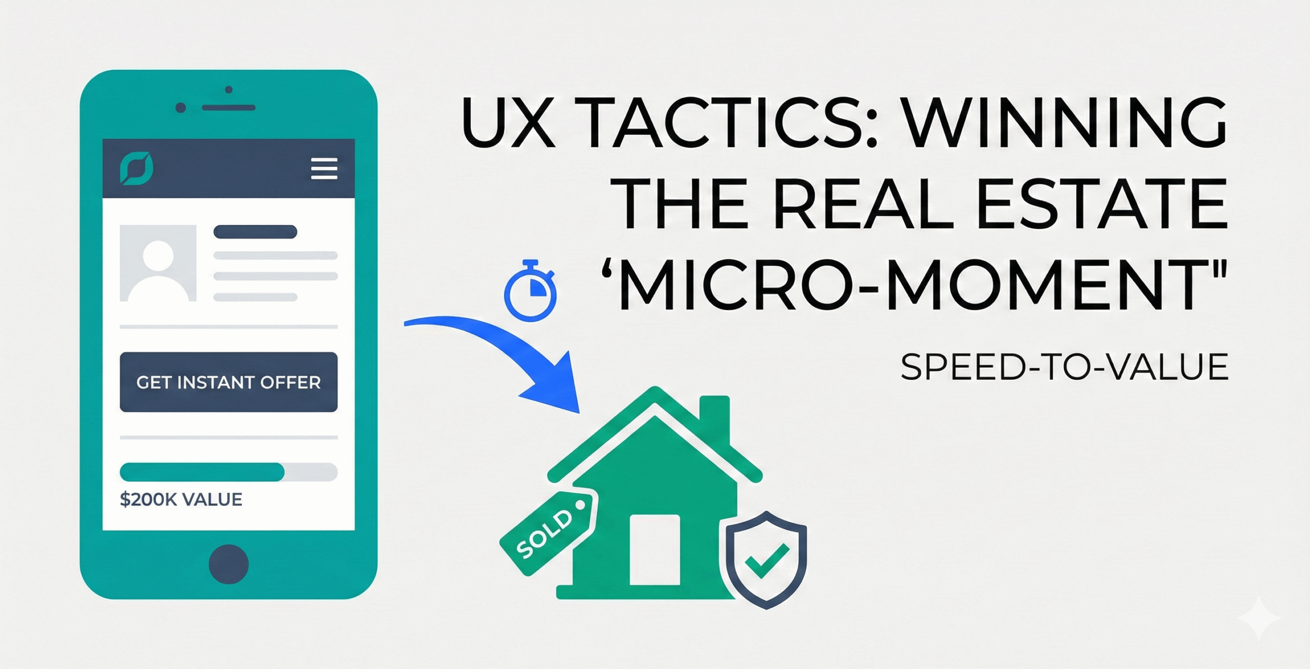
To win a $200k sale in five minutes, your User Experience (UX) cannot just be “pretty.” It must be a high-velocity engine of Speed-to-Value.
The Anatomy of the Searcher’s Mindset
When someone searches for a cash homebuyer, they are usually not “browsing.” They are seeking a solution to a problem, often an expensive or emotional one.
In these micro-moments, the user’s brain is scanning for three things:
- Relevance: Does this site solve my specific problem?
- Trust: If I give them my address, will I get scammed?
- Low Friction: How much work do I have to do to get an answer?
If your landing page takes four seconds to load and then hits them with a generic stock photo of a smiling realtor, you’ve lost. The micro-moment requires Interaction Design (IxD) that mirrors the urgency of the user’s situation.
Speed-to-Value: The “Aha!” Moment
In UX design, the “Aha!” moment is the point where a user first realizes the value of your product. If you need to sell your house fast, the “Aha!” moment isn’t when they sign the contract; it’s when they realize, “Wait, I can actually get an offer without fixing my leaky roof.”
The 5-Second Rule
Your value proposition must be “above the fold” (visible without scrolling). If you are a cash homebuyer, your headline shouldn’t be “We Help Homeowners.” It should be “We Buy Houses in South Carolina, Any Condition, Cash in Hand.”
Reducing Cognitive Load
Every form field you add reduces your conversion rate. To win the micro-moment:
- Use a single-field start: Ask for the property address first. That’s it.
- Progressive Disclosure: Don’t ask for their social security number and life history on page one. Get the address, then the email, then the details. This builds “sunk cost” momentum.
The Design Process: From Information Architecture to A/B Testing
Winning a $200k sale requires a rigorous design process that prioritizes website findability. If a user can’t find the “Get Offer” button within three seconds of landing, your information architecture has failed.
Benchmarking and Findability
Before you redesign, start with benchmarking. How does your current site perform against competitors for “Time to Task Completion”? Use tools for user testing to see where people get stuck. If your navigation is a maze, your findability score will tank, and so will your $200k leads.
Testing for Certainty
Don’t guess, test.
- Prototype Testing: Use low-fidelity wireframes to validate your flow before writing a single line of code.
- Mobile Testing: Since most micro-moments happen on a phone, mobile testing ensures your thumb-friendly design actually works in the wild.
- A/B Testing: Once live, run A/B testing on your headlines. Does “Get a Cash Offer” beat “Sell Your House Today”? Even a 1% difference in conversion can mean millions in deal flow over a year.
Interaction Design for the “I-Want-to-Buy” Moment
Interaction Design focuses on the “dialogue” between the user and the interface. In a $200k lead generation scenario, that dialogue needs to be supportive and streamlined.
Visual Cues and Feedback
When a user interacts with your site, they need immediate feedback. If they click “Get My Offer,” a loading spinner should appear with text like “Analyzing local market data…” This creates a sense of “Value Labor,” the user feels like work is being done specifically for them.
The Rise of AI Agents
Today, the “interaction” isn’t just with buttons, it’s with AI Agents. An intelligent agent can engage a user the moment they land, answering complex questions like “Do you buy houses with tax liens?” in real-time. This keeps the user on the page and moves them toward the “Aha!” moment without the friction of a 24-hour email delay.
Building Radical Trust in Seconds
The biggest barrier to a $200k sale isn’t the price; it’s the fear of the unknown. Your UX must bake in trust signals at every interaction point. Instead of hiding behind corporate jargon, use specific visual elements:
Social Proof: Use real photos of “as-is” houses rather than stock photography. Seeing a house with a messy yard that actually got sold proves to the user that you truly buy houses in any condition.
Process Transparency: Use a simple 3-step “How it Works” list. This removes the “black box” mystery of the sale and tells the user exactly what to expect in the next 24 hours.
Security Signals: Place SSL badges and “Privacy Guaranteed” icons directly near the submit button. This reassures the user that their sensitive property data is safe.
The “Five Minute” Conversion Funnel: A Case Study
Let’s look at a hypothetical case study if you need to sell your house fast:
- Minute 0:00 – 0:05: User clicks your ad. The page loads in under 2 seconds.
- Minute 0:05 – 0:30: User reads the headline. They see their city name and a “No Repairs Needed” promise.
- Minute 0:30 – 2:00: User enters their address. The site uses an API to auto-complete the address, saving them keystrokes.
- Minute 2:00 – 4:00: User answers 3-4 simple questions. The UI uses big, clickable icons rather than tedious dropdown menus.
- Minute 4:00 – 5:00: User hits “Submit.” They receive an immediate text notification from an AI Agent confirming their request and offering to schedule a walkthrough.
Empathy-Driven Design: The “Human” Connection
While speed is essential, a $200k sale often carries a heavy emotional burden. If your UX feels too mechanical or “robotic,” you risk alienating a user in a vulnerable state.
Tone of Voice: Your micro-copy should be empathetic. Instead of a cold “Submit Data,” use “Get My Free Quote” or “Check My Eligibility.”
Humanizing the Digital: Including a small, non-intrusive headshot of the lead buyer or a “Real Person” guarantee near the form can lower the user’s guard.
Avoiding the “Back Button” Pitfalls
What kills the micro-moment?
- Analysis Paralysis: Giving the user too many options. Stick to one goal: getting the property info.
- Lack of Localized UX: If the user is in Charlotte and your site shows pictures of palm trees in Florida, they will instinctively feel you don’t know their market.
- The “Wall of Text”: In a micro-moment, users scan; they don’t read. Use bullet points and bold headers to guide the eye.
Conclusion: The ROI of Better Design
In the real estate investment space, the cost-per-click (CPC) for terms like “we buy houses” can be astronomical. If you are paying that much to get someone to your site, you cannot afford a “leaky bucket” UX.
Winning the micro-moment isn’t about being the loudest voice in the room; it’s about being the most helpful one. By focusing on a design process that leverages user testing, benchmarking, and AI Agents, you turn those critical five minutes of digital browsing into a $200,000 reality. Your website is your best salesperson, ensure it is designed to close.
- UX Tactics: Winning the $200k Real Estate ‘Micro-Moment’ - February 23, 2026
![]()
![]() Give feedback about this article
Give feedback about this article
Were sorry to hear about that, give us a chance to improve.
Error: Contact form not found.