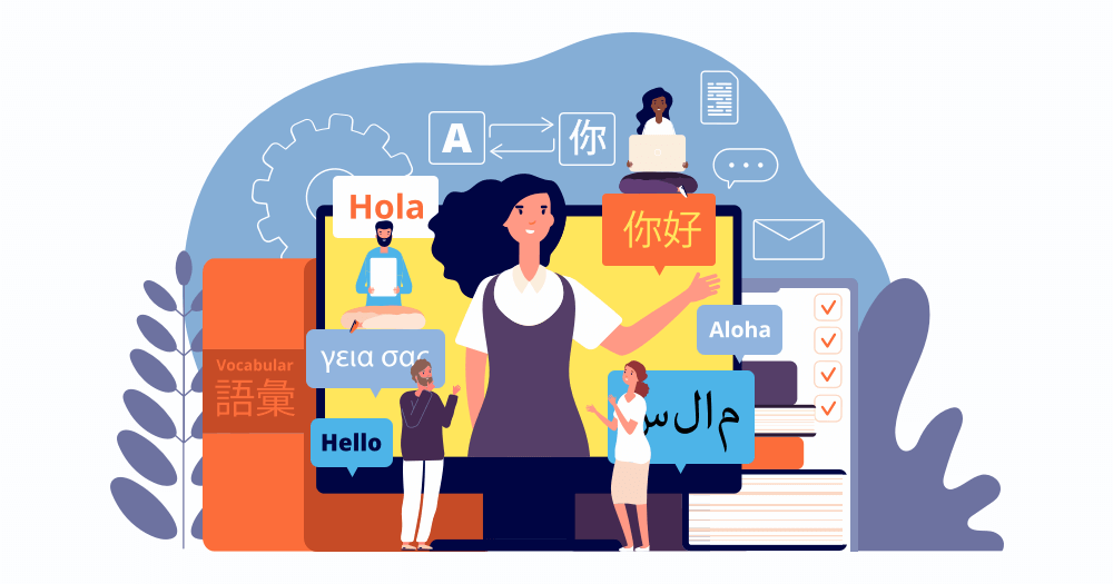
For far too long, web design has been obsessed with form over function. Designers have poured their efforts into sites that aim to take advantage of each respective platform, whether they’re on desktop, smartphones, tablets, or even – god forbid – smart watches.
Unfortunately for some, the average human doesn’t tap or click through the pages of a website because they see where the lines are drawn on a so-called ‘intuitively designed’ grid. They chase the information they seek, and decide along the way whether the site has really earned their trust.
But when web design prioritises screens over people, usability takes the biggest hit. They can be confusing to navigate and, in the worst cases, actively set up obstacles that obstruct the user experience – even if the site is aesthetically stunning.
Designing for humans is all about shifting the focus from style to substance, paying particular attention to how users think and behave. So, without any further ado, here are four practical ways to do exactly that.
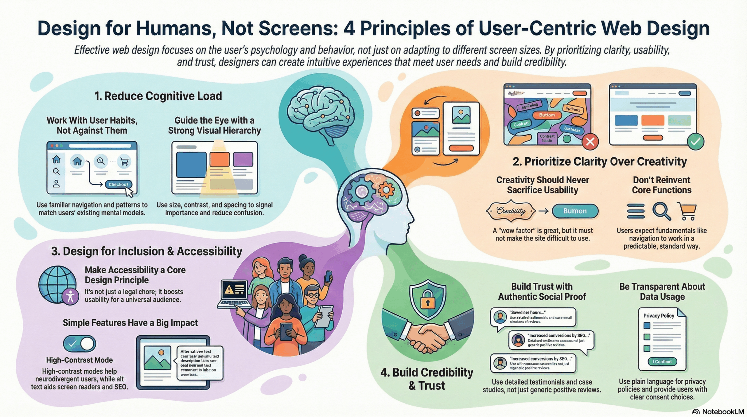
Design Around Cognitive Load
Every user visits a website with their own set of expectations. These existing mental models have developed based on the individual’s experience on other sites, and can relate to individual systems and elements, like navigation, specific labels, and interaction patterns. When a design aligns with them, users can interpret a website through these models almost instantly and move forward effortlessly. But when the design doesn’t line up with users’ mental models, confusion is inevitable.
One of the fundamental objectives of UX is to reduce cognitive load. So every unclear label, unconventional navigation system, and unnecessary AI agent adds friction. Users shouldn’t need to analyse the interface and learn a website just to use it, and the reality is that most won’t. They’ll palm the eject button faster than a bullet leaving a barrel.
Having a clear, strong hierarchy on pages will play the biggest role here. Optimising the information architecture so that each page is organised in a way that prioritises the needs of the user and grounds them in an experience that encourages them to access the content they’re looking for – whether they’re on an e-commerce site looking for a new pair of clogs or looking for local news stories.
The site’s visual design elements will also support this: size, contrast, and spacing signal to users what matters most and reduce cognitive load, allowing them to slip into well-worn cognitive processes informed by their years of experience browsing other sites. Since human-centred UX revolves around familiarity, patterns that users already recognise free up more mental bandwidth for them to complete the job they came to do.
User testing your site (with actual users) will help you gauge whether the baseline experience needs any tweaks, and if you’re redesigning, benchmarking the site against industry averages will give you a good idea of how your UX stacks up.
Clarity Over Creativity
I have to admit, I enjoy the feeling I get when a website’s design truly blows me away; when I can feel the passion and creativity of the designer bursting off the page and delivering a wow factor that my cynical brain seldom feels nowadays. Creativity is valuable in web design; it’s essential for innovation and can effectively communicate a brand’s personality, while keeping users engaged with the site and driving conversions.
However, there are too many sites out there that are trying to be too clever for their own good. Creativity should never come at the price of clarity, and there are fundamentals that designers should be wary about changing.
For example, what if I wanted to sell you a car that had a joystick instead of a steering wheel, oval-shaped wheels, and made a ‘cuckoo’ sound every time you shifted gears? That’s too much. Obviously, there are a whole bunch of safety concerns there, but hopefully my point still stands. We all have different preferences when it comes to cars, but the changes that manufacturers make seldom come at the cost of the fundamental driving experience and are more ornamental in nature.
The same can be said for UX and web design. Humans crave clarity, which is why so many sites utilize minimalist design principles. The functional design, combined with a clear, polished design, creates an experience that is undeniably pleasant. Unnecessary distractions are removed, calls to action are obvious and specific, and typography is large, consistent, and clearly contrasted against the background.
But that’s not to say that every site needs to be minimalist. Variety is the spice of life, after all, and there are plenty of maximalist sites at the opposite end of the spectrum that still successfully communicate the necessary information to users and have a fun browsing experience. This design agency in Manchester strikes the right balance between loud design features, flashy animations, and a clear navigational system that helps users browse the site.
Design for Inclusion and Accessibility
Inclusive design doesn’t need to be a box-ticking exercise that feels more like a legal chore than a part of the design process. When incorporated properly, accessibility features are a foundational part of any creative strategy and can boost a site’s usability to have a universal appeal.
While high-contrast dual-palette dark modes and low distraction approaches are aesthetically pleasing, they also help reduce the visual noise that can overstimulate neurodivergent users. Including alt text for different images is helpful for users with visual impairments who browse with screen readers, and it also improves website findability, as it’ll be better optimised for search engines.
If you want to go above and beyond for your users, you can have personalised adaptability settings built into the site itself, which incorporate toggles for high-contrast modes, dyslexia-friendly fonts, and adjustable text spacing. If you’re unsure about where to begin, there are plenty of accessibility testing services available that can help you find what’s best for your website.
Build Credibility and Trust
Trust and credibility are cornerstones of UX and web design because they directly affect users’ engagement with the site. If they are given a reason to be skeptical of a site, say, because of how it presents a product or service, or its data collection policies, they’ll be straight back on Google looking at competitors instead.
Social proof goes a long way. Reviews, testimonials, and case studies help solidify trust and certainty in users’ minds by demonstrating how others in their shoes have enjoyed the product or service on offer. But from a UX standpoint, social proof is best when it balances nuanced opinions evidenced by specific details, rather than ecstatically positive reviews, packed with sunshines and rainbows.
As users become increasingly aware of how their data is collected, transparency is just as important. If you can provide clear explanations of how data is collected and used, write privacy policies in plain language, and provide clear consent choices, then users will feel well-informed, reassured, and in control.
Closing Thoughts
The internet is crammed full of websites that aim to deliver a user experience based on abstract frameworks that do more to alienate than attract. Designers don’t need to reinvent the wheel or scream for attention with an overwhelming dog’s breakfast of visual noise. They need to choose clarity over cleverness and create an intuitive experience that reassures its human users that they’re in the right place.

- Designing For the 5-Second Brain - February 18, 2026
- 4 Ways to Design a Website for Humans, Not For Screens - January 13, 2026
![]()
![]() Give feedback about this article
Give feedback about this article
Were sorry to hear about that, give us a chance to improve.
Error: Contact form not found.