


Code is a developer’s problem… right? Mmmm, maybe, but when it goes wrong it can sure derail your user testing in a hurry.
There is one inconspicuous line of code that can ruin your UX testing and, as UX professional, it’s your responsibility, not your developer’s, to get right.
What am I referring to?
This:
<meta name="viewport" content="width=device-width, initial-scale=1.0">
Before we get into why this is a problem, lets understand what this line of code does.
The Mozilla Developer documentation resource describes it as follows:
“The width property controls the size of the viewport. It can be set to a specific number of pixels like width=600 or to the special value device-width, which is the width of the screen in CSS pixels at a scale of 100%.
The initial-scale property controls the zoom level when the page is first loaded. The maximum-scale, minimum-scale, and user-scalable properties control how users are allowed to zoom the page in or out.”
Clear?
I’m guessing not.
If you’re like me, seeing something can help immensely. So here is a website, as viewed on a mobile phone, with and without the viewport configured.
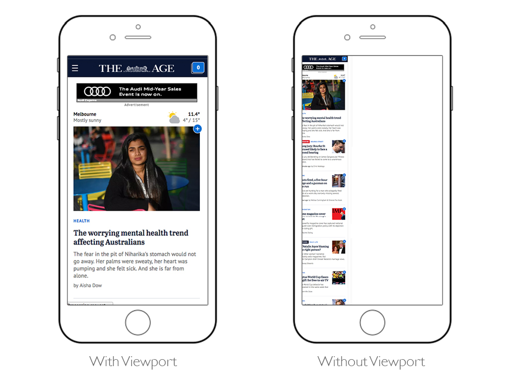
As you can see, when the viewport tag is not present the website is tiny and a user would have to pinch/zoom the screen and then scroll around horizontally in order to view the content.
When the viewport code is present the website fits the screen and we can interact with it as we’d expect.
So, I hear what you’re saying: “I’ll make sure my developer takes care of this”. You’ll dust off your hands and reward yourself with a Bullet Proof Coffee.
Hang on, hold off on blending that baby.
If you use a tool like Axure, then this is not your developer’s problem, it’s yours!
It’s not uncommon for us to field support calls at Loop11 from customers pointing out that “there is a problem with Loop11, it’s making my website tiny”. In these instances, the customer has set-up their prototype or website on desktop and the first time they take a look on mobile is when they are previewing their Loop11 usability test.
In these instances all we can do is point out the missing tag and highlight that their prototype/website is tiny with and without the presence of Loop11. If they are using Axure then we can link them to an article like this.
The reason why this is a such a big problem to UX professionals is because all of sudden you’re not testing the UI as it was designed. Rather, the first interactions are zooms, pinches and swipes just to get to the initially intended look and feel. Then when subsequent pages are loaded the participants will often have to repeat the resizing steps.
This results in longer study durations and feedback which is viewed through the context of the poorly sized UI. Instead of feedback that can really help you improve your tool, you’ll get feedback like:
“I found the text really hard to read, it was too small…”
Many of our customers are lucky enough to catch this problem during previews of their studies, prior to launch. However, you’d be surprised how many conduct their previews on desktop and then launch a study for mobile.
So, the moral of this article, is to ensure you preview your test in the exact scenarios that you are expecting your participant will be experiencing, and, if your website is inexplicably tiny on mobile devices then the missing viewport is more than likely the culprit.
 Give feedback about this article
Were sorry to hear about that, give us a chance to improve.