“How can good web design for a non-profit organization result in a better user experience, resulting in a higher likelihood of securing online donations?”
 Charities are often excused from executing at the level expected of for-profit companies. However, due to the positive impact they can have a counter argument exists that charities should put just as much effort, if not more, into their conversion analysis and UX design.
Most charities don’t have the big bucks to compete for the top talent so we conducted this comparative study for anyone looking to improve their website.
So how does a non-for-profit organization get users to take action, and keep them coming back? Also, what are the crucial UX elements that, if got wrong, can cost you millions in donations?
Comparing UX And Donation Behavior: UNICEF vs Red Cross
To conduct our independent study, we collected data on the usability of two charitable organization websites, UNICEF and Red Cross. Both were seeking online donations from users to assist with the identical humanitarian crisis.
We recruited 556 people to participate in the project, across two separate online surveys (UNICEF, n=279 and Red Cross, n=277). Respondents to both surveys were sourced through an external online panel, and ranged in age from 18-65+ years old. They were from different states and territories, represented a range of household annual incomes, and were roughly split across genders. Around two-fifths of respondents in both surveys reported that they had previously donated money online to organizations that support humanitarian causes.
Online Quantitative Research Methodology
Using Loop11, we asked online users to undertake two tasks commensurate with donating money online to a charity that supports humanitarian causes. Each task was assigned “success” and “fail” pages that were used to calculate the aggregated task completion rates. Users were then asked how easy or difficult they found the tasks to complete. In addition, we asked follow-up questions about:
- Overall user satisfaction
- Likelihood of donating money in future (so we could compare with their previous online donation behavior ascertained prior to starting the tasks)
- Likelihood of recommending the organization to friends or colleagues
- What specific information and features they think are important to include on these websites
Research Results
As a result of completing exactly the same two online tasks, the UNICEF website converted a higher proportion of non-donators (those who stated they had never previously donated money online) into potential donators (32%), compared to Red Cross (22%).
Online Donation Behavior
Prior to completing the survey tasks, around two-fifths of both sample groups had previously donated money online to organizations that support humanitarian causes (see Figure 1).
After completing the tasks, respondents were asked how much money they would be likely to donate online. While the Red Cross online donor proportion remained unchanged (42%), the proportion of potential UNICEF donors increased by 9% to around half (49%) of respondents.
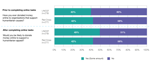
Figure 1: Online donation behaviour
Those Who Had Never Donated
When we analyzed the results according to respondents’ past online donation behavior, we saw more of a change in those who stated they had never donated before.
Figure 4 shows that significantly more UNICEF non-donators (32%) said they would be likely to donate at least some amount of money, compared Red Cross non-donators (22%).
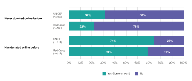
Figure 2: Likelihood of donating money online (Analysed by previous online donation behaviour)
How Does the UNICEF Website Drive this Behavior?
1. Ease of use
The System Usability Scale (SUS) is a self-rating provided by each participant regarding how easy each website is to use. Figure 5 shows that the UNICEF website scored a slightly more positive SUS result (68) than the Red Cross website (65).
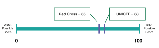
Figure 3: SUS Results
In addition, the majority of all respondents reported positive satisfaction levels with their website experience (see Figure 6). The UNICEF website, however, compelled a higher proportion of users to state that they were very satisfied (32%) compared to Red Cross users (19%).
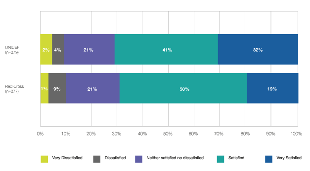
Figure 4: Overall, how satisfied are you with your experience on this website today?
2. Online task completion
Respondents were asked to complete two tasks based on scenarios similar to those that real life users of the websites might complete. The average task completion score was higher for the UNICEF respondents:
- UNICEF: 63% success rate
- Red Cross: 45% success rate
Task 1
Online donation: When attempting to locate the page required to enter personal details for making a donation to the appeal, around half of all respondents were successful in both the UNICEF (47%) and Red Cross (49%) surveys.
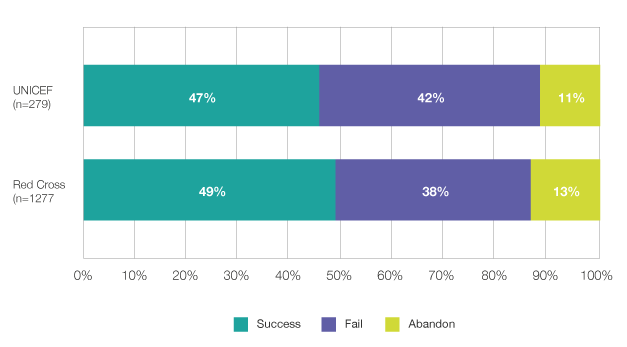
Figure 5: Please find the page where you are asked to enter your personal details to give money to this appeal.
Successful respondents were likely to click on ‘Donate now’ or ‘Donate’ icons clearly visible on the home page on both sites.
After analyzing the clickstream pathways, we found that users who failed this task did not finish on a page where they could enter personal details, or had navigated to the ‘give a gift’ or ‘monthly donation’ page.
Task 2
Find Information: Respondents were much more successful at finding information specifically related to the appeal on the UNICEF website (79%) compared to the Red Cross website (41%).
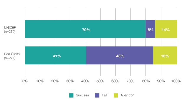
Figure 6:Please use the website to find out how many millions have fled their country as a result of the conflict.
The main impediment to successful task completion for Red Cross respondents was not having this information clearly visible or easy to navigate to from the homepage.
Of the UNICEF respondents who had never previously donated money online, the vast majority who stated they would in the future had successfully completed task 2 (84%), compared to only 71% of those who said they would not be likely to donate in future.
3. Importance of specific information and features
The table below shows what participants listed as the most important things that should be included on a website that seeks financial donations from users to support humanitarian causes.
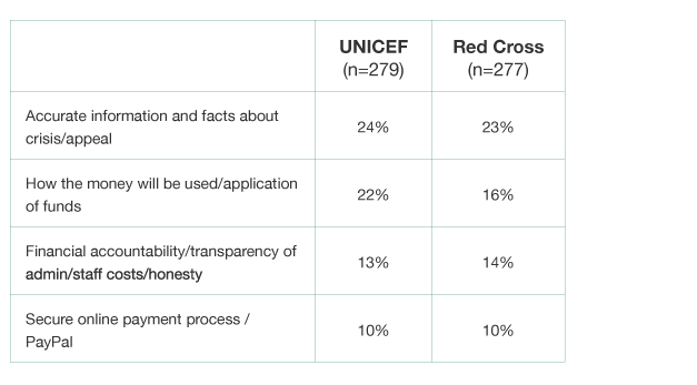
The ability to find accurate information and facts about the crisis appeal (say for instance, how many people have fled as a result of a conflict) was of key importance to include on a website that seeks financial donations from users to support humanitarian causes.
The fact that significantly more UNICEF respondents were successful at finding this information (in Task 2) goes someway to explain the positive shift in their future online donating behaviour.
4. Net Promoter Score (NPS)
The NPS was designed (by Fred Reichheld from Bain & Company in 2003) to obtain an indication of loyalty to a product or service, and how the customer experience affected company growth.
We analyzed the data from UNICEF respondents in detail to see if there were any correlations between their NPS scores and the likelihood of donating online in the future.
Interestingly, whilst the overall NPS score is -38 (see Figure 11), the score is much higher for those UNICEF respondents who said they would be likely to donate in future (-19) compared to those who would not donate (-57).
We can therefore see a link not only between the usability of this website causing changes in potential online donor behaviour, but also improving users’ loyalty to the organization.
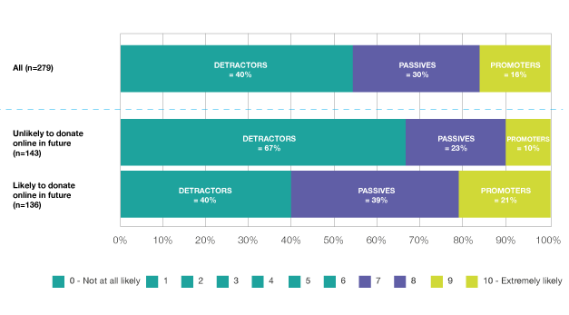
Figure 7: Based on your experience with this website today, how likely are you to recommend UNICEF to a friend or colleague?
Conclusion
Through online testing of the UNICEF and Red Cross websites, we gained some useful insights into users’ thought process when donating money online.
This study illustrates that good UX alone—not just bombarding people with various types of marketing—can influence consumer behavior and increase online conversions.
To access our full report and conclusions enter your details below and we’ll send you the report.
[wufoo username=”loop11″ formhash=”pzktzc003fv6u4″ autoresize=”true” height=”400″ header=”show” ssl=”true”]
![]()
![]() Give feedback about this article
Give feedback about this article
Were sorry to hear about that, give us a chance to improve.